Another new Superman #1
It’s Superman Day and I’m just getting home from the Superman Celebration. I had a wonderful time this year as always and highly recommended for every Superman fan.
Earlier this year DC published a new “facsimile edition” of Superman #1. This made me want to revisit my earlier post on the issue and how there have been changes to it over the years.
From what I’ve seen there are seven different versions of the cover. I’ve given them all handy names for clarity.
- OG. This is the original as published in 1939
- Licensed. This version is used on merchandise that features the cover. In my collection I have a notebook, magnet, and short comic box. The differences from the original are the color of the roof top, the fully colored in logo top, there is a red rather than yellow border on S shield, his costume is a darker blue, and the 10 cent price is in black.
- Archive. This was first seen in the recolored Archive hardcovers (as noted in my previous post) and also seen in the Golden Age Omnibus and Chronicles trade paperback series. - The suit is a lighter blue, the building behind him isn’t colored, and the text isn’t red.
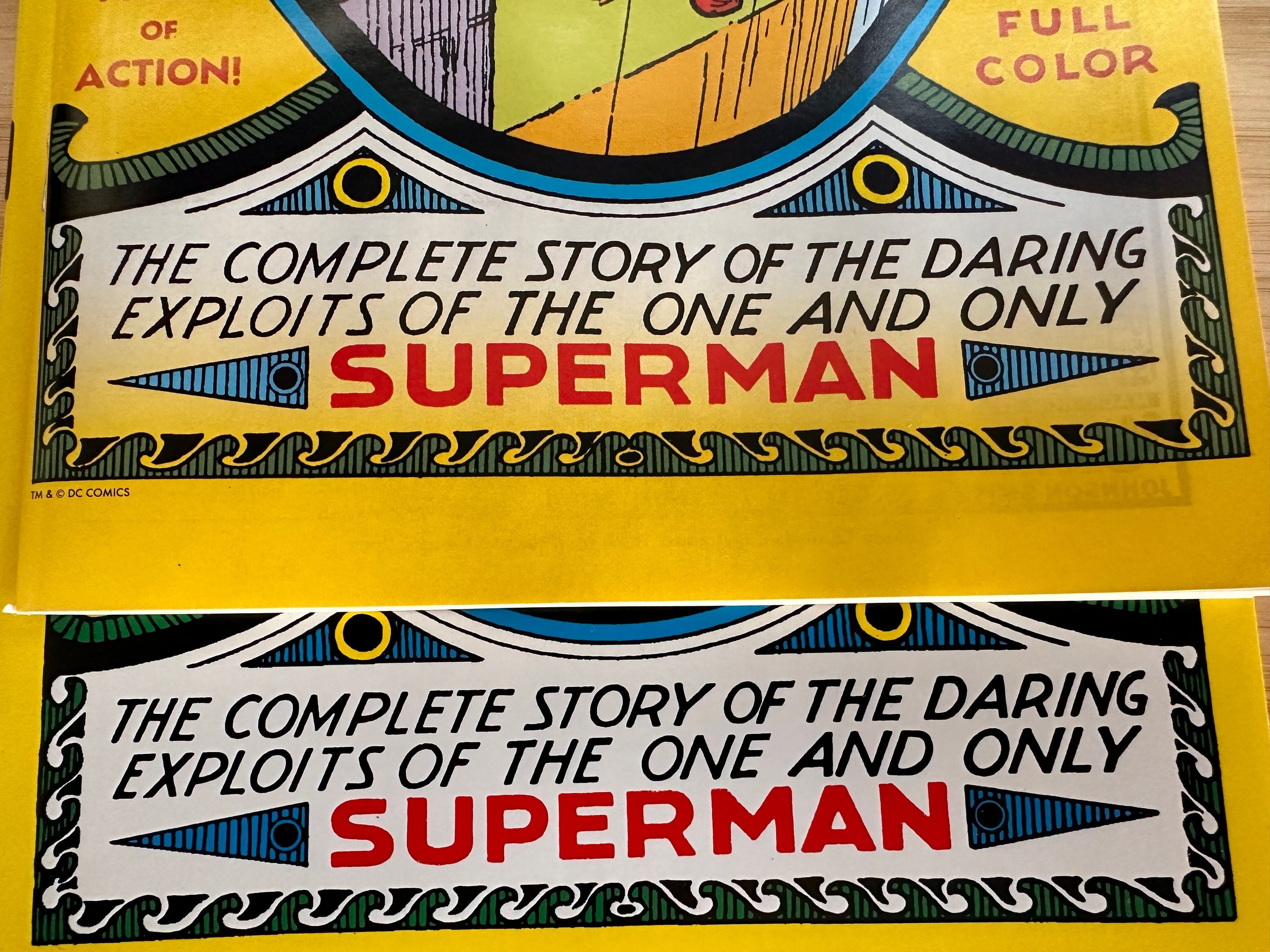
- Millenium Edition. First seen in DC’s Millenium reprint lines. This is the version they used for the newest facsimile except without the foil. Because this was originally for a foil cover there is a gradient on the yellow at the bottom which really stands out on the new facsimile edition. Additionally, the roof under his hand isn’t colored pink and he has a red belt loop.
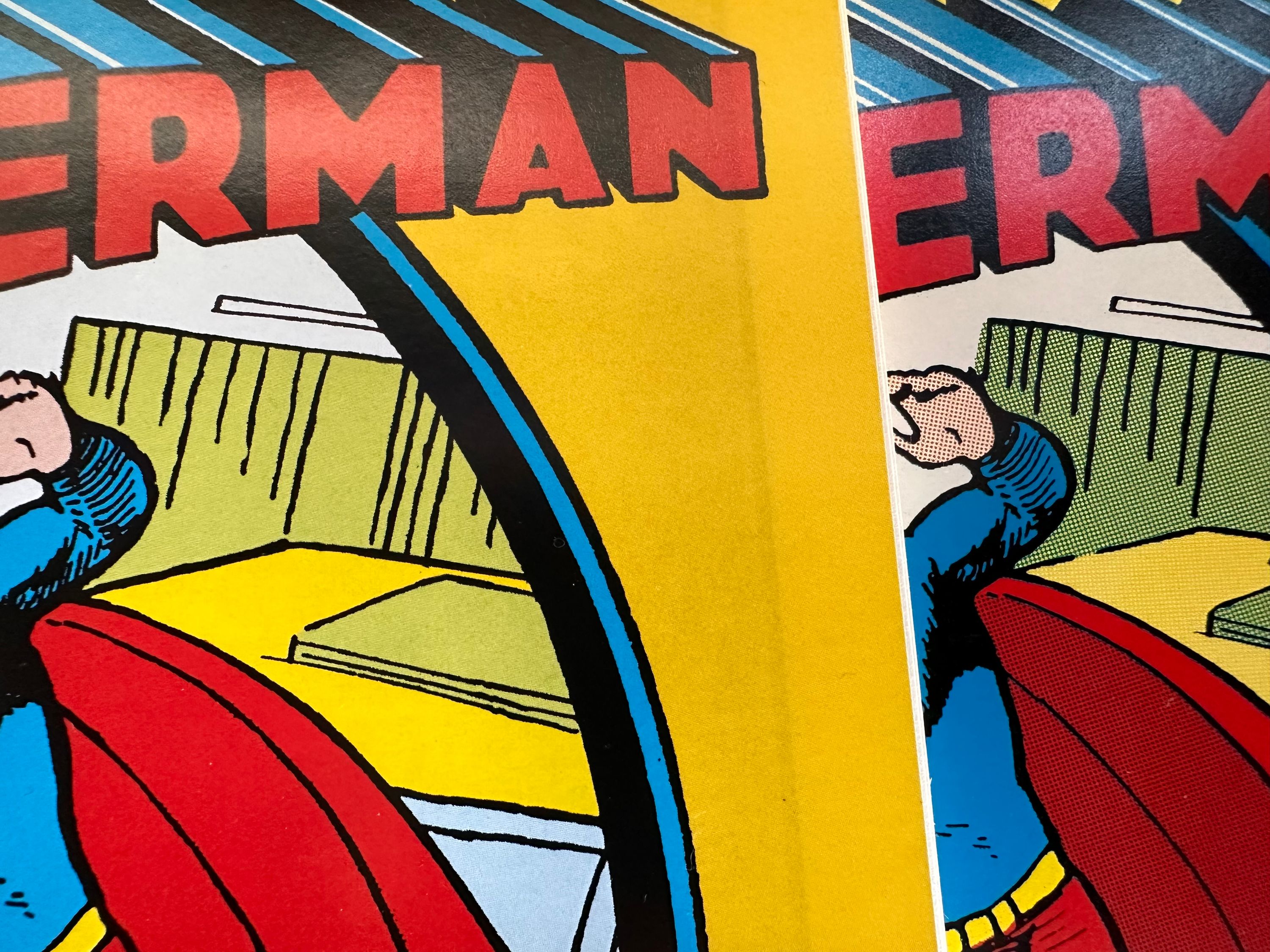
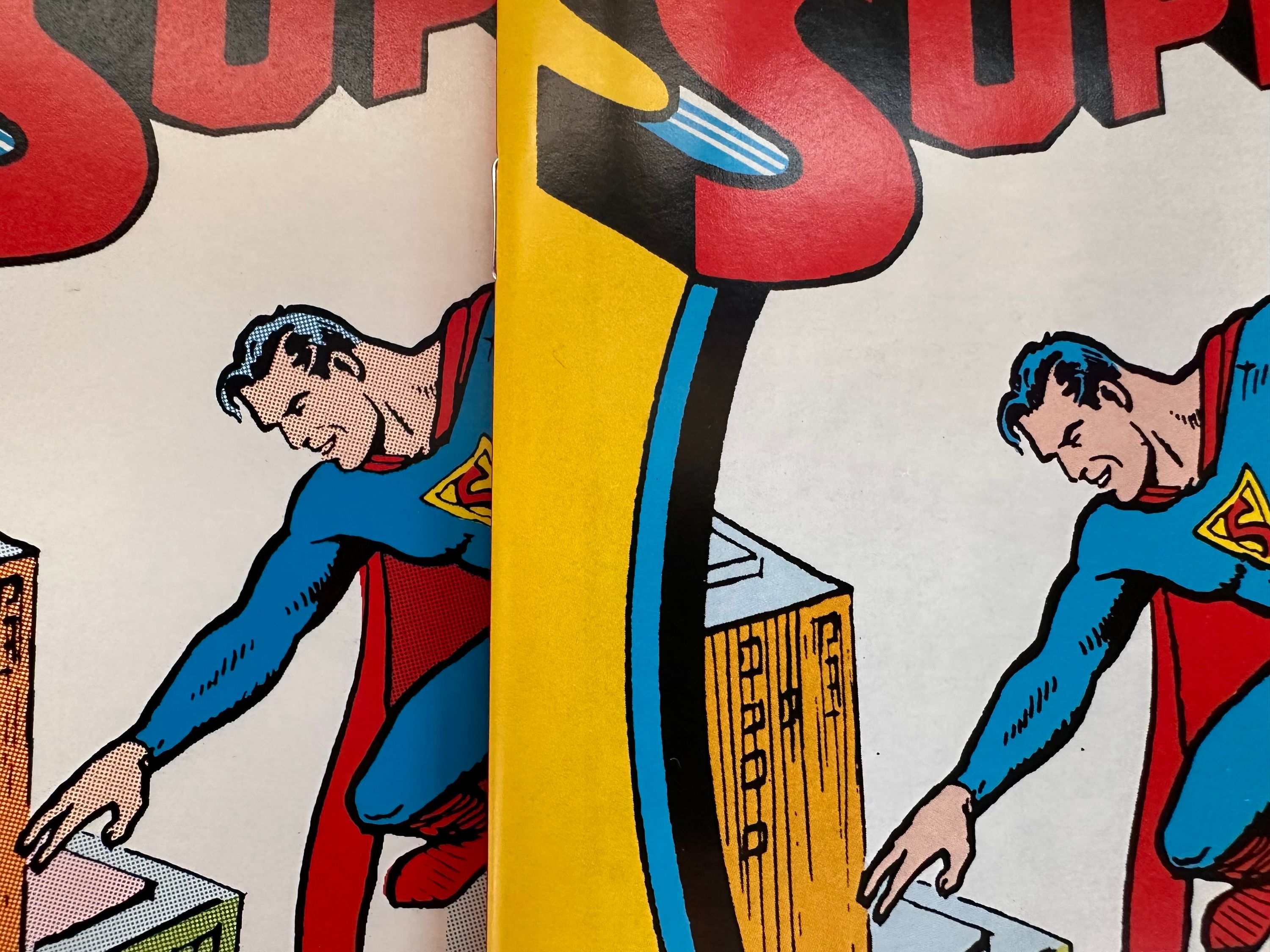
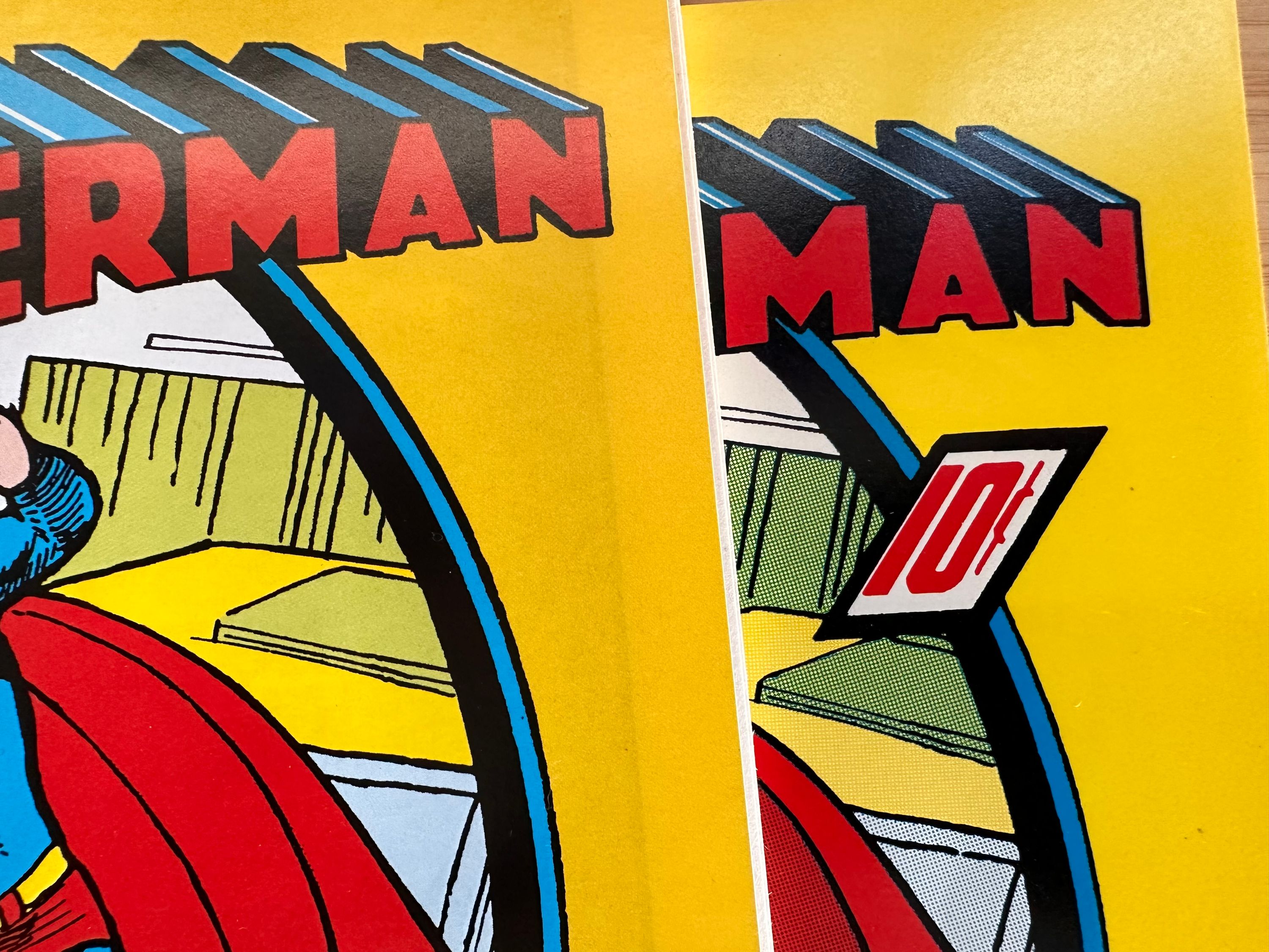
- Masterpiece - This version from 1999 was packaged with a hardcover book and statue; and is a very accurate reprint. The logo is missing a tiny black line on the S, everything is colored with Ben-Day dots, and his skin tone is very light.
- Famous first inside cover. The inside cover from the Famous First oversized edition in the 70s. Superman’s hair is darker blue and there is more white on the logo
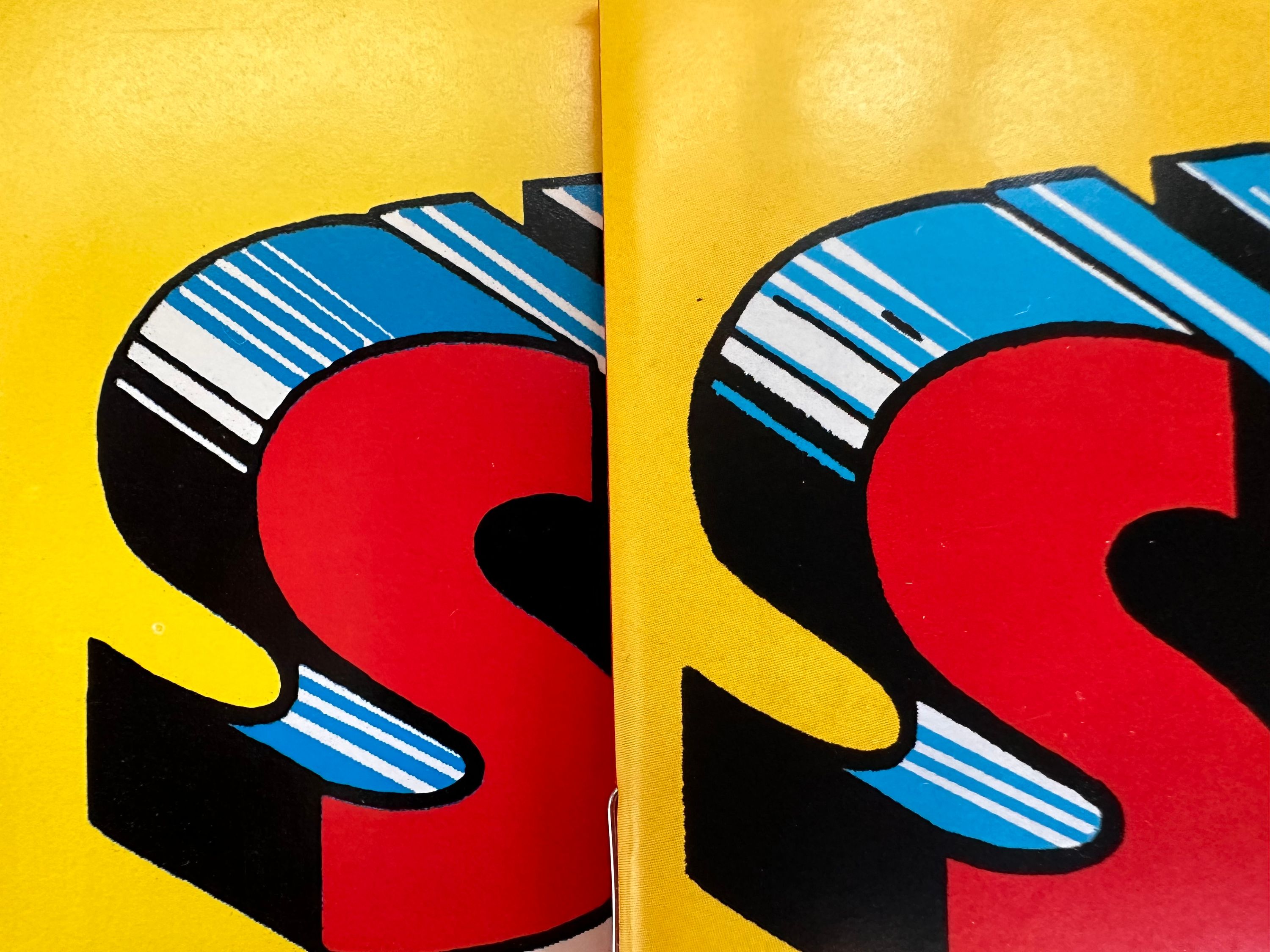
- Famous first outside cover. The inside cover from the Famous First oversized edition in the 70s. It is missing the tiny black line on the S and the blue in the logo doesn’t line up exactly.
I love the giant Famous First reprints, but I think the Masterpiece version is my favorite coloring. The Millenium version is decent but I hate the gradient and they should not have used it for the facsimile. Also the facsimile is modern comic sized which feels off, is missing the 10 cents price and has copyright text on the bottom. The Archive recoloring is bad. Kind of shocking that they marketed this as an accurate recolor in these beautiful expensive hardcovers but did such a poor job. Licensed is fine for consumer products, I get the changes they’ve made because it makes it look more like the modern costume. They are going for recognition.
I’ve only identified three versions of the interiors as detailed in the earlier post: The Original (which is the same as the Famous First and Masterpiece versions making them the most accurate), the Archive recoloring (which is reused in the new facsimile), and the Millenium Edition (also used in the Chronicles trade paperback, and Golden Age Omnibus).
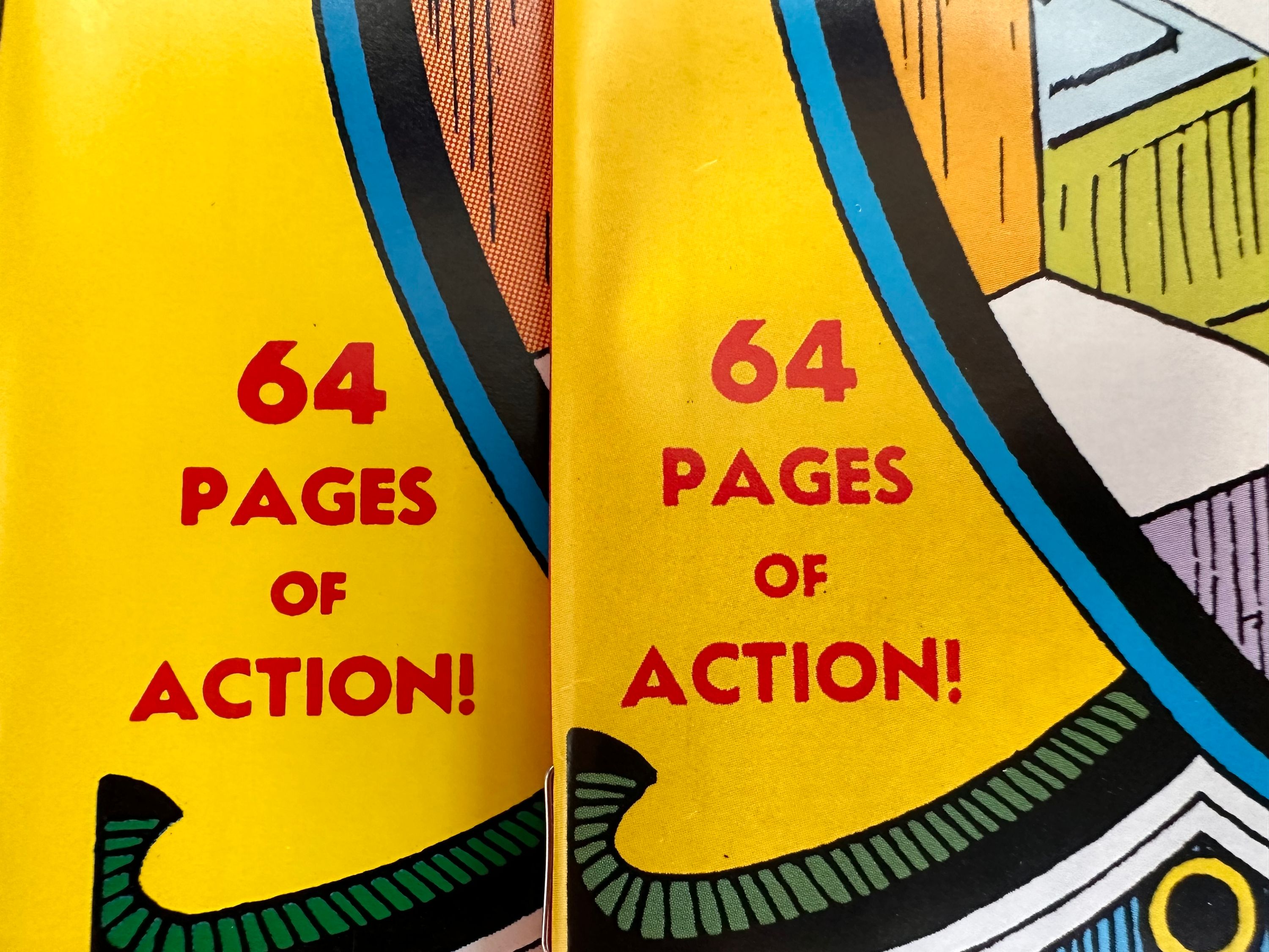
Here are some detailed shots comparing the new facsimile cover to the Masterpiece cover: