Standards Manual DC Comics Style Guide
Back in June I posted my excitement over the upcoming reprint of the DC Comics Style Guide. Well it is here!
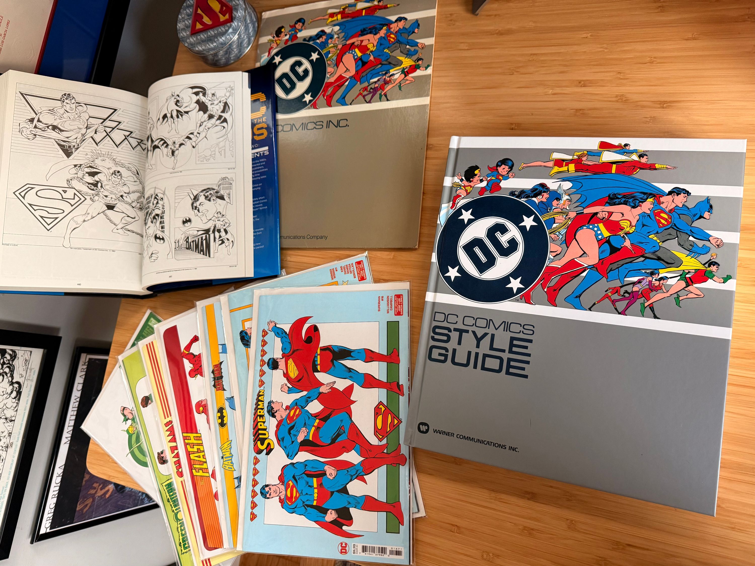
Over the last couple years DC has picked up on the demand to see this in print. In my previous post I mentioned they included some of it in the DC Through The 80s: The End of Eras hardcover. Only a few of the pages there are in color and all of them are printed at less than half the size. At the time I assumed this was going to be the best we’d ever get! It was probably the deciding factor in me purchasing the book—although the Twilight of the Gods pitch is cool to have.
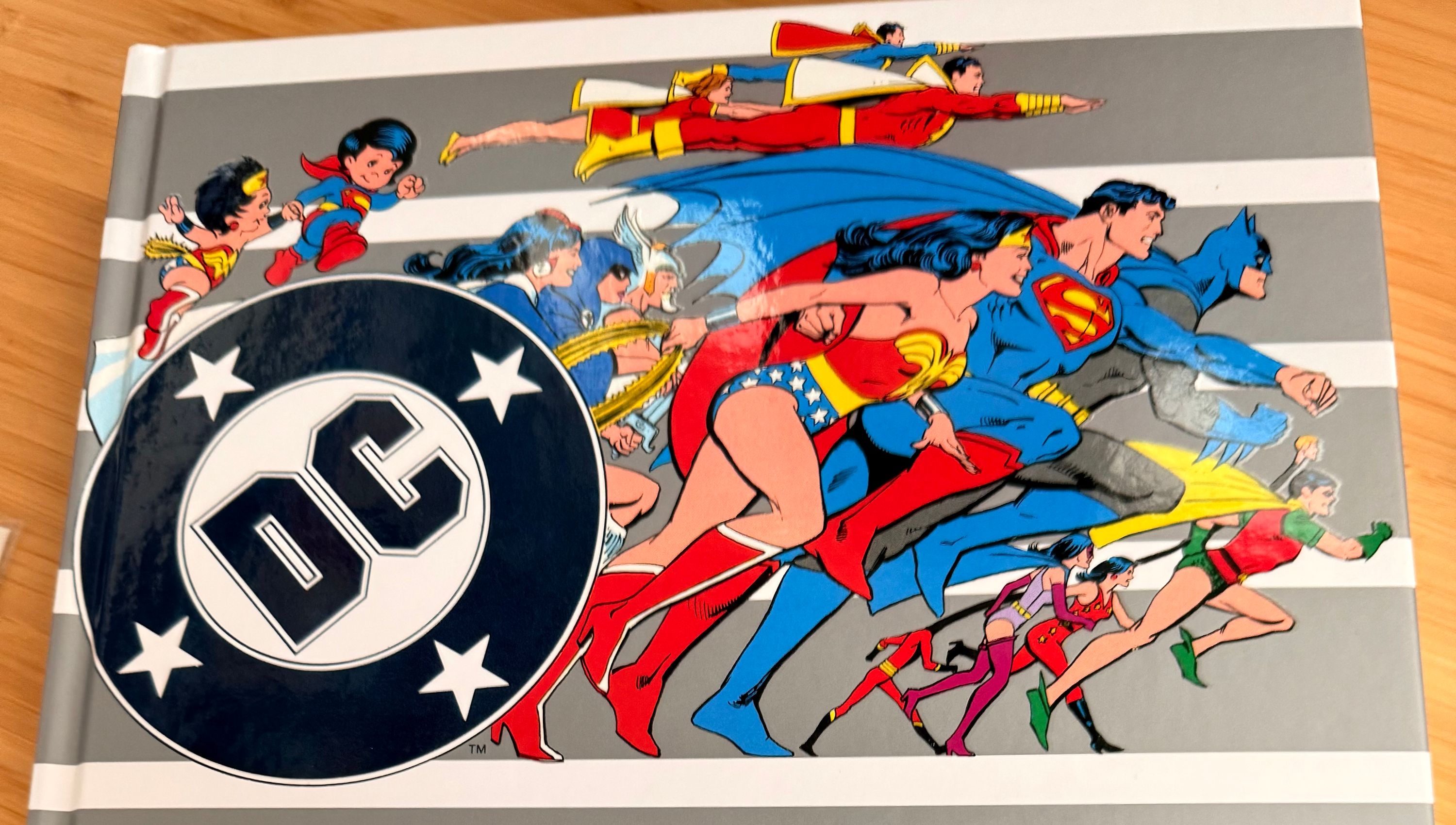
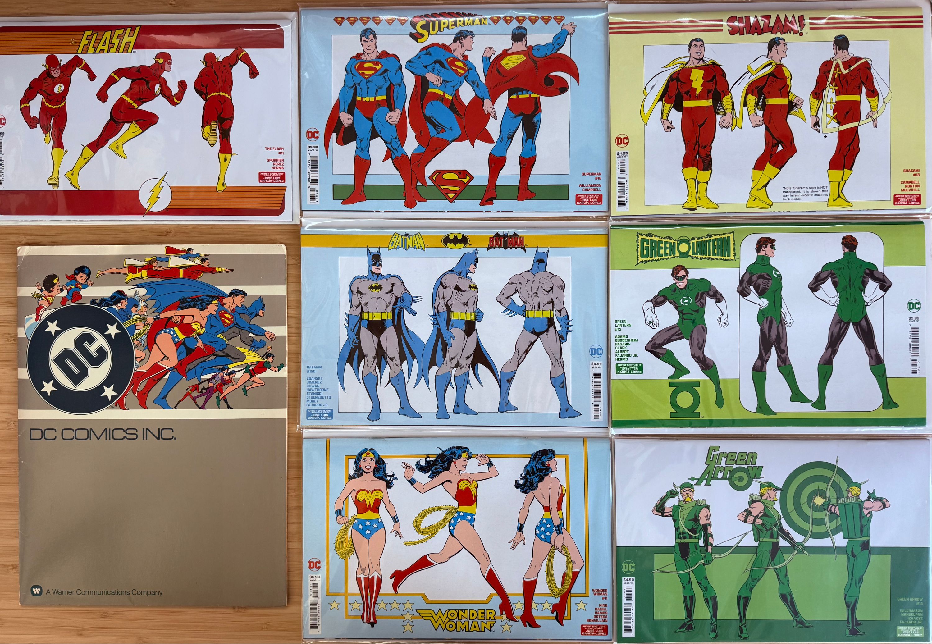
A much better attempt was the artist spotlight variant cover series. Seven of DC’s A-List heroes got a variant cover with the Style Guide turnaround art. It was marketed as a spotlight on García-López as an artist rather than a reprinting of the Style Guide, but it’s both! There was also an SDCC exclusive Justice League variant. The reprint makes it very clear it features the “legendary art of José Luis García-López”
To finally have the whole thing in hand is amazing. The original version I have is little more than a small folder. I’ve never been able to acquire a full binder. The care and detail they’ve put into this edition makes that sting much less. Scanned and reproduced from an original copy it feels more authentic than a reprint. A straight reprint probably wouldn’t have the three-hole-punches on each page! That plus an introduction by Paul Levitz and an interview with García-López and Mary Moebus Yedlin make this book a no brainer for me.
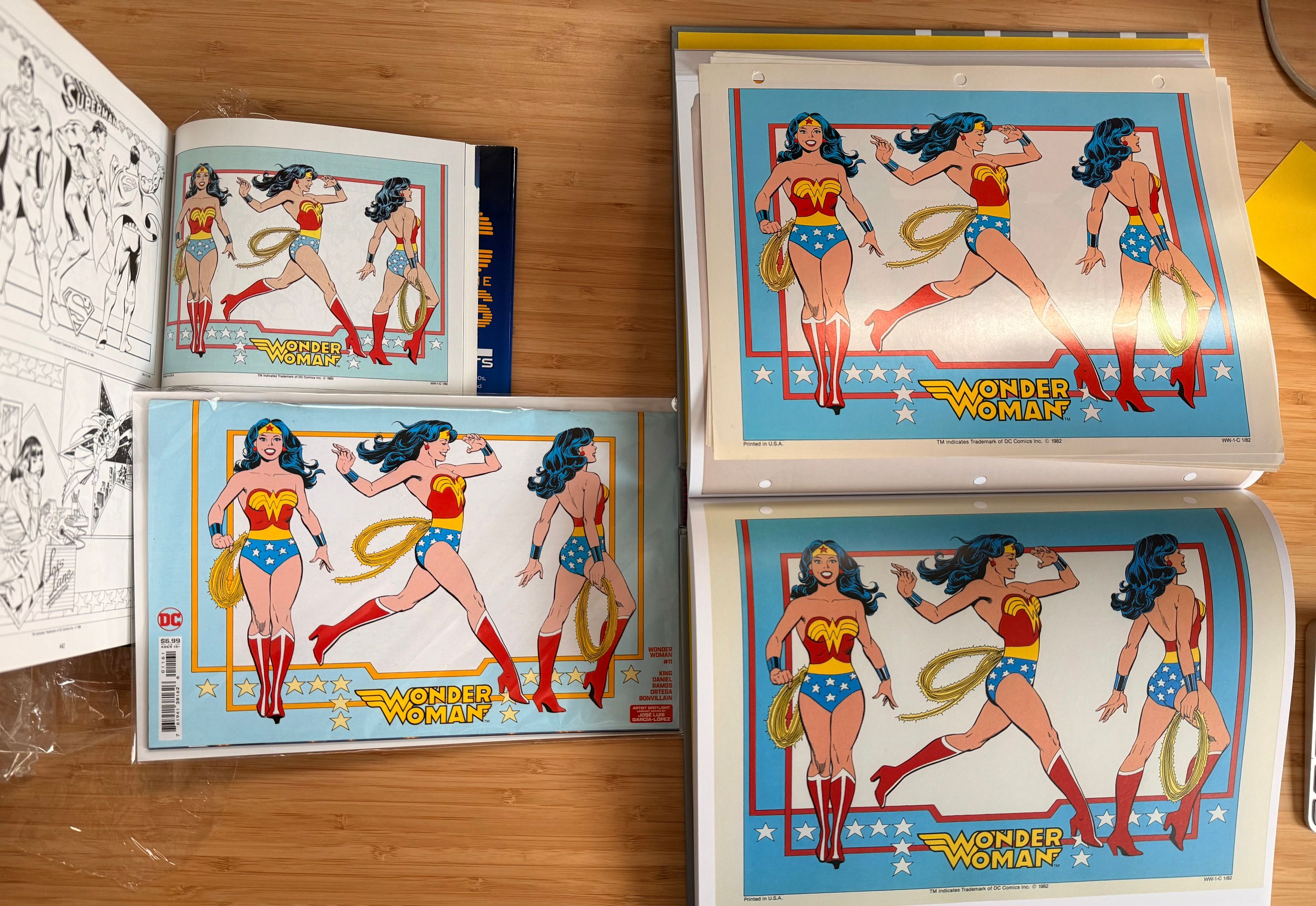
I tried to show the differences between various printings using the Wonder Woman page as the example. On the top left is the aforementioned End of Eras hardcover. One of the few pages they printed in color. Below that is the Wonder Woman #11 variant cover. These two versions have the lightest blue with the glossy cover being the brightest of the bunch. The End of Eras version seems very muted in comparison to originals. On the right we have my original page above the Standards Manual version. The original is a tad glossier, but I think the new version is fantastic. The paper feels very premium and of course I’m not going to be losing any pages from this.
Now the Facebook post isn’t obsolete. The style guide was updated over the years with new pages and the post has pages that aren’t included in this reprint. Plus there are some color versions that aren’t included either. I’d love to see Standards Manual do a supplement a few years down the line (like DC did) that includes some of these other pages.
Thanks to Standards Manual for putting in the work and for DC/Warners for allowing it to happen.