Superman Wordmark
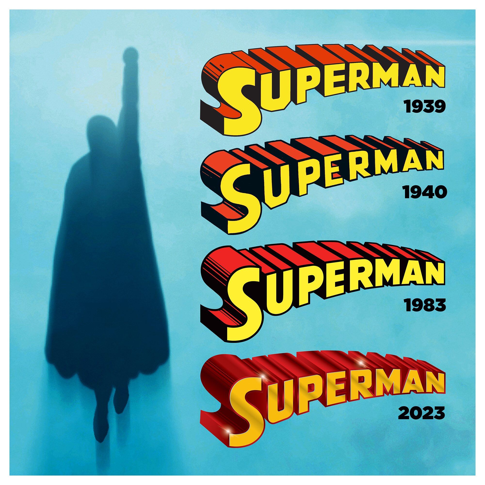
Earlier this year Superman fans got something we haven’t had since 1983: a new Superman logo wordmark. For the last 40 years we’ve been using the logo that debuted in Superman (Volume 1) #386.
With the debut of Superman (Volume 6) designer Darran Robinson (his website was darranrobinson.design but that seems to be down) has redrawn the Superman logo. He posted the following image to social media announcing the redesign, but this doesn’t tell the entire story.
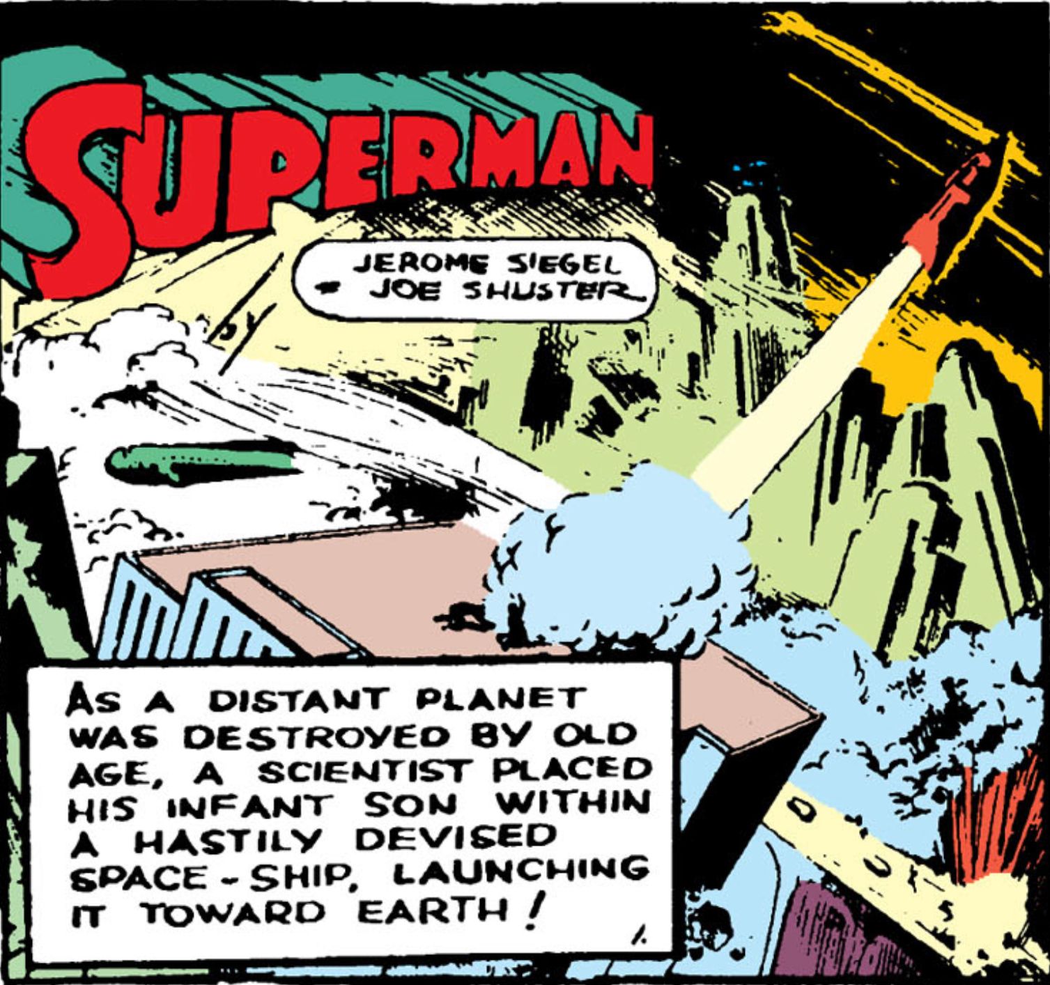
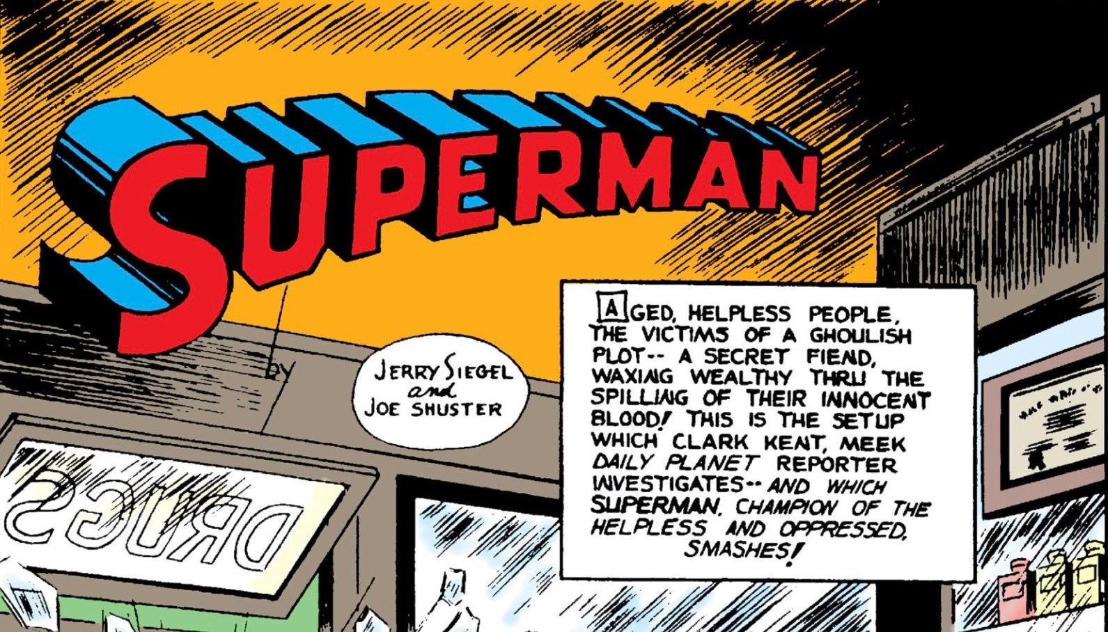
Those first few years there was lots of variability. The wordmark first appeared with our hero in Action Comics #1 in the very first panel:
The wordmark was inconsistent over the next couple of years, looking like it was handdrawn each time. It was typically used on the first panel of every story and then finally on a cover in Action Comics #12. But it’s the cover of Superman #1 that really stands out. That’s where that first version comes from in Robinson’s image.
Over the next few covers of the quarterly Superman title and in the issues again we saw lots of inconsistency, likely due to different artists drawing it by hand. That is until we get Superman #6. The logo was finally standardized and consistent (and the 1940 version from Robinson’s image).
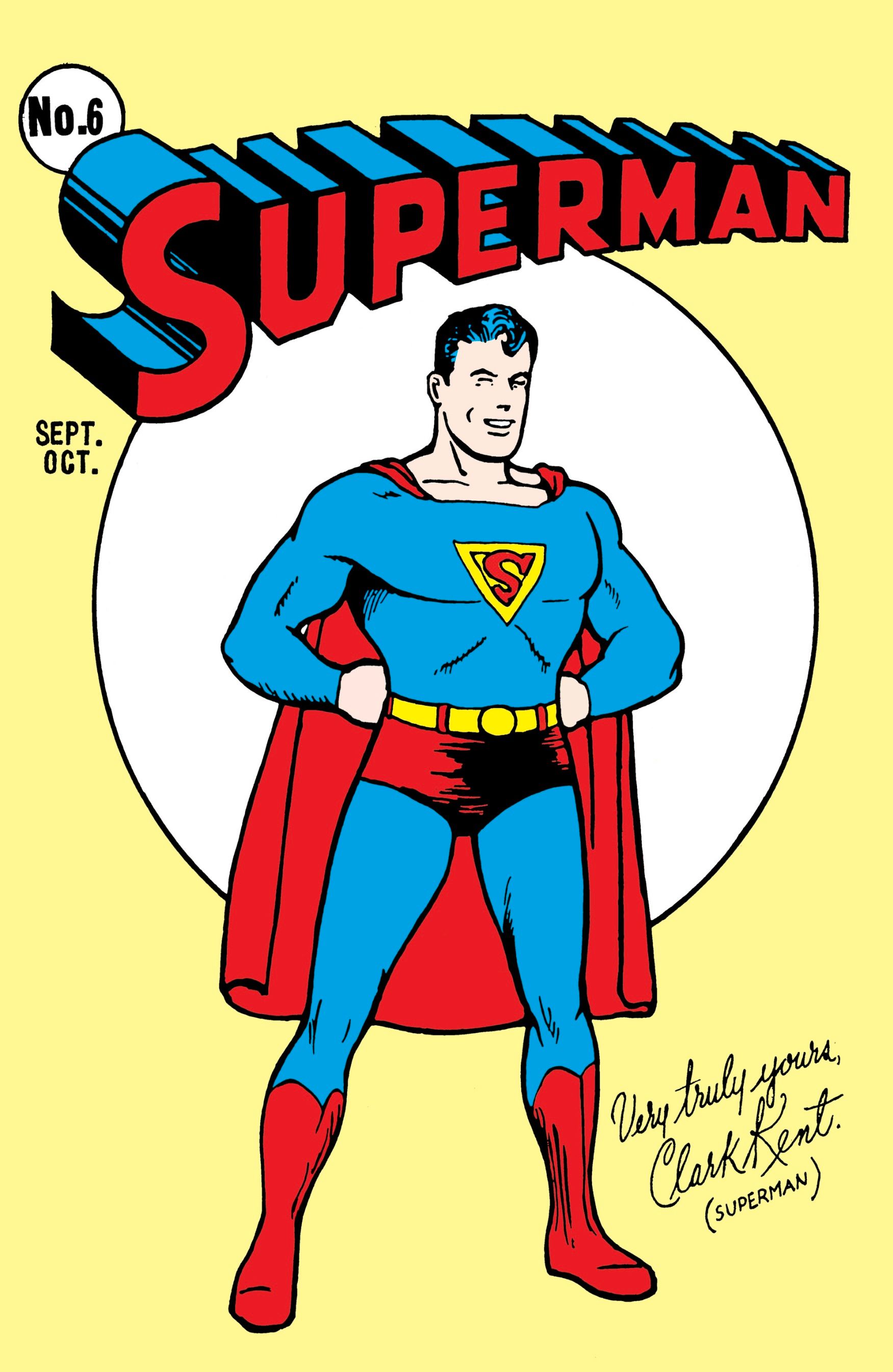
Although this didn’t hit the interiors for a while as even in Superman #6 the first panel has a logo that looks handdrawn.
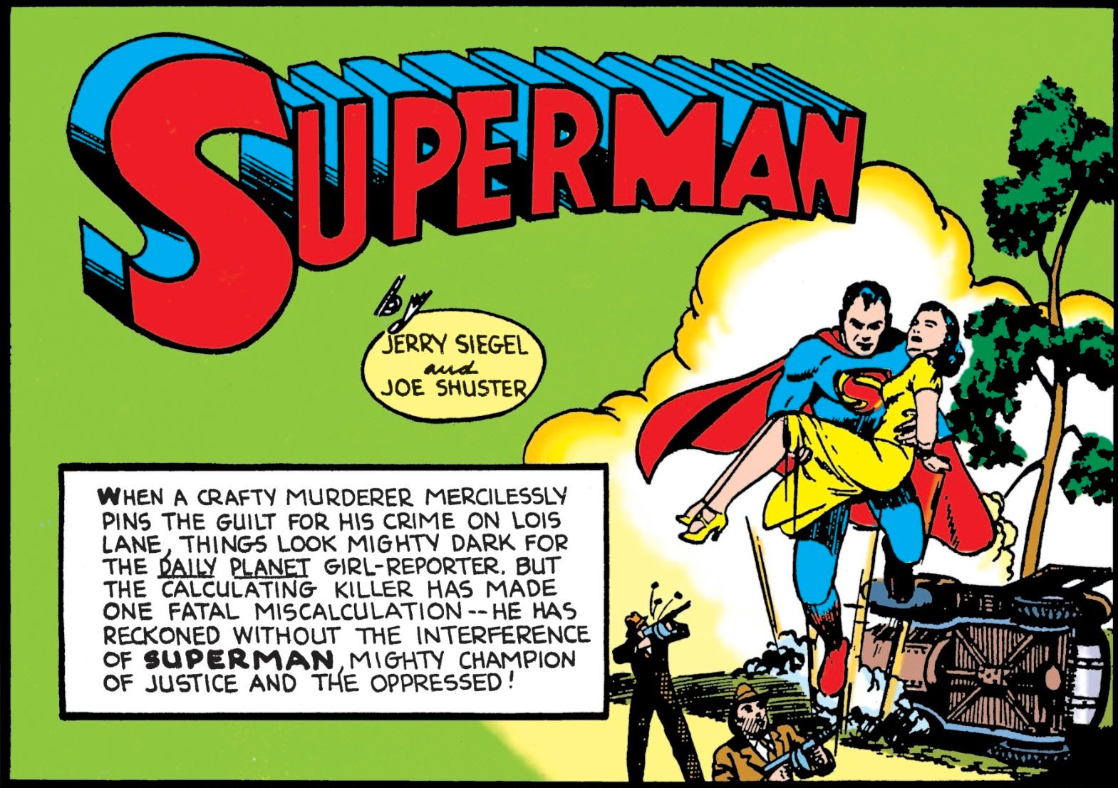
Now I say handdrawn for these as if to imply they had other options in 1940. No computers here. But the new logo created for Superman #6 was then machine reproduced for covers and issues moving forward. The first appearance of this logo on an interior panel looks to be Action Comics #29.
This logo would remain in use all the way up to 1983. Now there are some notable exceptions including the Fleischer cartoons, the Adventures of Superman television show, and even Superman the Movie. But outside that this is the logo you’d see on every comic book and related piece of merchandising.
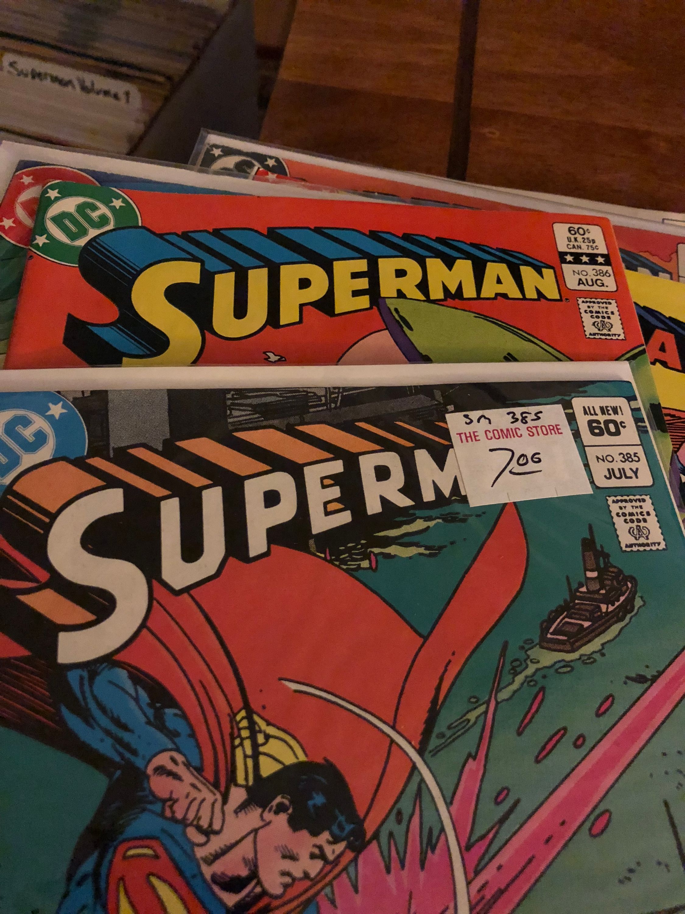
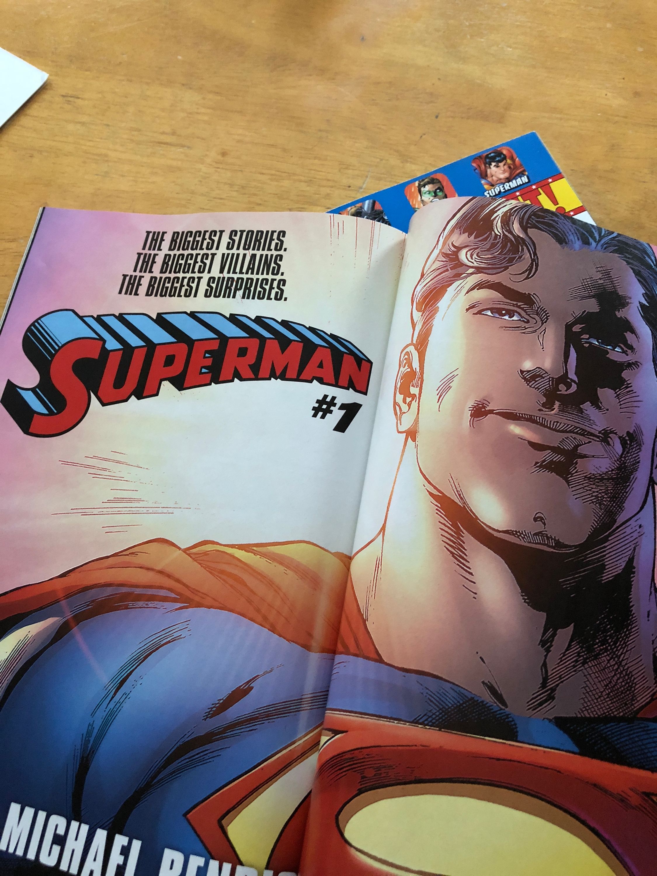
When we changed over in 1983 the older logo was banished. Being seen only sporadically over the next 40 years. Some notable places include period correct DVD releases of the Adventures of Superman and the Filmation New Adventures of Superman. The Superman “classic” merchandise line. The new Super Powers toy line (even though the original line had the post ‘83 logo). A house ad for Bendis’ Superman #1 relaunch. And the most recent use: Superman: Space Age. It jumps out to me every time I see it as feeling old.
Now of course the post ’83 logo has had many variations. Computer generated versions made to look shiny starting with Superman (volume 2) #178, the infamous electric version in the late 90s. But over all we kept coming back to a really standard version (albeit in many colors). All from a company who changed their logo three times in the interim.
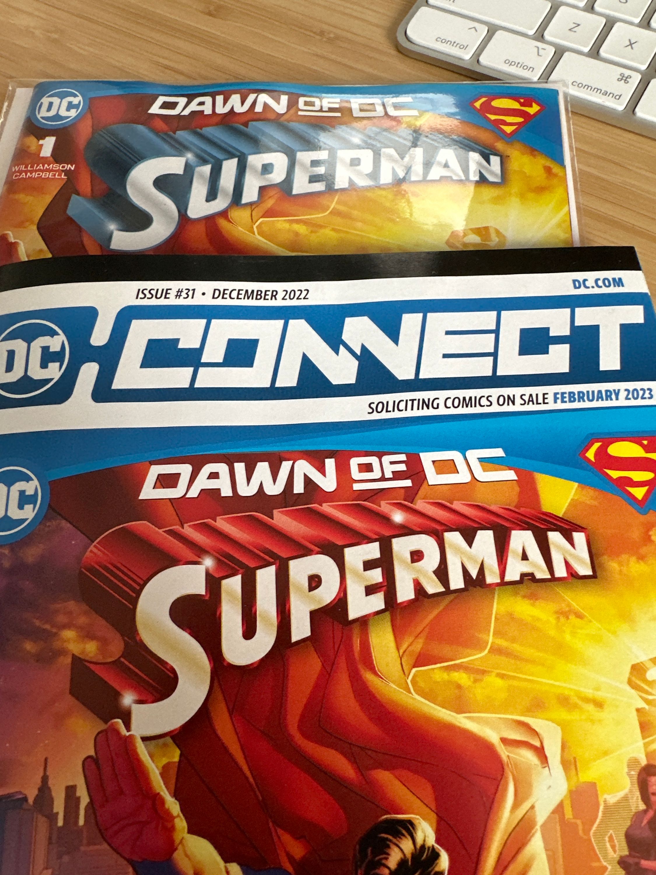
When DC published their “Connect” previews issue it still had that ’83 logo, with some computer shine added to it ala the aforementioned Superman 178. So when the book shipped I was surprised!
Now why have I written 800+ words on a logo that has only subtly changed over the last 85 years? Because I really don’t like this new version. I’m fine with them adding some Photoshop shine to it, but I think the 83 logo is perfect. I fully admit that it could be because it’s the logo I’ve lived with my entire life (I was born in 83). But I don’t like the squared off U, P, and R. I do see how it aligns with the earlier logo, but that logo feels old. The rounding of those letters feels smooth and pleasing to my eye. Plus when it was originally drawn in Action Comics #1 those letters were rounded. I think they were only squared off for consistency and ease of duplication.
I am personally not a huge fan of the trade dress in many recent DC books. Lots of them have little to no regards for the history of the characters or their logos. The recent Son of Kal-El, Superboy Man of Tomorrow, and Adventures of Superman Jon Kent logos do nothing for me. I actually do like the My Adventures with Superman logo from the upcoming cartoon for a couple reasons. It is reminiscent of the Action Comics font, cartoons often have unique logos (Fleischer & The Animated Series), and the incorporation of the new S design.
I’m not anti-change in my Superman books. I love when they change the status quo and challenge us as readers. But I hope this change goes the way of some of the other big Superman changes and is rolled back.