Absolute Superman Design
Back in 2000, Marvel Comics had a hit with “Ultimate Spider-Man”. A reimagining of Spider-Man for the new millennium, unencumbered by decades of continuity. This was shortly followed up with a full range of Ultimate Universe titles. Five years later, DC made a similarly inspired attempt with their All-Star line. Giving us one of the most beloved Superman stories and a Batman story with, let’s say, some mixed reactions. Not quite the Ultimate Universe they were going for. In 2011, DC tried a different approach with The New 52. Rather than a separate universe, they would relaunch all of their main titles. Again, to varying degrees of success. Like the reboot after Crisis, some characters would be more rebooted than others.
Now, in 2024, Marvel has started a new Ultimate Universe with a new Ultimate Spider-Man. A fresh reimagining for the 2020s. Not to be outdone, DC is jumping in with their new “Absolute Universe” as part of this year’s “All In” initiative. Starting initially with Batman, Wonder Woman, and Superman. I think the Absolute moniker is a little strange considering it’s what they call oversized hardcover collections already. Would we eventually get an Absolute Absolute Superman? I’m going to hold off on making conclusions about the XTREME and dark direction it looks like they are taking until I can actually read the books. What can I talk about then? The design!
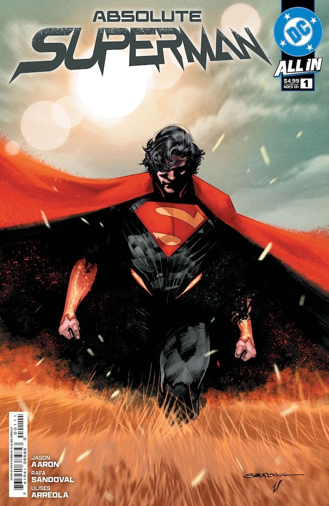
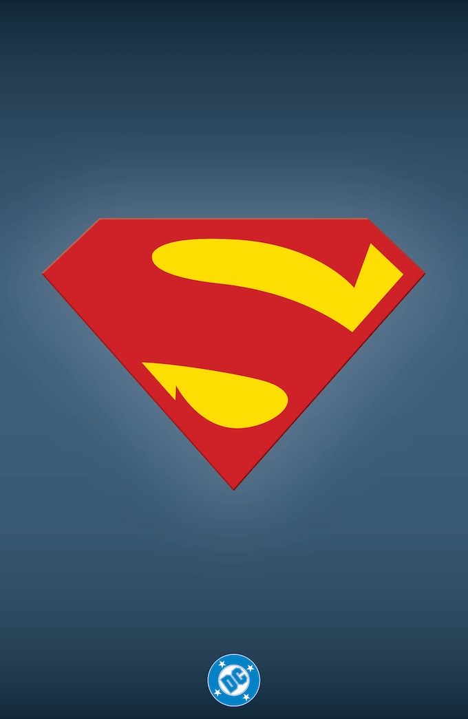
Last week, DC released the covers with the full trade dress, giving us our first look at the Absolute Superman wordmark and a clear official version of the logo.
Absolute Superman Wordmark

Right off the bat, this wordmark doesn’t do a ton for me. It fits with the All In logo. It looks futuristic in a Star Trek: The Next Generation way. It has the same fizziness the cape has, which ties it into the character design. It doesn’t use the new S like they did for My Adventures with Superman. It has almost no connection to the history or legacy of the character, which for this kind of reboot I do understand. It has that slight tilt like the standard and All-Star wordmarks have.
It does fit with the recent DC trend of distressed logos. Like how the All-Star Superman title fit in with the then trend of flat boxes of colors with bold sans serifs. Final Crisis is another good example of that. I believe those were all designed by Chip Kidd. DC does not credit any designer in their press release. I’d be willing to bet they are designed by Darran Robinson, but his website is down, and his Instagram makes no note of these new covers.
Finally, it looks a little strange for the cover box and DC logo to be on the right. Love having the DC Bullet back since that is the best logo they’ve ever had, but it belongs on the top left!
Absolute Superman Shield Logo

I love this! I’m not certain who is responsible, but they clearly understood the assignment. A red S on a yellow background in a diamond shield. Make it different from the current well-known standard. This does exactly that. The biggest change is the removal of the serifs. This makes it feel modern while also being connected to what’s come in the past. It succeeds in a way I think the 2025 movie shield doesn’t. In going with a Kingdom Come-inspired design, it doesn’t ring immediately as an S. This shield does that right off the bat. It reminds me of the My Adventures with Superman shield. Both are clearly an S, which I think is important. It’s what this shield is!
1982 Style Guide
In other design news this week, to make up for the slight delay in shipping the DC Style Guide, Standards Manual shared some new photos with 13th Dimension. Really excited to get my copy of this. Even the Amazon Washington Post had a story about it today. A little bit of a bummer that the Style Guide covers DC released last month have the 2016 logo rather than the bullet. They got it right with Super Powers variant covers this month.
Next week: The First Five Years.