Formerly Known as Legacy
Looks like I posted too soon yesterday; we got some big Superman news for his birthday later in the day. When I was on my way to see Dune Part Two my wonderful partner mentioned “they are going with the Kingdom Come shield.” I know that they used the Kingdom Come shield for the name cards during the table read, but beyond that it was still speculation. She pulled up director James Gunn’s Instagram and I resisted the urge to pull over to take a closer look.
The live-action theatrical shield has been on a parallel evolution path with the comics. In the late 1940s the comics were just starting to solidify the shield to the “standard” we’d recognize today. Specifically look at the round bulbous serif on the bottom. An early example we can see in 1948’s Superman #53 released as the ten year anniversary issue. 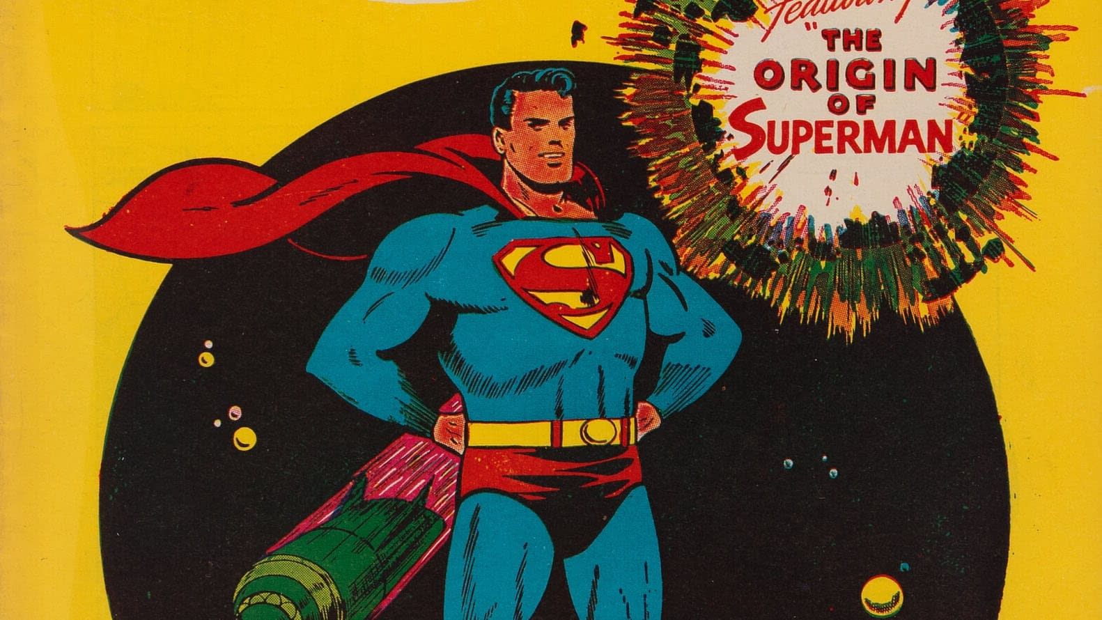 When Kirk Alyn hit the big screen in 1948 his S skips this round serif going with the shield that had been more common throughout the 40s. George Reeves and his Mole Men stuck with a very similar style S—although the color TV show years did flatten the top line.
 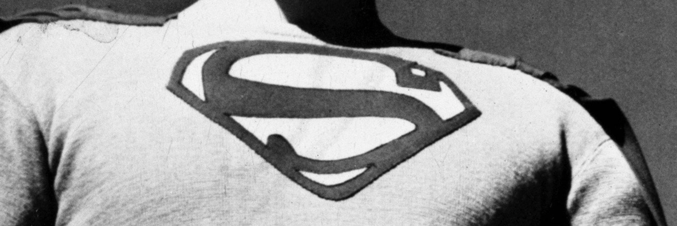 Fast forward to Christopher Reeve in 1978 and his shield also eschews that rounded serif. While the movie marketing material has it, Chris’ costume does
not. The size and shape are also adjusted with thicker red lines along with a new angle on the top serif. I find it interesting that I often see fans describe this costume as the classic despite this S being unique. Being a Salkind production the Supergirl shield stays close in line to this one.
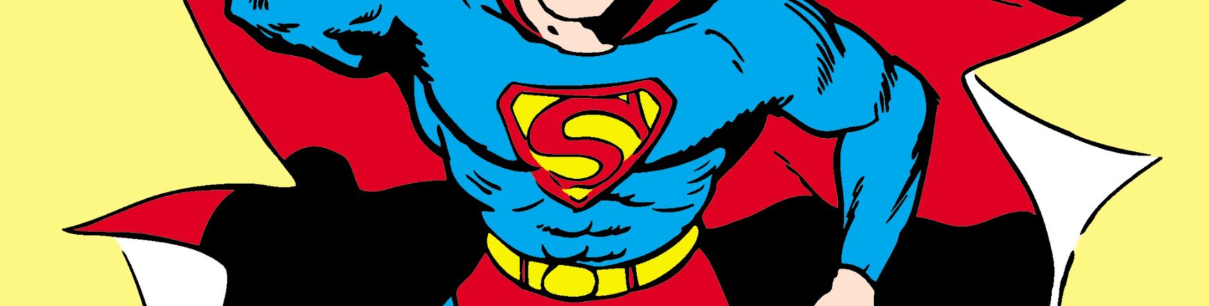
Fast forward to Christopher Reeve in 1978 and his shield also eschews that rounded serif. While the movie marketing material has it, Chris’ costume does
not. The size and shape are also adjusted with thicker red lines along with a new angle on the top serif. I find it interesting that I often see fans describe this costume as the classic despite this S being unique. Being a Salkind production the Supergirl shield stays close in line to this one.
We don’t get another Superman theatrical release until Brandon Routh dons the cape in 2006. Again this shield evolves off the previous one. Missing that serif, but also getting much darker and smaller. The spandex era was over at this point so this S is no longer just sewn into the costume. The darker maroon almost brown color instead of red was this movie’s attempt at being modern. Hindsight is not kind to these colors.
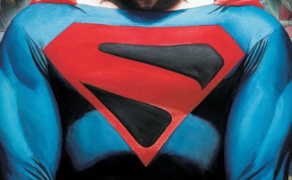
That iteration only got one theatrical flight before Henry Cavill took the mantle. For the final time (so far) we skip the round serif, but gain a large serif at the top. I find this to be reminiscent of the early 1940s logos that these spun off of in the first place. Subsequent Cavill shields add a strip of Kryptonese text in the middle.
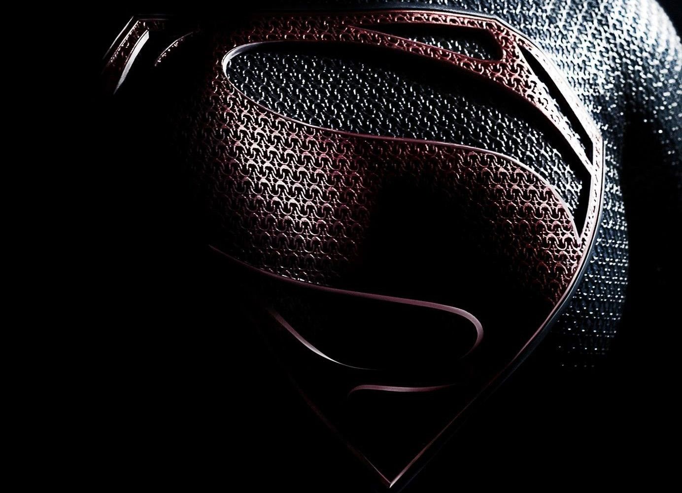
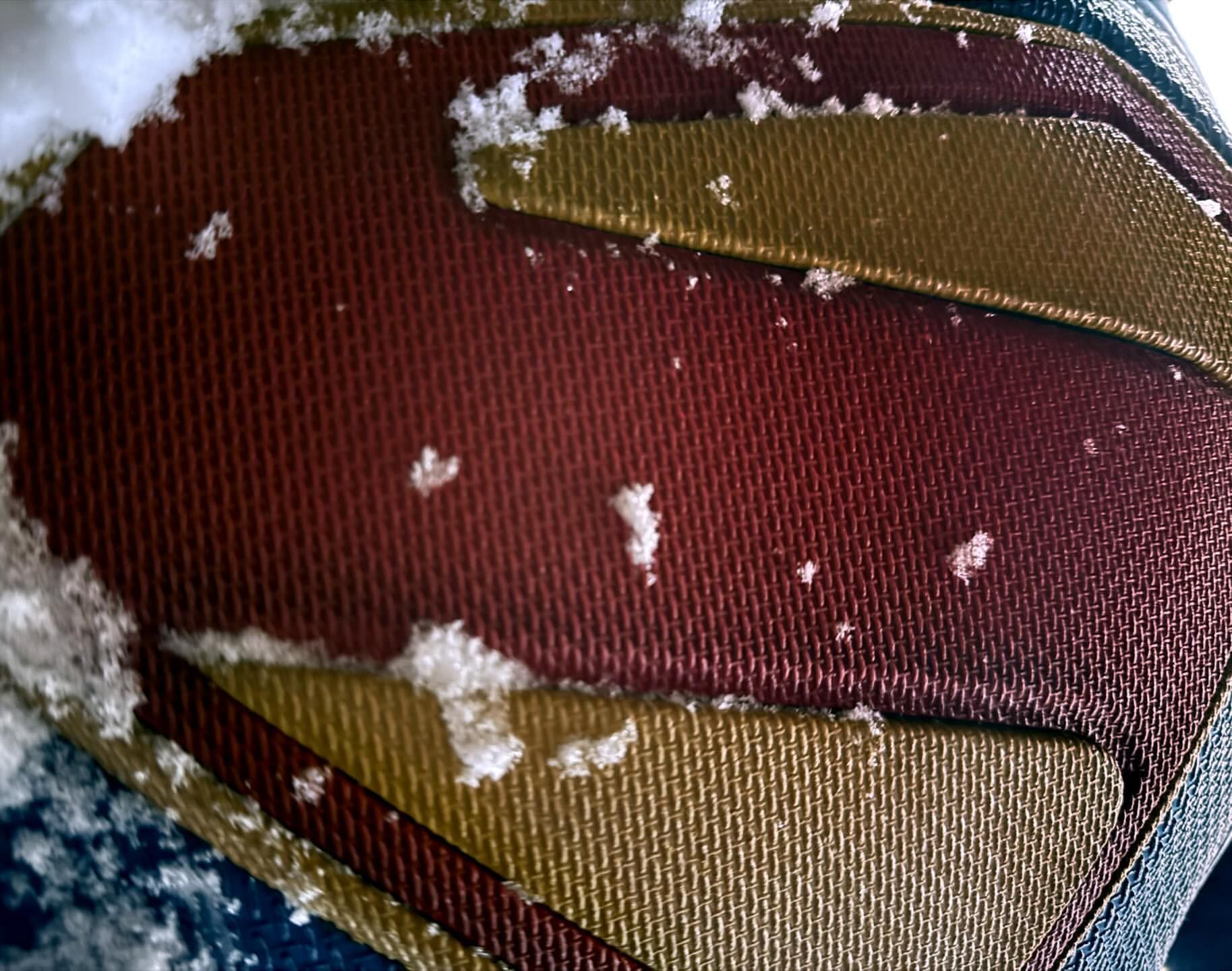
Corenswet’s new S breaks with this evolutionary path and gets its inspiration elsewhere.
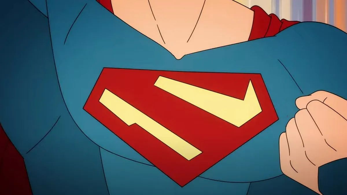
With 1978’s Superman: The Movie, Jor-El wears the shield for the first time. Rather than standing for Superman, the S is now a family crest. The Superman name comes after the S in the movie. This is now an alien family crest that just so happens to be in the shape of the Latin letter S; the first letter of the character’s name. 2003’s Superman Birthright miniseries takes this to the next level. Explicitly calling the shield the Kryptonian symbol for hope. When Man of Steel was made ten years later they took this idea and ran with it. It informed their redesign of the shield making it a bit more “alien” while still being recognizable as an S. I think this story element and influence was taken to the next level in the recent animated series My Adventures with Superman. The shield for this show sticks with classic comic colors but simplifies the shapes into straight lines. It can easily be read as an S, but is also believable as an alien symbol unrelated to human letters. This has been taken in the completely wrong direction with General Zod’s Kryptonian symbol of a Z in the comics. It makes no sense.
Now the Kingdom Come of it all. The late 90s was the height of the Dark Age of comics. Gritty, violent superheroes were all the rage. The question the book asks is how does a character from the Golden Age like Superman fit in this world? Is he “relevant” for today’s climate and sophisticated reader. Superman returns to a world that has largely forgotten about him with a new shield. Black replaces the yellow and the design is far simpler, more alien, and less obviously an S. This Superman previously wore the standard comic book S of the time, but his return in this changed world is decidedly darker. In trying to show the way to a new brand of heroes he veers into authoritarianism before ultimately failing.
I love this book, but the question “does Superman fit into modern times” is almost as old as the character! People were saying that in 1978 when the first movie was made and people are still saying that today. How many times do we have to ask this question and get the same answer? I hope this movie isn’t trying to ask this same question.
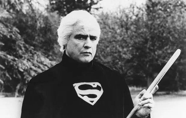
When The CW wanted to bring back Brandon Routh to the cape as an older Superman for Crisis on Infinite Earths it was decided it should an adaptation of the version we saw in Kingdom Come. He was given the backstory from Kingdom Come minus some important bits like Magog and his exile. Fitting with this tragic backstory is the red and black S. While this costume is a very close adaptation of the comic version it is still influenced by the Routh’s Superman Returns costume. There is a raised plastic element to the shield and the suit is textured rather than a flat blue fabric. In the comic we never see Superman in costume during the denouement. The shield is always red and black. In fact, the epilogue from Justice Society #22 and the pseudo sequel The Kingdom also never feature a red and yellow version of the Kingdom Come S. On television though we got a farewell/homage to the Reeves/Routh version of the character with him flying over Earth
and smiling at the camera. The black in his suit is replaced with yellow, but the shield maintains the abstract design. 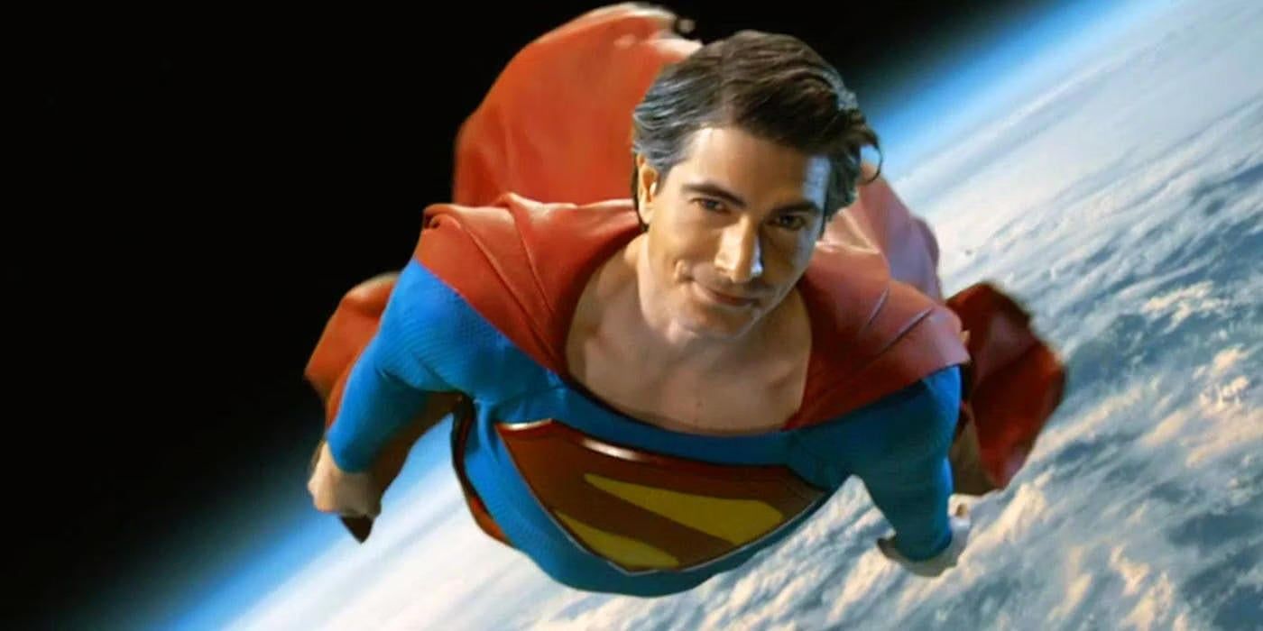 This new S is closest to that final Brandon Routh S; with the textures and materials most like Man of Steel. Rather than being made of a separate material like Crisis and Superman Returns the new shield is made from the same material as the costume like Man of Steel. This new shield also adds a yellow border further differentiating it. This S is not the Kingdom Come S. It’s Kingdom Come inspired, but it would be inaccurate to say it’s the Kingdom Come shield.
I personally don’t think this is a good choice for the S for this movie. I have never loved the idea that the S is a Kryptonian symbol and I think the biggest reason to use a design like this is to lean into that. I just want it to be an S. Maybe it becomes a symbol of hope in the universe after Superman’s appearance. I like that better thematically than him being born with a symbol of hope. I understand we’ve had 45+ years of it being Kryptonian, but the more alien we make it the less Superman it feels to me. This specific shield design was originally earned as part of a story that ties to years of continuity. It’s an old Clark. This is new movie is early days for this Superman. I think John Byrne explained the S really well in the Man of Steel miniseries. Clark saves the spaceplane without a costume, gets named Superman by Lois in the Daily Planet, and that name inspires the symbol. His mom makes the costume, him and Pa Kent make the S. But the biggest reason I think this symbol is a mistake is it comes with too much baggage. Every theatrical adaptation has had it’s own unique take on the shield signifying it is something new. Especially, Superman Returns and Man of Steel. Using an alteration of an existing comic design doesn’t make it instantly associated with the new movie. You post a black and white version of this and it could be Kingdom Come it could be Crisis on Infinite Earths or it could be this movie. You post a black and white version of the Man of Steel shield and you know what it is.
I haven’t touched on my feelings on everything else we know about this movie so while we are diving deep lets look at the rest of what we know. 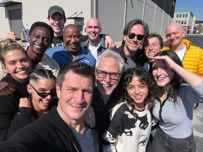 I like James Gunn. I think he is a good filmmaker and storyteller. I think he’s coming from the right place in making this movie based on everything he has said about it. He’s mentioned how important it is to his relationship with his father and he is concerned with the legacy of the character. There are things about Gunn that make me nervous though.
The first is his penchant for taking a lesser known character and just completely changing them to fit the story he wants to tell. It’s fine if you don’t have any love for a particular character (like Vigilante in Peacemaker), but can really hurt (like Adam Warlock in Guardians of the Galaxy).
He’s also taking a usual suspects approach to some of the cast and crew. The Guardians films are great, I’m not denying that. But do they have the best cinematography and best music in the film world right now? I don’t think anyone would say they do. I want this movie to be transcendant. I want it to be next level. It can’t just be another superhero movie. It needs to start a whole new universe and at the same time continuing a character legacy going back almost 90 years. This isn’t Star Lord and Rocket Raccoon. Using the same cinematographer and composer might be comfortable, but are they going to bring this to the next level it needs to be? We know he’s pals with Nathan Fillion, but do we need Fillion as Guy Gardner in the first new Superman movie? How about his brother as Max Lord?
Final point on Gunn, is the Brightburn of it all. Yes Gunn didn’t write or direct this movie, but he had a hand in producing it. Not only was this a movie I didn’t like, the evil Superman trope is one of my least favorite ideas in fiction. It shows a fundamental misunderstanding of what makes Superman special. Now I like The Boys and Invincible, because those stories aren’t simply about “what if Superman went bad”. They are about what would the rest of the world do if there was someone with Superman’s powers without his moral compass. It works as metaphor to actually powerful people and how we handle abuse of power. Versus an Injustice which has a focus on how cool it would be for Supes to rip someone in half. It is a videogame.
Our main cast for the movie? The big three of Lois, Clark, and Lex? They are great. The minute Rachel Brosnahan was announced I started watching Mrs. Maisel and she’s fantastic. She is like Lois Lane jumping off the page into real life. David Corenswet has a great look and was great in Pearl. The dude is giant, which really sells it for me. I’ve liked Nicholas Hoult in everything I’ve seen him in and he’s already shaved his head. Win, win, win.
The rest of the cast? No complaints besides why are all these characters in a Superman movie? Seems like a random bunch and seems like maybe too many characters for this movie that we want to focus on Big Blue! Miss Teschmacher and Otis tie it very closely to the Donnerverse so it’s strange he went with them rather than Mercy Graves or someone new. I know lots of the choices are dead ringers for their comic counterparts (looking at you Skyler Gisondo as Jimmy Olsen) which is cool, but I like when they throw curveballs too. Lawrence Fishburn was inspired casting as Perry White.
Just after I published I saw the report that Wendell Pierce has been cast as Perry White. Looks great!
Last bit I have to say on this movie right now is the about the title. I’ve never loved Superman Legacy as the title, but I do like the sentiment. When Superman Returns came out it felt like the perfect title. It was a continuation of a long dormant franchise, it was about Superman coming back after a long absence, and it echoed Tim Burton’s Batman Returns. Man of Steel was also perfect. A reboot with a title echoing The Dark Knight (which was also part of a reboot of Batman). Superman: The Movie made sense for the first one and even echoed Batman: The Movie (1966). Yes, I always call it “The Movie” because I like the 1970s vibe it gives and it’s on some advertising despite not being officially the title. Changing the title of this movie to simply Superman is undoubtably going to cause confusion. But it’s putting the flag in the sand saying this is going to do for Superman what Batman (1989) did for Batman. I hope they are right.
PS Maybe we shouldn’t have been surprised by this shield at all since Gunn basically told us almost a full year ago on BlueSky.