Revisiting the Superman Wordmark
Readers of this blog will know I have a bit of an obsession with the iconography around Superman. As a character that’s been around for 85+ years the logos and wordmarks have approached an almost religious/idolatrous level of complexity and evolution. With fervent believers on each side of course.
For the second Superman Day of the year I thought I would revisit the wordmark that was updated last year. A few months after it debuted last year I wrote about the wordmark and it’s history over the preceding decades. At the time I wrote that I did not like this new iteration and that I preferred the version debuted back in 1983.
Over a year later, I’d argue this new wordmark has failed. I’ll give two specific examples why I think so.
This morning DC sent out a marketing email for Superman Day telling people to “shop our new merch drop!” The wordmark they used for the email? Of course it’s the post-83 version:

In fact there is no current piece of Superman merchandise that features this new wordmark. If the powers that be were fully onboard with the change they’d have rolled out all kinds of products with it. Especially when the main toy complaint with Superman is that he doesn’t have any other costumes or accessories like Batman. New designs give them new things to sell!
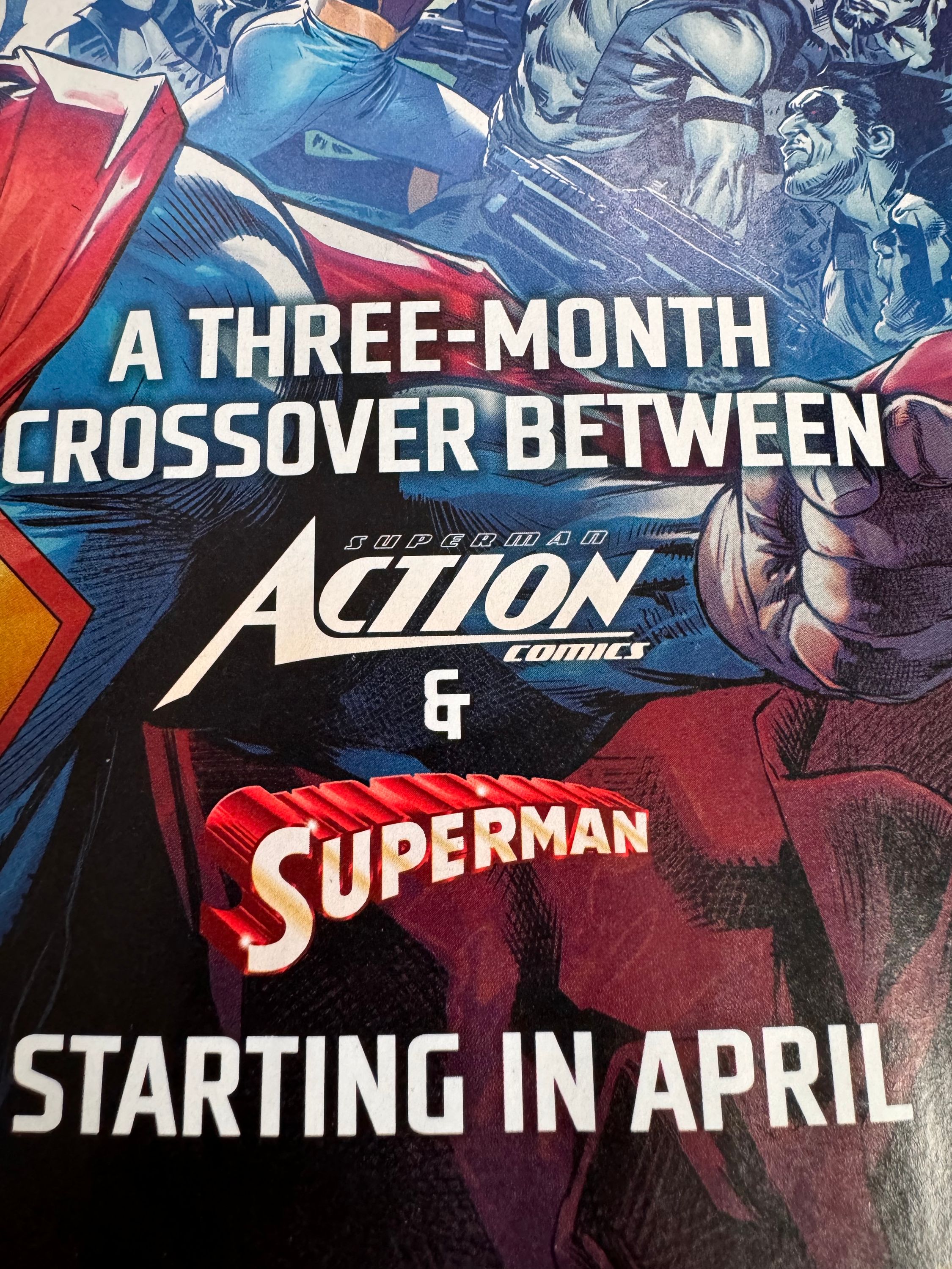
My second and most damning piece of evidence: the new house ad for the “House of Brainiac” crossover. One could easily argue that the merchandising arm of Warner Discovery isn’t tied in to the day to day aesthetics of the comic books so the above miss is excusable—although I’d argue that they should be very concerned with how their flagship character and property are being presented. But there is no argument that DC’s inhouse ad design team shouldn’t be aligned with current character logos. In last week’s Green Lantern #10 which features a tie-in story to “House of Brainiac” we get a two-page spread advertisement for the story that has the correct modern Action Comics logo—which I also don’t love—but has the classic post-83 wordmark—specifically the version from the DC Connect preview from last year with the extra gloss. How could they miss that in the ad for what they are promoting in a part of that storyline?

I went back through the last year of Action Comics and found the post-83 version used seven separate times. That’s overlooking the two early house ads for the Superman relaunch since they were likely put together before the issues were finalized. This new wordmark isn’t used in the pages of Action Comics until this month’s issue with the new recap page that was introduced as part of relaunch/rebrand.
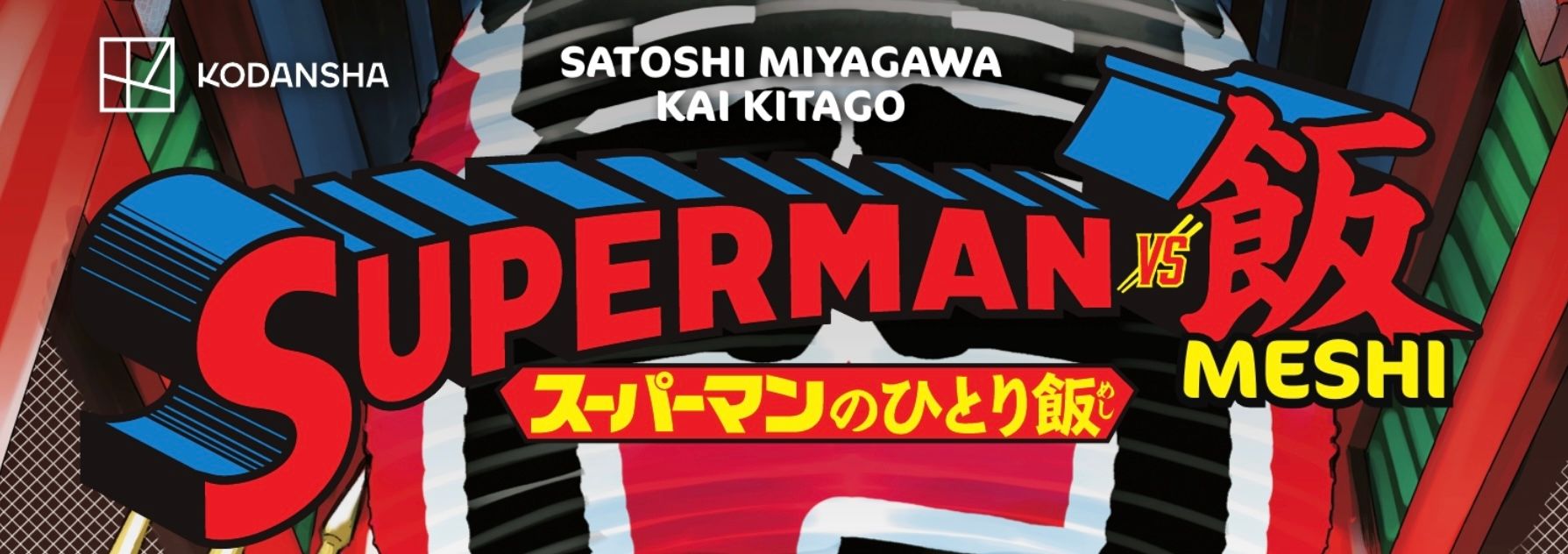
For additional context some of the other Superman books published in the last twelve months include: Superman Space Age which used a pre-83 wordmark matching it’s Pre-Crisis era story. The Return of Superman special used the period appropriate post-83 wordmark. Superman ’78 used the movie-styled wordmark, again appropriate for the subject matter. Finally, the Superman vs Meshi manga used a redrawn version of the post-83 wordmark.

It seems the only books that have had this new wordmark on or in them are ones written by Joshua Williamson and I wonder if it was him that was the driving force behind it. There doesn’t seem to be any traction around the company to make this new version stick.
I’d love to ask designer Darran Robinson about it, but it appears all his social media and web presence have been removed.