MAWS Season One
Last year for the first season of My Adventures with Superman, I wrote reviews for the best comic book site in the biz Multiversity Comics. When that website shuttered its virtual doors earlier this year, I decided to carry on my MAWS writing to this site. Now that season two is over, I figured I’d move all my season one coverage here. So now every word I’ve written about My Adventures with Superman is all under one roof. It’s interesting to read back to my speculation and thoughts now that we are finished with season two. I’m looking forward to season three and Superboy! Next week on the blog: MAWS issue #3!
Five Thoughts on My Adventures with Superman’s “Adventures of a Normal Man” Parts One & Two
July 10th, 2023
Look at your screen, it’s a bird, it’s a plane, it’s My Adventures with Superman, the first Superman solo cartoon series since Superman: The Animated Series ended in 1999 after three seasons. Superman has a long history of animation starting in 1941 with the Fleischer theatrical shorts, but in the last twenty years the character has only been a part of teams or a guest on other shows. Once this show was announced I was excited for big blue to get back into the starring role. Was my excitement warranted? Read on, Superfriends, but beware spoilers ahead.
I want to get this out of the way, I loved this two-part episode “Adventures of a Normal Man.” Any adaptation that has Superman save a cat stuck in a tree is a winner in my book—I also loved the second episode of Supergirl where she saves a snake named Fluffy stuck in a tree.
How to present Superman to a modern audience
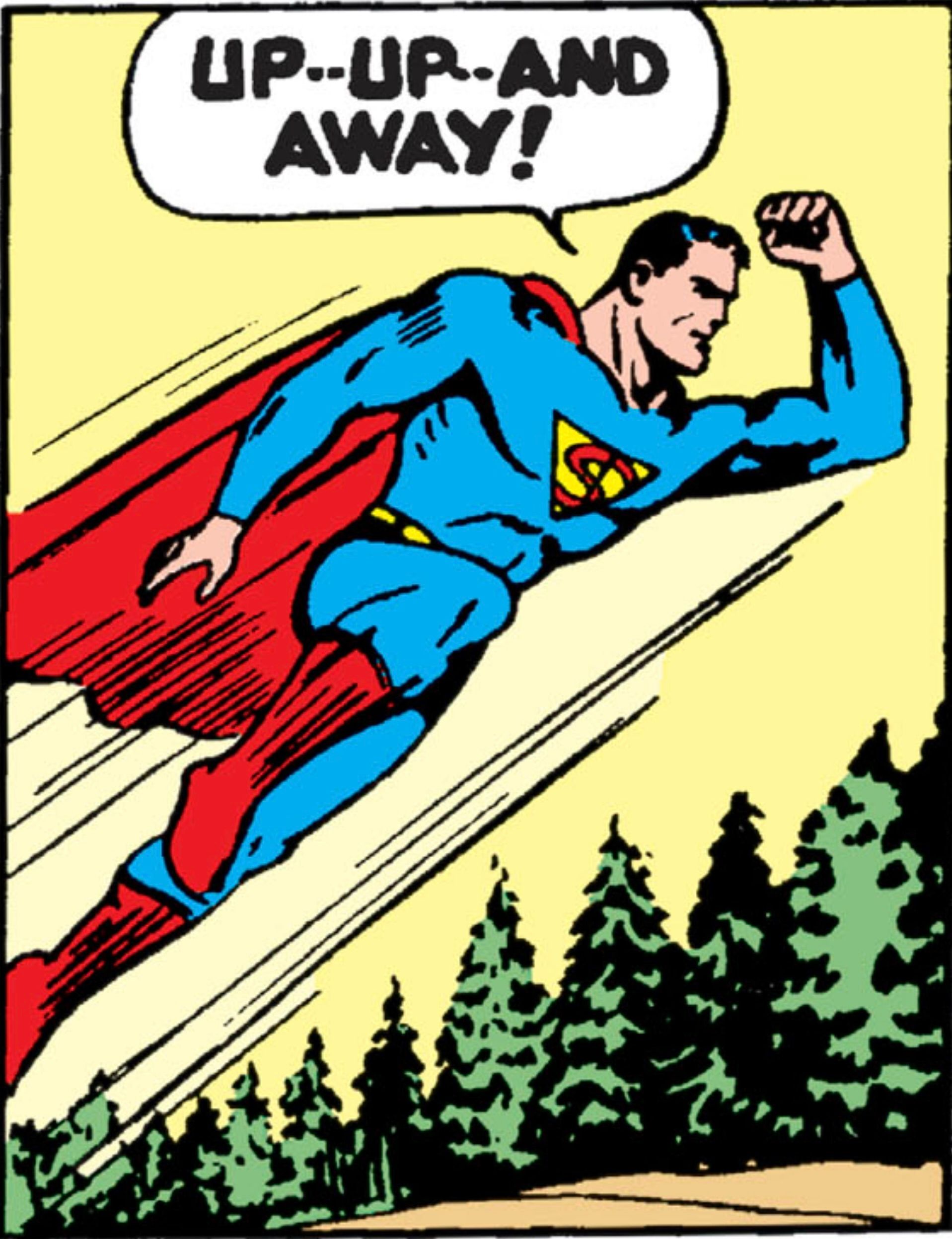
It’s clear this is an anime influenced take on the Man of Steel. From the opening credits, with original song “Up and Away” by band Kyle Troop and the Heretics (that we did not get in these first two episodes), to the magical girl-inspired transformation, all the way to the ending credits, this show wears its influences on its sleeve. I think this is a fantastic idea. If this show wants to bring new fans to Superman they’ve got to meet fans where they are. Similar to how Smallville adapted the Superman story to an early aughts teen drama. This is a show My Hero Academia fans will get right away. Rather than trying to “modernize” Superman by making him grounded, realistic, and gritty, the show borrows stylistic shorthand that is well understood by a modern audience and drops a classic Superman story into it.
Superman’s costume doesn’t stray far from the comic book version. We do get a new stylized Superman shield befitting its Kryptonian origin. The suit isn’t only Kryptonian though, we get a mix of the “my mom made it” style when Martha adds the trunks and belt. It combines Clark’s alien heritage with his Kansas upbringing, which plays into the themes of the episode. While not a costume, I did love young Clark with the “cool S” on his shirt.
“Who am I?”
The main theme of this two-part episode is identity. We start with a young Clark (voiced by Kari Wahlgren, who also voices Ma Kent) trying to get a kite stuck in a tree. A car drives by at an unsafe speed and starts spinning out of control. The emergency awakens something in Clark and his eyes start to glow blue. He speeds to the car and with super strength stops it before it hits a tree. Emboldened by this feat he leaps into the air and grabs the kite he previously couldn’t reach. Now airborne after a moment of flight he stops and asks himself the question “Who am I?”
We flash forward to modern day and it’s Clark and Jimmy’s first day at the Daily Planet as interns. As he prepares for the day he continually tells himself to be a normal man, but Clark is not normal. He breaks his alarm clock, his shoes, and a door all before work. But more than that, his kindness is what makes him special.
After Clark is seen using his powers to save Lois and Jimmy for the first time, Lois — like in Superman: The Movie — asks “who are you.” Clark flies away and again asks himself “Who am I?”
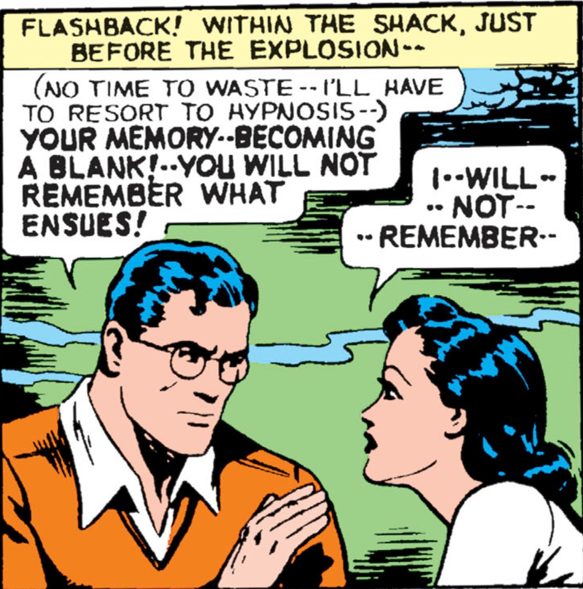
Part two starts with another flashback. The Kents bring Clark to his spaceship to learn about his origins. Clark is introduced to his biological father Jor-El in a hologram, but cannot understand the Kryptonian language. Clark gives up on investigating the ship when Ma Kent is put in danger, but is left with the question once again, “Who am I?”
It’s Lois that pushes Clark to take the leap and begin to answer that question. Her desire to discover Superman’s identity reminds Clark that he doesn’t know who he is and he has the ability to find out.
Clark returns to the ship with his adoptive parents and again meets hologram Jor-El. While still unable to understand the language, Jor-El shows Clark the destruction of Krypton and baby Kal-El being put in the rocket to escape Krypton’s fate. But this doesn’t tell Clark who he is. It’s Martha who reminds Clark who he is. Clark is Martha’s son. When Clark emerges wearing the suit, he knows this. “I’m still me, Ma. I’m still your son.” She tells him of course he is, but he’s something else too. Superman.
Lois’s character arc mirrors Clark’s in a clever way. She knows exactly who she is, but it’s the rest of the world that doesn’t. She may be an annoying intern to editor-in-chief Perry White — played delightfully by Darrell Brown — but we know she’s ace-reporter Lois Lane. Rather than discover her identity, she needs to show it to the world.
Finally, our antagonist Leslie Willis also goes through an identity transformation throughout the two episodes. While she starts as a thief, her interaction with the stolen technology transforms her into something more. While we never hear the name, fans of Superman: The Animated Series will know her as Livewire.
Characters
The show does an excellent job of diversifying Superman’s supporting cast. They take some leads from Man of Steel and Supergirl in this department which I loved. The show isn’t afraid to give us original takes and from the previews we’ve seen; it doesn’t stop here.
We don’t get much Jor-El, but I’d be remiss if I neglected to mention his design is inspired by Big Boss. Looking at comic inspiration his look reminds me of a mix of Adam Kubert’s Jor-El from “Last Son” and the rebirth-era Mr. Oz eye patch look.
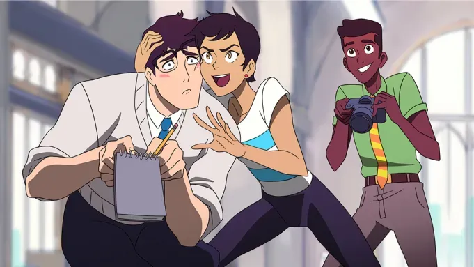
The first meeting of Lois & Clark is classic meet cute material. Despite being animated we can feel the chemistry between the characters as they flirt with each other constantly. Alice Lee and Jack Quaid shine in their roles. The youthful energy they bring to the love story is a major standout. A big part of Superman’s adventures is the relationship with Lois. It’s adorable and my favorite part of the show so far.
Would a Superman adaptation be complete without Jimmy Olsen? Ishmel Sahid gives us a Jimmy looking for conspiracies and aliens around every corner. His rapid fire dialogue gives us some of my favorite Easter eggs like the psychic starfish from Germany (Starro), a super intelligent gorilla from France (Monsieur Mallah), and even his streaming channel name Flamebird. Jimmy is Clark’s roommate and is also starting as a new Daily Planet intern, making them peers, both learning from the “old” intern Lois. While describing himself as having a keen eye for observation, Jimmy is almost hit by a garbage truck running a red light. As Clark pushes an oblivious Jimmy to safety he sees Leslie Willis driving the truck.
We get an updated version of Jack Kirby and Joe Simon’s Newsboy Legion in the Newskid Legion. Flippa Dippa becomes Flip their leader; along with new versions of Big Words, Gabby, and Scrapper—just called Patti now. These characters were a big part of the 90s triangle-era of Superman and it’s great to see them updated. Their job delivering newspapers makes them the perfect sources for Lois Lane and her investigation of some stolen robots. After dropping a couple of Easter eggs for the triangle-era fans (Bogdanove’s diner and Mrs. Jurgens) Flip mentions seeing some suspicious garbage trucks. Clark makes the connection to Jimmy’s almost hit and run earlier and their investigation is off.
Our Perry White is at his wit’s end with Lois. She’s trying to become a journalist and Perry wants her to be making copies and getting coffee. He rejects the blurry photos they bring him of Superman’s first appearance, but luckily doesn’t fire them. After Lois and Jimmy bring back clear photographic evidence of Superman, he gives the story to Cat Grant, Ronnie Troupe, and Steve Lombard. Three characters I hope we get to see before this season is up.
Lois at this point is lying to Jimmy and Clark. They both think they are helping her with the investigation with the permission of Perry, but they have gone rogue. When Perry calls Clark it gives us the opportunity to separate the group and put Lois and Jimmy in danger. They stumble on Leslie and her stolen robots alone.
Livewire is an excellent choice for a first villain. Introduced in the last solo animated incarnation of Superman it makes for a nice passing of the torch. Her character doesn’t share many similarities to her original debut, she’s not a radio shock jock. It’s great to have Zehra Fazal voicing her. Fazal is responsible for many characters in Young Justice, among other great performances.
Quick note on our settings: we get a distance between Metropolis and Smallville. A sign we see in the first scene says the Kent farm is 4 miles from Smallville and 198 miles from Metropolis. Smallville the show and Superman & Lois sometimes fudge the distance so I like that it’s clearly defined here. Although, I wouldn’t take the signs as gospel since later in the show we see the time on Clark’s phone as 5:02am when it must be after 12pm. Not the best attention to detail.
Mechanical Monsters
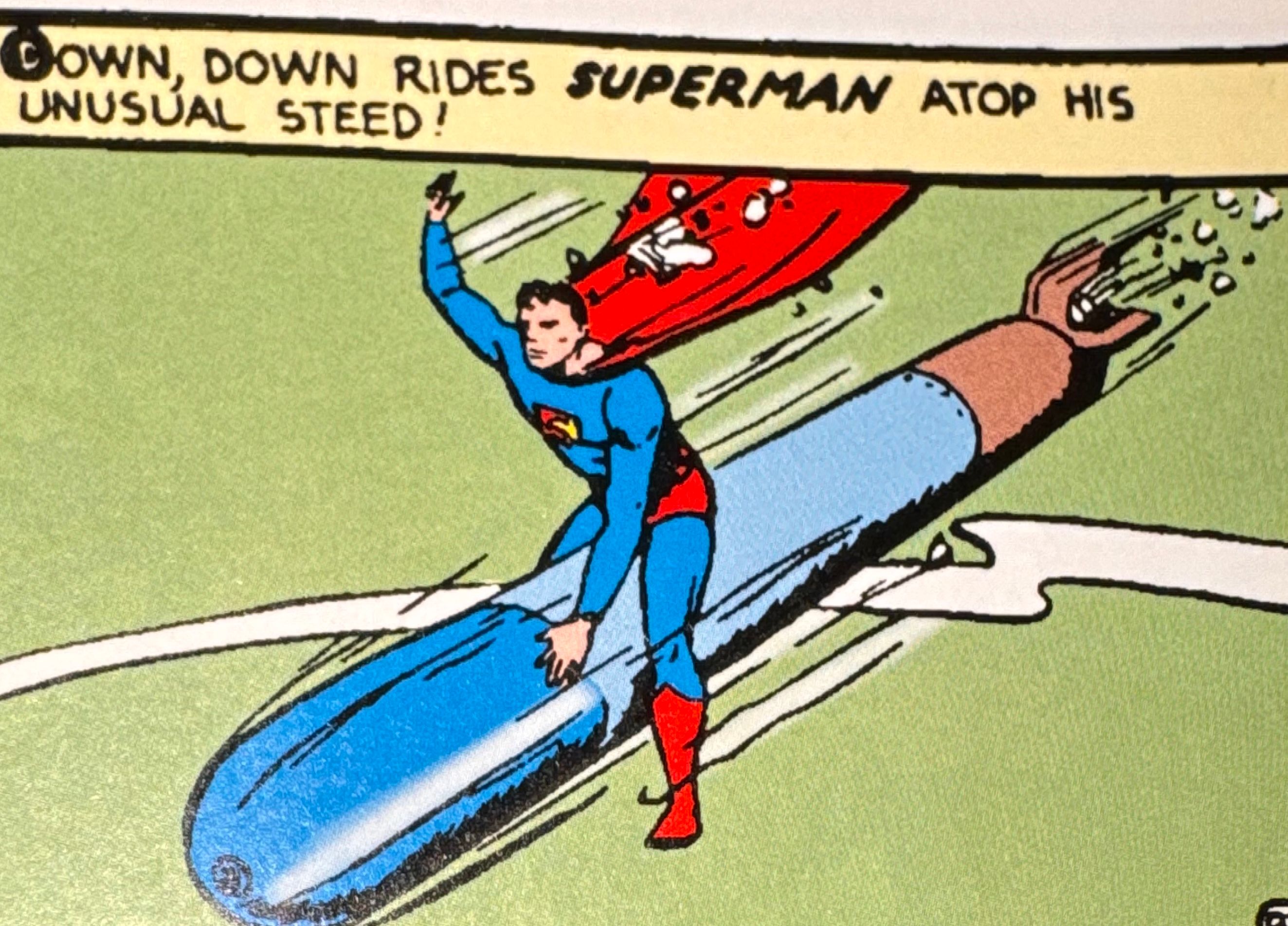
Superman is spurred into action when Lois and Jimmy are attacked by Leslie’s stolen robots. Donning a quick disguise he barely defeats the robot chasing them. Leslie then unleashes all the robots to cover her escape. Watching Superman cut loose on giant robots never gets old. Animated Superman has been doing it since the 40s and it always feels right.
Superman struggles to keep up with the fight until Lois comes to his rescue. Lois disables them one by one, until the last robot destroys its own controls. Like at the beginning, seeing someone in danger sparks something in Clark and his eyes again light up in blue. He has newfound strength which he uses to dispatch the final robot.
The designs of these robots were straight out of anime mech suits. I got a strong Evangelion vibe, but that could be because it’s a favorite of mine.
Task Force X
After the robots are defeated Leslie is on the run. She assumes Superman is working with the government and searching for her. She’s attacked in an alley and after defeating her assailants uses their radio to set up a meeting at noon with whomever is looking for her.
While Clark is discovering his Kryptonian origins, Lois and Jimmy set out in search of Superman. To find him they first look for Leslie and her stolen tech. Lois and Jimmy follow the trail from the empty container ship straight to where Leslie is meeting with Slade Wilson.
We discover that Leslie stole the robots and other tech from the mysterious group Slade Wilson is working for. When Lois and Jimmy show up Leslie attacks assuming they are all black-ops government agents there to capture her.
Superman arrives in his new costumer to save Lois and Jimmy. Slade’s attacks have made Leslie’s stolen tech go haywire and Superman is the only one that can stop her. Clark tells Leslie—who seems fully out of control—that he isn’t here to hurt her, he’s here to help. Classic Superman stuff right here.
It is strongly suggested the tech Leslie steals is Kryptonian in origin. The power source of the robots is the same as the power source Leslie uses. When Clark touches it he sees a flash of a space battle and a portal to the stars in the shape of his shield.
After Superman stops Livewire, Slade takes her away to an undisclosed location to interrogate her. Task Force X is mentioned and we see Amanda Waller and an unidentified man (maybe General Lane) standing by. They want to know what Leslie knows about Superman.
Not content to leave the area a mess Clark cleans up to some triumphant orchestral Superman music. We get a glimpse of a billboard for Amazo Tech which I bet will pay off later.
Stop the presses! Superman is revealed to the world. What will be next for this young Superman? Tune in next week to find out!
Five Thoughts on My Adventures with Superman’s “My Interview with Superman”
July 17th, 2023
Welcome back, Superfriends, to another exciting episode of My Adventures with Superman. We get the anime intro credits we were promised this week! Want to know what else Lois, Clark, and Jimmy are up to? Read on and beware, spoilers abound.
Superman television episodes often have a loose formula to them. A mystery presents itself to Lois and Clark, typically with a sci-fi twist. They investigate with the help of Jimmy. After breaking the story, Superman swoops in at the end to save the day. The formula can then be used to explore different themes or advance a season long plot.
We’ve had this formula since the original Adventures of Superman. Check out “Mystery in Wax” as a good example. The mostly forgotten Superboy show has a couple episodes that fit the bill like “Special Effects” with Lana and Andy rather than Lois and Jimmy. It was put to frequent use in Lois and Clark: The New Adventures of Superman like in episode four “I’m Looking Through You”. Even Smallville gets in on the fun, with the early years replacing Lois and Jimmy with Chloe and Pete. “X-Ray” from season one uses the formula. My Adventures with Superman is no exception.
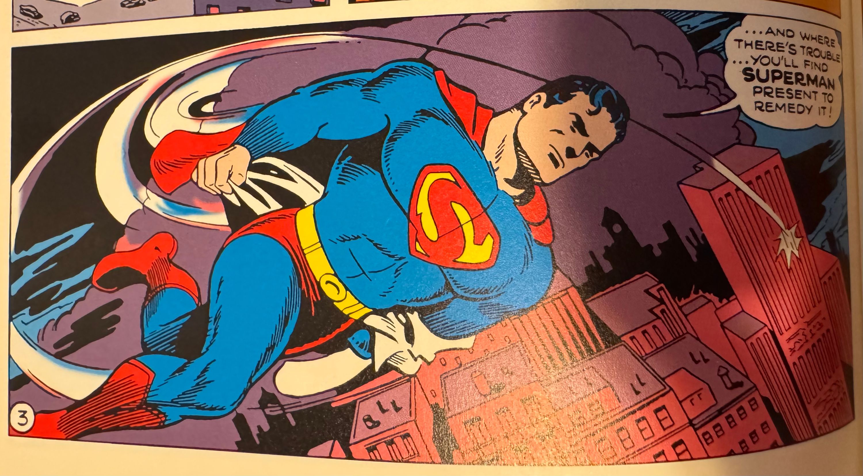
The episode cold opens with a blimp in danger above Metropolis. The crowd is amazed as he saves the pilot and a large metal beam. This is a Superman that checks in with the crowd to make sure everyone is okay.
When the pilot asks “Who are you?” Lois rushes up to get her interview. Instead Superman flies away to finish saving the blimp.
We jump to a prison break already in progress. An invisible man we later learn is Mist—played by Lucas Grabeel someone Smallville fans will recognize as Young Lex and Conner Kent—is in charge. Mist and his accomplice Rough House are using tech they got from Livewire to break out Siobhan McDougal (Silver Banshee). Siobhan gets a mask that can amplify sound similar to her comics powers. This is our sci-fi twist story for Lois, Clark, and Jimmy to investigate.
After saving the blimp Clark continues his low key flirting with Lois by getting her a coffee from Waid’s Cafe. We get our first glimpse at Clarks vision powers starting to kick in here, which helps the awkward cuteness they have going on.
Lois expresses her frustration with being unable to get the Superman interview and asks Clark to pretend to be Superman. Clark is so flustered and I love their interactions. “If it was within my power; I would do anything for you Lois”.
Meet the rest of the Daily Planet staff
We get to meet the rest of the Planet staff because our heroes are getting scooped! Steve Lombard, Cat Grant, and Ronnie Troupe all get introductions to showcase their characters. These are more good adaptations from the comics. Steve is dead on from his Bronze Age appearances; more modern readers would known him better from All Star Superman. Cat Grant is true to form as the gossip columnist. Ronnie is the serious journalist of the bunch, which tracks with the Ron Troupe she’s adapted from. When they take the team’s “murder board” Ronnie explains Perry told them to get the research they compiled. Lois is not at all discouraged by this set back.
The team learns about the breakout on 52 News and Jimmy notices the tech looks like it came from Livewire. I wonder if Jimmy will hand out more villain codenames on this show. Clark has a great slip up here where he proclaims he has to stop the criminals and then corrects himself to say he has to write about them. Lois agrees to go after this story, but has the ulterior motive to use this to get to Superman.
Intergang and how the show will be giving us villains
In the last episode Livewire told Deathstroke she had given away the tech to every low level criminal in the city. This is our first example of that and I’d bet it’s how most of the antagonists this season will challenge our Man of Steel. It further connects to Clark since we are given another hint the technology could be Kryptonian based on the vision Clark has when he interacts with it. Mist demonstrates a freeze weapon to Siobhan and Rough House, but the off button gets stuck in a Chekhov’s Gun moment.
When Lois, Clark, and Jimmy get to the prison Lois reveals she has stolen their rival’s press badges. Clark is initially bothered, but goes along with it. This gives us a fun moment of Lois and Jimmy mimicking the Cat and Ronnie introductions from earlier and Clark going through the motions.
The warden explains the escaped criminals are Intergang. Unlike the comics this Intergang is three small time crooks who rob convenience stores. They aren’t even good at it. We see a clip of them in action and Siobhan is wearing pants with bones on them as a reference to her comic Silver Banshee look.
The team slips out of the warden’s office and come across the area of the breakout. Clark gets a kick out of Lois stealing the warden’s keycard, in sharp comparison to him being upset when she stole the press badges. Clark’s vision powers act up again while they are snooping around Siobhan’s room.
After our interns get out of the prison they put together the clues they discovered and make the deduction Intergang is planning on robbing the Metropolitan City Bank.
The action is excellent
Intergang starts their robbery and Clark makes the excuse he’s going to call the authorities. This is when he learns Lois’s plan to ambush Superman when he’s saving the day. Before Clark gets a chance to get upset they are separated by the ice. This gives Clark the perfect opportunity to change.
The fight between Superman and Intergang is fantastic. It’s so good they used a bunch of it in the preview trailers released promoting the show. Rough House and his gauntlets might be no match for Superman’s strength, but Silver Banshee’s scream is a force to be reckoned with.
Mist shoots the ice weapon at Superman and is unable to turn it off as expected. When Rough House punches the power source goes through a transformation that reminds me of the angel Ramiel from Evangelion. The ice starts to spread out of control and Superman sees Lois and Jimmy working to get people to safety.
Lois and Jimmy being in danger is the push Superman needs for his newest power to fully show up: heat vision. A quick blast of heat vision gets him out of the ice and destroys the weapon’s core giving him a vision of robots on a battlefield.
After the ice recedes Deathstroke shows up as part of the clean up crew.
Lois gets her interview, but it’s not enough
Superman offers Lois the interview she’s been looking for, but the Planet staff shows up to scoop her. Superman picks up Lois and flies her to the most classic of Superman and Lois interview spots: the roof of the Daily Planet. It’s a sweet scene between the two of them with Superman admitting he’s nervous about being interviewed. He tells Lois he saw her and Jimmy risking themselves to help others which made him want to be interviewed by her.
Lois doesn’t get much from the interview though. Superman can’t give answers to her questions like where he comes from and how his powers work. He’s putting all that together.
Right after Superman flies away Clark runs up the stairs to meet Lois. After apologizing for deceiving Clark with her plan she tells him she got the interview, but that Superman is a liar. She can see right through him.
What a way to end an episode. Clark thought his simple interview would satisfy the great Lois Lane! She’s no mild mannered reporter and she’s going to get the real inside scoop on the Man of Tomorrow. Tune in next week for more Adventures with Superman!
Five Thoughts on My Adventures with Superman‘s “Let’s Go to Ivo Tower You Say”
July 24th, 2023
We have a lot happening this week including a major reveal shaking the status quo only four episodes in! What are our intrepid reporters up to? Read on to find out and beware of spoilers.
The Truth is in the Tabloids
This week starts like last week ended. Lois had her interview with Superman, but it didn’t get her the story she wanted. She is determined to get her answers and is frustrated that she didn’t get them from Superman.
There is a great moment where she puts her head on Clark’s shoulder and he tells her maybe Superman is just a nice guy with powers looking to help as many people as he can. She’d believe it if Clark had powers, but not this Superman guy. This moment is echoed at the end with Ivo. Their dynamic reminds me of how Superman & Lois depicts the relationship. Lois initially doesn’t trust Superman and she’s really into Clark.
Jimmy shows up with a stack of tabloid newspapers. Lois may be embarrassed to admit it to Clark, but this is a good idea in context. If no major news source is going to report on aliens they should see what hints they can gather from less-than-reputable sources. In fact the Metropolis Star has an interesting story about a flying boy in Smallville Kansas. When Clark sees this he rips the page out and puts it in his pocket.
Don’t Call Me Chief
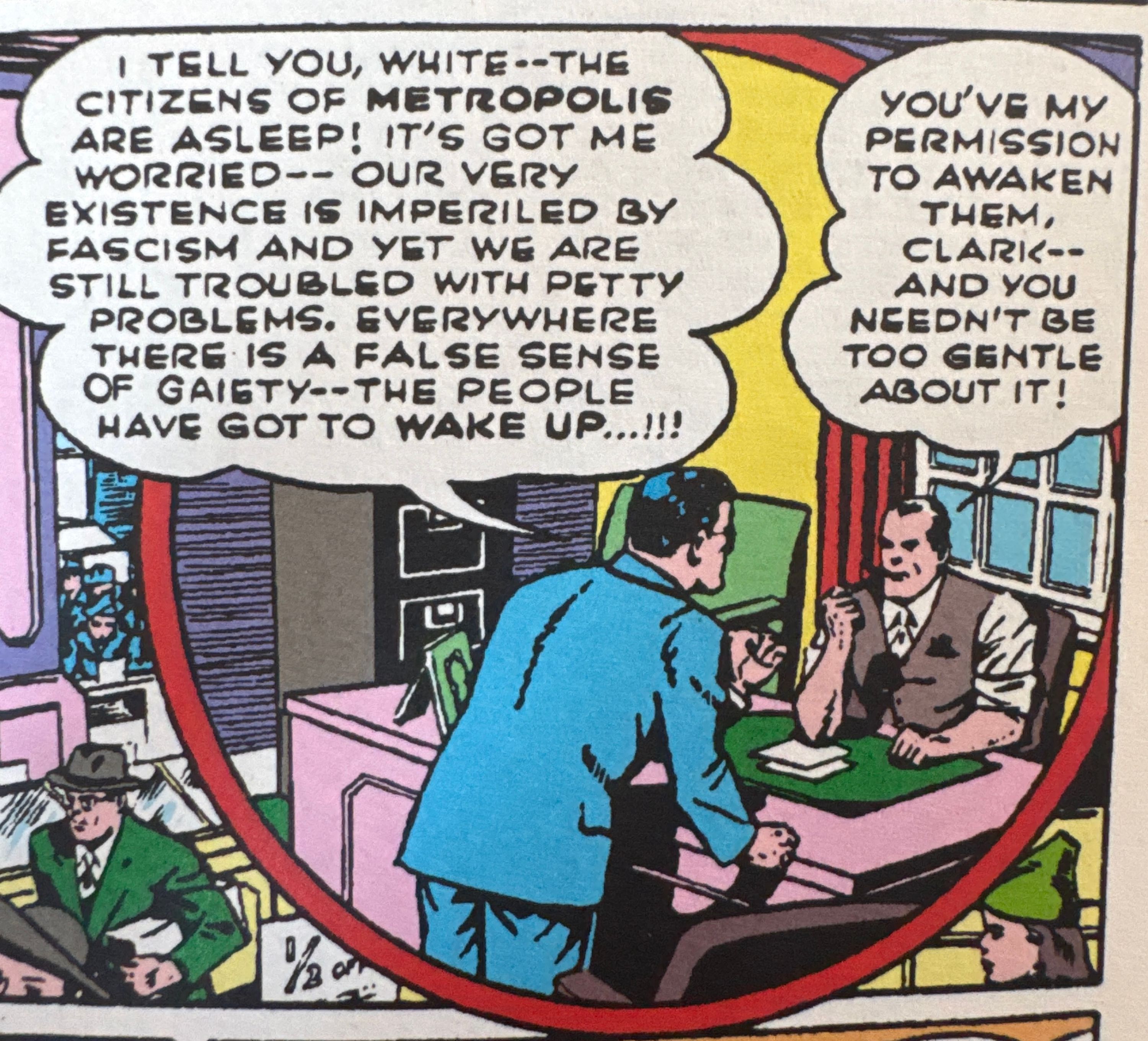
Perry White interrupts by telling the three of them to come to his office. They assume they are in trouble for co-opting the storage room as their own workspace, but it turns out Perry wants to give them their first assignment.
Perry explains Cat Grant is doing a piece on Dr. Ivo; CEO of Amazo Tech. Perry wants them to get quotes to use for background. Clark brings up serious accusations against Ivo, but the chief makes it clear they only print what they can prove.
It’s their first assignment from the chief and our heroes are determined not to let Perry down. Jimmy brings all the camera equipment he can get his hands on, including a handy UV light. Lois, on the other hand, brings hard hitting questions for the Metropolis elite. The three get “black tie” looks befitting their characters especially Clark’s high school chess club suit.
Once at the event Lois throws away Cat’s suggested questions. Lois isn’t interested in a puff piece about an eligible bachelor. Lois wants a real story to impress Perry. This Lois doesn’t have the experience to get answers to her questions and comes up empty handed. Clark brings her a slice of cake to console her and suggests they go back to the assignment.
Dr. Ivo in Name Only
We are then introduced to the show’s take on Dr. Ivo. Being the narcissist he is, he does his own introduction. Like the DCEU’s take on Luthor, this Ivo is a tech bro CEO. The gala is his latest product unveiling.
Ivo is told by a board member he is broke and the board is planning a vote tonight. Ivo isn’t concerned, his newest product will redefine humanity and the money problems will go away.
Clark interrupts, and Ivo tries wooing him as a bro. Ivo’s big failure here is insulting Lois. This gives Clark the courage to follow Lois’s lead and he hits Ivo with some hard hitting questions. Clark’s journalistic courage doesn’t pay off as he’s immediately thrown out.
Clark is the one needing to be saved and Lois comes to the rescue. She lets him back into the building and offers to fix his torn jacket. This is my favorite scene in the episode. The color palette changes while Lois and Clark get a wonderfully tender moment. Lois ignores a call from her father (presumably the unnamed Task Force X member we saw in episode one) and opens up about their relationship. Lois tells Clark about her struggles at the Planet. She’s disappointed she’s been stuck as an intern for a whole year. Clark lets his guard down too and is so sweet to her. He puts on his Superman voice and is about to tell her the secret when Lois says that Superman is what has been throwing her off! She hates being lied to. The colors jump back to normal and the audience feels just like Clark in the moment. Thrown back to reality.
Around the corner they hear a thud and stumble onto Ivo’s lab. Clark gets them in with a little super strength and they discover more stolen tech. Ivo is preparing his demonstration and is warned the tech caused out of control aggression in test groups. Ivo doesn’t need an excuse to be a bad guy though. Ivo gives us the classic “with this I’ll show them all” line with real villain energy.
Ivo comes back to the gala and introduces the new product as Parasite 1.0. I’m not sure why they chose Ivo for this. With all the Ivo/Amazo talk Parasite is the last villain I expected. It’s a weird choice to make Ivo into Parasite and use the Amazo name for a tech company. We have had several Parasites in the comics and the show could have used any of their names. Melding Ivo in there doesn’t give them anything extra to work with. The show has already been taking creative liberties with character backstories; Rudy Jones could have been a tech CEO. When Superman & Lois wanted to do Parasite and have it fit in with the theme of opposites and Bizarros they chose a version of the Parasite with a twin. Not a separate character they just called a Parasite.
Now we get our requisite Superman action. Parasite grabs that board member who told Ivo he was broke and holds him out a window. The ensuing panic gives Clark the perfect opportunity to change to Superman.
This is all just a trap for Superman to demonstrate Parasite 1.0 to the captive audience. Ivo’s assistant Alex—doing his best Gendo Ikari impression—turns on the “Amazo Panic Room” which also doubles as a power supply for the Parasite suit. The suit absorbs Superman’s attacks and redirects the energy which is where we get the Parasite name.
Jimmy and Lois jump into action. Lois punches the assistant in the face while apologizing to him. Jimmy’s UV light comes in handy in finding the right button to shut down the Amazo Panic Room.
Without his power supply Clark only needs to wear Parasite out. Superman avoids fighting until the suit begins to crush Ivo. Superman rips him from the suit and brings him to an ambulance for medical attention.
Clark is slowly beginning to realize some people don’t trust him immediately. Both Ivo and Lois don’t believe Superman is just there to help. I think this will inspire him to do something to win the city’s trust.
Jimmy the 3rd wheel
Clark and Lois show Jimmy the lab they discovered, but it has been all cleared out. They are left with no evidence Ivo was using stolen tech. Clark declares that he needs to figure this out; too many people are getting hurt. Then Lois gives him a kiss! She likes seeing him obsess over a story and I like seeing their relationship blossom.
Lois and Clark’s burgeoning relationship often leaves Jimmy out. When they are about to leave for the gala we see this could be their first date, but Jimmy jumps in excited to be working with his friends. When they get to the gala Lois and Clark go off to do their reporting and leave Jimmy behind. And now at the end of the episode Clark puts his jacket on a cold Lois and walks her back. Poor Jimmy is left to himself.
Lois and Jimmy are always risking their lives to help on this show. Neither of them are damsels to be rescued. I think Superman is going to bring them both closer to the action moving forward and Jimmy won’t feel like a 3rd wheel anymore.
The Secret Revealed
When Lois gets back to the planet she writes up the story and turns it in. Just as she is about to leave she notices the ripped out page from the Metropolis Star. She’s inspired to clear their board to refresh her Superman investigation. She’s left with one missing link. Lucky for her she is still wearing Clark’s jacket because in the pocket is what she has been looking for. Flying boy of Kansas, the missing link she needed. After a quick Clark and Superman montage, Lois puts it all together. Clark Kent is Superman. The credits end on a picture of Superman with Clark Kent glasses drawn on. Reminiscent of a moment from the Richard Donner Cut of Superman II.
I’m completely invested in the Lois and Clark of it all. The next episode is titled “You Will Believe a Man Can Lie” and it makes me excited to see how knowing the secret is going to change everything. While I may be baffled by the Ivo Parasite, the real mystery here is why they put it on Adult Swim at midnight. This show needs to be in front of every little kid with an interest in super heroes! Until next week I remain a little kid at heart.
Five Thoughts on My Adventures with Superman’s “You Will Believe a Man Can Lie”
August 1st, 2023
Welcome Superman fans to our latest thoughts and recap on My Adventures with Superman. The show continues to do a great job of moving both the plot and characters forward while giving even long time fans new surprises. Read on, but beware of spoilers!
Third wheeling again
We pick up this week with a call back to the first episode with Lois and Jimmy starting their days. Lois wakes up and rather than being excited for her day she wakes up frustrated. Jimmy wakes up with that same excitement but this time it’s for their Bigfoot camping trip. To Jimmy’s disappointment Clark isn’t home.
Jimmy has split screen phone calls with both Clark and Lois to remind them about the trip, but they are both too focused on what they have going on. Poor Jimmy is left in the dust. Clark is focused on saving people as Superman, and Lois is focused on proving Clark is Superman. To add insult to injury he gets a notification of a response to one of his Flamebird videos. Someone has responded to all of his videos with a “nah!”
Jimmy is assigned to Steve Lombard for the day as his photographer. With Lois and Clark so engaged in what they are doing they never respond to Jimmy’s calls and texts for help. Lombard looks at this as a mentorship opportunity, but Jimmy just wants to escape. This is when Steve drops a bomb on young Olsen. Jimmy is the Steve of his friend group. He’s a lone wolf. Jimmy won’t admit that he’s been left behind by Lois and Clark. It’s Kent, Olsen, and Lane: journalism pals for life. Just doesn’t seem like the other two thirds of the group are focused on that.
Oh and that internet troll saying “nah” to all of Jimmy’s Flamebird videos? Yes even to that one psychic starfish in Germany. It’s Lombard!
Jimmy still has faith in his friends. But that faith isn’t rewarded. Lois and Clark are too caught up in what they have going on and don’t show up at the bus station for their trip. He heads to the camp grounds on his own, but instead of Sasquatch he finds a gorilla! We did get a monsieur Mallah reference in episode one, but this gorilla wasn’t wearing a beret. DC doesn’t have a shortage of intelligent gorillas.
The Lois & Clark relationship has hit turmoil
Clark tells Jimmy that he’s going to tell Lois he likes her. She’s been staring at him all day—probably because she knows Clark is Superman and she’s working it out in her head. Sure Lois already knows Clark likes her, but this will be the first time he’s said it out loud. Turns out Clark won’t be taking the big steps he hopes for this week.
Lois is also thinking about how to talk to Clark, but in a different way. She’s putting together the times Clark disappears without a good excuse, mostly bagel related. While waiting for Clark she struggles moving a box of weights there for Steve. Of course Clark picks it up no problem, further cementing her suspicions.
Clark wants Lois to help him crack the story of the tech weapons and brings out his investigation board. Little error here for most of the scene the board says Dr. Ivo twice. At the very end of the scene it is corrected to Intergang. Clark notes there is something weirdly familiar about the tech, but doesn’t explain to Lois what that is.
Clark’s plan is to use an old police dispatch scanner to listen for reports of the weapons. Lois is still on her one track mind and suggests they get Clark and Superman in the room at the same time to talk through it. Clark runs off to get a bagel while the scanner reports on various emergencies for Superman across town. The voice on the scanner is Chris Parnell’s Deathstroke so when they get a report of suspicious people at McGuinness Luxe Garage armed with strange tech weapons we know it’s a trap.
More interesting reimaginings
The main baddie of the episode is Heatwave. Not traditionally a Superman villain, but one that fits with the show’s focus on this specialized technology.
Beyond the name Rory doesn’t have much in common with her comic book counterpart Mick Rory. She isn’t a pyromaniac with a gun that shoots flames. She’s part of a gang of small time crooks in Metropolis knocking over jewelry stores.
Heatwave’s crew gets attacked by what they think is Superman and several of them are kidnapped. When Superman and Lois track Heatwave down she’s afraid Superman is going to take her too. Heatwave thinks everyone with Livewire supplied tech has been taken by Superman.
Lois handcuffs herself to Superman because she doesn’t want him getting away without her proving he’s Clark. This causes some problems when Heatwave’s gang attacks. With some fancy footwork though, Superman keeps Lois safe and the two of them take out a few gang members.
During the fight Superman has another vision when touching the tech again. This time he sees a meteor shower, a cornfield, and a man we later learn is the general.
When Heatwave escapes Superman tells Lois they need to go to the Daily Planet first. Superman drops her off there and breaks the handcuffs. He won’t let her get hurt. She yells Superman and Clark at him through tears but he flies away. Deathstroke, who had been watching the Heatwave fight, asks Waller and the General who he should follow: Superman or Heatwave. He’s instructed to focus on getting the rest of their stolen tech.
The General is Sam Lane right?
We catch up with Heatwave being chased by Deathstroke thinking it’s Superman. When Superman shows up he explains he just wants to help. Deathstroke is given permission to engage with Heatwave and Superman (called Nemesis Omega) by holograms of Waller and General.
Heatwave is quickly taken down by Deathstroke and we start the real fight of the episode. Once again Deathstroke describes himself as being the good guy. Task Force X unleashes robots to assist Deathstroke in taking Superman down and Superman takes a real beating. Superman makes the connection that not only is this the group that’s been kidnapping Heatwave’s gang, but it’s also the group that had the tech to begin with. Superman recognizes the general from his vision.
During the battle an overpass to Blüdhaven is damaged. Waller instructs Deathstroke to take his shot and finish Superman while he’s trying to save people. The general calls off the attack after some back and forth with Waller. She mentions he’ll be responsible for the next zero day, which is an interesting new mystery. Could zero day be the meteor shower that Superman saw in his vision? Is the meteor shower when Superman arrived on Earth like on Smallville? Deathstroke retreats while Superman repairs the overpass.
This is the moment that seals the general as being Lois’s father for me. He cares about people getting hurt. He’s not like Waller where the ends justify the means.
This show likes the Donner Cut of Superman II
The episode starts with the picture of Superman with Clark’s glasses drawn on just like in the Donner Cut. Then it ends with another moment straight from that movie. Clark shows up on the roof to meet Lois after his big fight. He blames his scratches on a shaving accident and says he went home to water his plants. Lois tells him she’ll have to do it the hard way and jumps off the building.
Unlike Superman II, Clark does catch her; revealing his secret identity. He explains he wanted to tell her but she was going to publish everything about him. She tells him that she doesn’t know what their relationship was going to be, but it’s all over now.
Our three heroes have never been more apart. Jimmy with a gorilla. Lois and Clark on the outs! Our credits end with a picture of the three of them ripped up. The mysteries of the season deepen. Where did Task Force X get this tech? What do they know about it? What was zero day? Tune in next week for another exciting episode in My Adventures with Superman.
Five Thoughts on My Adventures with Superman’s “My Adventures with Mad Science”
August 7th, 2023
Welcome Jimmy Olsen fans to our latest thoughts and recap of My Adventures with Superman. We never actually get Superman in this episode, but new characters and secrets are revealed. Read on, but beware of spoilers!
Be our guest
Jimmy is the belle of the ball this week; with Monsieur Mallah and The Brain filling in for Lumiére and Cogsworth. Heavy French accented character with a clock-faced companion who have been cooped up in hiding for years showing an outsider their magical world. Looks like anime isn’t the only influence on the show.
The episode begins with Lois and Clark both searching for Jimmy. Clark wants Lois’s help, but she’s still angry at him for the secrets and lies. She agrees to help, but only for Jimmy.
Once in the woods Lois shows her tracking skills and explains her dad took her on wilderness survival weekends. She tells Clark there is a lot about her he’s never going to know. They come across a restricted area fence and Clark is surprised he missed it in all his flights over the area. Lois tries calling Jimmy’s phone and hears it ringing on the other side of the fence. When Clark follows he is hit by a red forcefield that is surrounding the whole area. Magical barrier around a castle? This explains why Clark wasn’t able to see this area from above: it is hidden somehow by this forcefield. On Jimmy’s phone they see the video he made last episode. Jimmy has been kidnapped by big foot!
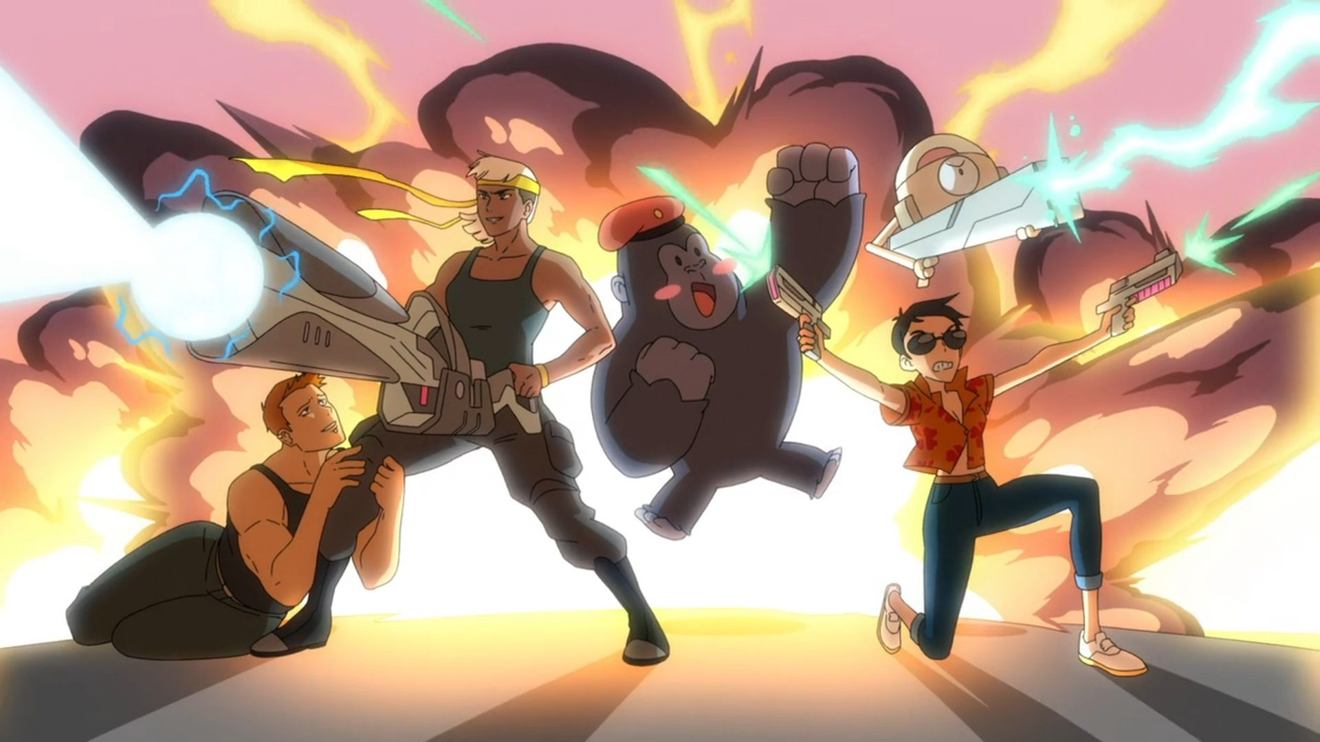
Jimmy is so happy to be right about all his conspiracy theories and so upset that his friends let him down that Mallah feels sorry for him and shows him around Cadmus Labs. In adaptations Cadmus is the stand in for generic super secret government labs so I think it works with what they’ve done here.
Lois and Clark walk by a sign for a Cadmus minefield and are reminded of a Flamebird video where Jimmy describes Cadmus as area 52. The minefield area was the site of a major battle and upon walking into it Clark unknowingly triggers a robot. Lois asks if Jimmy knows that Clark is Superman. Clark tells her no and that he doesn’t want to talk about this. She doesn’t let him get off that easily and asks if everything he’s said and done is just a cover. Lois wants to know if Clark lied about his feelings for her. At that moment they start to be chased by the robot
Meanwhile, Mallah gives Jimmy a tour of Cadmus and fills in the backstory. 22 years ago Cadmus and Task Force X were given strange technology by the government. Undoubtedly Kryptonian tech from when Clark landed. Their orders were to make weapons, but Cadmus was not interested in destruction. This is how Mallah gained his super intelligence. Task Force X was then sent in to destroy what they had built. During the attack the unstable black hole they created went critical and destroyed most of the facility. This is how Brain lost his body. Presumed dead by Task Force X, Mallah and The Brain are left alone to be together.
Lois and Clark continue to try and evade the attacking robots without much luck. Clark tries to fly them both away, but the force field prevents it. A laser cannon activates and shoots at them, but Clark is able to shield Lois—losing his shirt in the process. Lois asks if Clark knew he would be bulletproof. He didn’t, but he knew Lois definitely wasn’t.
Jimmy finds a new black hole. Mallah explains they are trying to stabilize it into a wormhole. They hope to create a gateway to another dimension where we are welcomed not feared. It is perfectly safe as long as nothing messes with the flow of power to the room Mallah says just as the lights begin to dim.
Jack Kirby Love
Lois and Clark arrive at the facility and Clark is greeted by a punch in the face from The Brain in his full mech form. Jimmy stops the fight and explains that Lois and Clark are his friends; the bad ones.
Cadmus isn’t the only Jack Kirby creation we get in this episode. The robots that are chasing Lois and Clark? The Brain identifies them as OMACs. Sent by Task Force X, they are not part of Cadmus security. When the OMACs reach the lab Mallah sends out his mutants which look like Kirby’s DNAliens inspired by the anime Gurren Lagann. He says they got bored one year in to hiding and made some mutants.
The crew retreats back into the black hole room. As they fight back the OMACs, Mallah and Brain give them instructions on how to keep the black hole stable. Mallah realizes that they need to let the black hole reach critical mass for it to stabilize. The black hole begins to suck in the OMACs and Clark is just barely able to save the group.
Jimmy knew all along
During the battle Clark apologizes to Jimmy and tells him his secret. This Jimmy has great observational skills. Not only was he right about the super intelligent French gorilla, he already knew Clark was Superman. They’ve been roommates since freshman year! Like in the first episode; the day Jimmy and Clark met Clark ripped a handle off a door and blamed it on the screws. He didn’t say anything before because it seemed like a sensitive subject.
Lois and Jimmy want to know why Clark never told them before. He says that he just wanted to be normal. He doesn’t want to be treated like an alien, he just wanted to be their friend. Lois and Jimmy tell him they don’t care what he is, just who he is.
Definitely Kryptonian Technology
We get more indications that this technology is definitely Kryptonian. The force field that surrounds Cadmus? It’s called the red sun omega field. This isn’t the first omega reference either. Could we also be getting Darkseid, another Kirby creation? The Brain warns Clark about the general. The red sun omega field and the OMACs both reacted to Clark. He is definitely connected to the tech in someway and he is now in Task Force X’s crosshairs. He describes the general as a man who would blot out the sun if he thought his country demanded it. Blotting out the sun would certainly cause Superman some problems. The Brain suggests Clark come with him and Mallah. He is different and strange like them. Clark says he wants to help the world be more welcoming to people who are different.
Lois and Clark have patched up their rift and hold hands while Monsieur Mallah and The Brain walk through the wormhole to their new world.
Parasite working with Task Force X
The episode ends with the general at what is left of Cadmus Labs. He explains this place brings back memories. It was his first operation and the first hard call he had to make. Now he wants the Parasite to give his opinions on the tech they’ve found. Why would Ivo help Task Force X? They both want the same thing: to take down Superman.
Our heroes are back together as indicated by the photo at the end of the credits. We’ve got three episodes left (next week’s Kiss Kiss Fall in Portal and then the two-part Zero Day) and it feels like we are moving quickly towards a climax. Is this technology really Kryptonian and did it arrive with Superman? How will Clark learn more about his origins? What is Zero Day? Is the general really Lois’s father? Tune in next week as we see the show’s interpretation of Mr. Mxyzptlk!
Five Thoughts on My Adventures with Superman’s “Kiss Kiss Fall in Portal”
August 14th, 2023
Welcome multiversal Lois Lane fans to our latest thoughts and recap of My Adventures with Superman. This episode has something for fans old and new including some excellent references and easter eggs along with some fun re-imaginings. Read on for the details, but watch out for 5th dimensional imps and spoilers!
The Relationship is Back on Track
Like we’ve been teased in the opening credits since episode three, Lois and Jimmy get to see Clark’s spaceship. Jimmy is of course loving the spaceship. I definitely chuckled when Jimmy called the obelisks “pointy boys.” Clark doesn’t want any secrets between them. But he’s also bringing Lois because there is nothing to interrupt him when he asks Lois to go on a date with him.
The show has consistently got the chemistry between Superman and Lois right and moved it along at a good pace. With only ten episodes this season we don’t have time to do the “will they won’t they” dance that other iterations have done. The one thing that doesn’t quite click for me is Lois using the nickname Smallville for Clark. I think it works well when their relationship starts a bit antagonistic. She is the big city girl and he’s the country boy from the farm. It only later becomes a term of endearment when Lois discovers how important that his Smallville upbringing is to who Clark is and why she loves him. This version didn’t have that dynamic, they started out crushing on each other. From what we’ve seen she doesn’t know too much about Smallville.
Later when Clark is getting ready for his date he gets to be himself for Jimmy. Clark’s character journey through this show has been him feeling like he’s strange and that he won’t be accepted by people. He started the show wanting to have a normal day. But here he gets to be his weird self. He doesn’t have to hide who he is from his best friend and the woman of his dreams.
While Clark is panicking trying to put together the perfect date, Lois is doing the same thing trying to put together the perfect gift for Clark. She wants to help him discover his past. Since she’s an ace reporter it’s what she does best. But of course she’s forgotten her dress at the cleaners and is still wearing sweatpants.
New Ideas and Old Ones Done Well
This episode we are introduced to the show’s Mr. Mxyzptlk. I love Mxyzptlk. He’s one of those characters that allows for so much creativity and variation. Looking like a Dragon Ball character this version is no exception. David Errigo Jr.’s performance captures this anime inspired Mxy excellently. Although the show doesn’t use my personal preferred pronunciation, “mix yes spit lick”, it’s probably the most common one and way better than the Super Friends version “mixle plick”.
Mxy introduces himself as an Interdimensional Peace Keeper charged with the safety of the multiverse. Superman fans know he’s pulling Clark’s leg. I loved the little “IDPK” detail in Interlac on his ID card. He needs Superman’s help and he knows that mild mannered Clark Kent is Superman in almost every reality. This is when the multiverse references start coming in hot which I’ll detail later.
Mxy uses the old “Lois Lane is in danger” line to get Clark to follow him through a portal and break down a door. Once inside Superman realizes he’s been duped by Mxy who just wanted to use Clark’s strength to rob the place. Mxy is looking for a tape recorder no doubt owned by an important Lois Lane.
As Lois and Jimmy run home from the dry cleaners they are met by one of my favorite new additions of the show: The League of Lois Lanes. The League tells us that this Lois Lane and Jimmy Olsen are from Earth 12. Although Mxy made an Earth 12 reference earlier in the episode so either this is a mistake or someone is lying. Interestingly they use the same line on Lois that Mxy used on Clark. “Your Clark Kent is in danger.”
The League of Lois Lanes was founded by Lois Prime; the first Lois to discover the multiverse. The Lois Lane in every universe is a hero and I love this. This is now my favorite multiverse league/council/corps/parliament. Meeting multiple versions of Lois plays into Lois’s arc of trying to prove herself and feeling like a failure. She hasn’t won her first Pulitzer Prize yet and she’s 23.
The League is not just for Lois Lane though. Many Olsens are also part of the League and this Olsen, Jalana, is also a Flamebird. Our Jimmy now has a flame bro. He’s definitely not the Steve.
The League explains that Mxy calls himself a chaos god. They were taking him into custody when a portal opened to a previously unknown universe. That portal? It’s the one opened last episode by Monsieur Mallah and The Brain. They think rather than Clark being in danger that he’s helping Mxy. They pull one of her hairs to analyze the dimension’s tachyons and find Clark.
During their break-in Mxy admits to Clark that he lied to him and tells him he’s not the brightest guy from the planet Krypton. We’ve heard the word Krypton before but it was mixed in with a bunch of Kryptonese from Jor-El. Clark is for the first time hearing the name of his home planet. Clark tells Mxy that he’s going to turn him over to the authorities and then go on his normal date with Lois. But Mxy says that Clark is never going to be normal. It is always Clark’s fate to be different, weird, and alone. This is Clark’s worst fear playing to his character arc.
There is More to This League Than Meets the Eye
The League tells Lois and Jimmy to make themselves at home, but they can’t go in one secret room. Lois being Lois takes the first opportunity she gets to go in. Strange the other Lois’ don’t anticipate this. Accessing their computers Lois sees versions of herself from Earth 52, Earth 24, and Earth 1. Each more successful than the last, making her feel even worse about herself. Then she stumbles upon Superman — File X which is redacted. It can only be accessed at League headquarters. Lois is now even more suspicious of what is being hidden from her.
When they catch up with Clark and Mxy they still assume Clark helped rob Earth Prime’s Space and Superhero Museum. It seems like this batch of Lois’ haven’t been paired with the best Clarks. Our Lois thinks it’s a misunderstanding, but Superman is too powerful to give the benefit of the doubt. They lock up Lois and tell her she’s not League material, but she’s enough like them to cause problems.
The League attacks Clark with Kryptonite weapons and it’s his first exposure to it. He’s never been hit with anything like that before, but Superman fans watching know it’s no good. The effect on Clark reminded me a bit of Smallville with the use of green in his veins, but it also looked like he was growing bits of Kryptonite rocks from his skin. This is all part of Mxy’s plan though. He uses the battle to escape with the League’s ship.
Mxy does not expect our Lois to still be on the ship, so when she pulls a Kryptonite gun on him he’s not happy. Mxy is trying to get to League headquarters, but Lois not trusting this League wants to get there too. She knows they are hiding something from her in the Superman file. They form an unlikely partnership and Mxy uses the secret key in the stolen tape recorder to get to headquarters.
Mxy is looking for his hat at headquarters. This has some precedence in the comics: the character The Hat has a fifth dimensional hat with magical abilities. It’s also Mxy’s classic bowler hat that he has worn since the 40s. Once he puts the hat on it changes to match his appearance and looks more like a crown. Now he’s got his full abilities and sets headquarters to self destruct.
Clark and the League show up to stop Mxy and we get our first kiss of the show. Clark apologizes that he ruined their date. They both apologize to each other about their perceived shortcomings (Clark is weird, Lois is a failure). But neither of them sees the other that way. They love each other for who they are. Both of their character arcs align really well here. But they’ve gotta stop making out so they can catch the chaos god!
Lois has the idea to get Mxy to chase Clark around and distract him long enough for Lois to grab the hat and Jimmy to capture him. Once Mxy is locked up Jalana helps our three slip away. Always trust a flame bro.
Back on their Earth. Lois and Clark get the titular second kiss.
No More Secrets
While Mxy was looking for his hat Lois was able to access the League’s computer system. She gets a globe with the Superman X file, but in the moment doesn’t know how to activate it.
Later at home she is gets it working and sees alternate versions of Superman that are very different than the one she knows. Mxy pops in (jail didn’t take) and explains that just like not every Lois wins a Pulitzer, not every Superman is good. The globe opens up and there is a piece of Kryptonite inside. I wonder if the three members of the League are connected to the three evil Supermen we see explaining their anti-Superman behavior.
We get a tidy bookend to the episode with Clark starting off saying no more secrets between them and Lois ending with a big secret. The credits end with a photo of the Kryptonite in her hand.
References and Easter Eggs Galore
I’m going to try and get out all the references and easter eggs here in one shot starting with Superman. When Superman first meets Mr. Mxyptlk he transforms him into multiple Superman variants. First we see the 1940s Superman from the theatrical animated shorts—commonly referred to the as the Max Fleischer Superman. This Superman is noted as being from Earth 12. Earth 50’s Superman is from the Super Friends cartoons. Earth 508’s Superman is from Superman: The Animated Series. I can’t place weird crab Superman to something specific, but I wouldn’t be surprised if it happened in the Silver Age. Later in the episode Lois sees several evil Superman variants including Overman and Justice Lords Superman. The third Superman she sees looks a bit like the Gods and Monsters Superman if you remove the goatee and add a scar.
Lois meets three variants of herself, which the show calls Leader Lois, Grizzled Lois, and Lewis Lane. We’ve had several Louis Lanes in the comics including one created by Mxyzptlk. Lauren Tom voices Leader Lois, which is a fun spin on her voicing Lois’s rival Angela Chen in The Animated Series. We also see Lois Prime who is based on the Fleischer Lois. One of the variants Lois reads about looks like she’s holding a Keyblade from Kingdom Hearts. In the headquarters we get Lois from Superman The Animated Series, Superwoman Lois from Action Comics 60, and several Lois’ of different races and ethnicities.
Let’s not forget our Jimmy Olsen variant Jalana Olsen voiced by Kimberly Brooks who DC animated fans may recognize as Bumblebee in DC Super Hero Girls (which incidentally is an excellent show fans should watch).
My personal favorite character reference is Comet the Superhorse. It’s the best thing Jalana Olsen has seen in her Flamebird investigations. I practically jumped out of my seat when she started talking about a telepathic horse. Comet doesn’t get enough love these days.
In addition to character variants we get lots of weapon and artifact references. In Earth Prime’s museum vault we glimpse a Mother Box, an Nth metal mace, a Green Lantern Power Battery, a T Sphere, the Helmet of Fate, the Cosmic Rod, a Legion Flight Ring, and Katana’s Sword. The League of Lois Lanes headquarters has a collection of weapons pulled from various movies, video games, and shows from Bioshock Infinite to Men in Black.
Finally, even the episode’s title is a reference. While we do get two kisses and plenty of falling in portals the title references Ouran High School Host Club’s theme “Kiss Kiss Fall in Love.”
Did I miss any obvious references? Sound off in the comments!
If I were to speculate sometime in this next two part episode we will discover that the general is Lois’s father, he will tell her Superman is dangerous and use Zero Day as the proof. Lois will need to make a decision. Will she share the Kryptonite with her father and use it against the man she loves? Or will she side against her father with Superman and work to show that he isn’t a threat. How will what she has seen of Overman and Justice Lord Superman influence her? Tune in next week for “Zero Day” part one.
Five Thoughts on My Adventures with Superman’s “Zero Day Part 1”
August 21st, 2023
Welcome Suicide Squad fans to our latest thoughts and recap of My Adventures with Superman. This week we are treated to the best battle yet, which is saying a lot because the action on this show has been consistently good. Read on, but beware of spoilers!
The Suicide Squad for Kids
The general and Amanda release the prisoners they’ve been gathering all season from their cells. Silver Banshee, Rough House, Heatwave, & Livewire are now tasked by the general to work with the Parasite to take down Superman. Since this is a kid’s show they are going to stick with the code name Task Force X, but DC fans know what’s up. Rather than exploding chips in their brains this Suicide Squad has electric shock collars.
There is one thing that doesn’t make complete sense with this line up. None of the members actually have any special skills or abilities. The Intergang members were famously inept; barely able to rob convenience stores. They could have given the tech to well trained soldiers to take down Superman. The only benefit of using this crew is they have all fought Superman before. Maybe it’s this motivation that makes them a good choice; that and plot purposes.
Super Hearing Sounds Rough
Clark wakes up to voices that aren’t in his apartment calling for help. He pinpoints on one of them as a man and a child in a burning building. Clark now has super hearing.
We’ve seen super hearing development adapted before. Most recently on Superman & Lois where a young Jordan Kent is dealing with being able to hear everything going on. It’s not adapted as being painful here, it’s more of a nuisance. It’s not a problem that Clark can hear everything. It’s a problem that he can hear everyone that needs help. Even cats stuck in trees. Have I mentioned that every good Superman adaptation should have a cat stuck in a tree?
The moment with Jimmy is hilarious. Really paints the picture for us of what it’s like hearing all the cries for help and Clark’s desire to help them all. All the Superman activity has really bumped up Jimmy’s Flamebird followers. Jimmy is at first concerned that Clark hasn’t slept in a few days, but the new found notoriety makes him happy.
During his super hearing escapades Superman hears the general which gives him a newfound motivation to stop him. While Superman is looking for the general, we know the general is plotting to take down Superman.
Vicky Vale
Clark fills the teams storage room/office with flowers as a gift for their one-week anniversary. Lois starts to appreciate it, but her mind goes back to Overman. She pulls out the orb from the League of Lois Lanes and watches Overman attack the city. She doesn’t believe her Clark would do that, but we can see the the cracks in her belief start to form.
Perry wants Lois to assist a guest editorial writer he’s brought on. He wants to make sure Lois doesn’t freak out because of who it is: the famous Vicky Vale. Perry is hoping to get the award-winning reporter to write for the Planet full time since she is thinking about leaving the Gotham Gazette. It’s an interesting reversal using Vicky Vale for this, since Lois was clearly the template for her rather than the other way around.
Lois gives us the full rundown of Vicky’s accomplishments including breaking the Queen Industries inheritance scandal (wonder what Oliver is trying to do with his parents money) and taking down the Falcones. Lois even has a poster of Vicky in her bedroom! I wonder if young journalists in the 70s had pictures of Woodward and Bernstein up in their rooms.
Lois isn’t too happy when she learns what story Vicky wants to investigate. The number one danger to Metropolis: Superman. Vicky has the same distrust for Superman that we saw in Ivo’s episode. Can anyone with that much power be good? It’s a good question and one of the most remarkable things about the character of Superman in the first place. If absolute power corrupts absolutely, every Clark should be an Overman. But as Mxy said last week Clark is Superman in almost every universe.
Continued below Lois and Jimmy set up interviews with people they know are Superman fans. It’s easy to find people in Metropolis that Superman has saved like Captain Immonen and Flip Johnson.
Meanwhile, Superman hears the general mention that he’s missing someone. Superman makes the connection to an invisible man on a crime spree. Mist, the 3rd member of Intergang hasn’t been caught by Task Force X and could be Superman’s key to finding them. When Superman catches up with the reporters, Jimmy says that a Flamebird follower has posted about a break in at Morrison’s Pawn Shop. Must be Mist. Side note here; is this alley the only alley in Metropolis or is reusing this location a subtle nod to the stock footage alley used in many episodes of Adventures of Superman for the change from Clark to Superman?
Lex Luthor
Vicky isn’t impressed with who Lois and Jimmy have set up for interviews, but she has someone in mind: Ivo’s former assistant Alex. I know there has been some internet speculation that Alex is the one and only Lex Luthor, greatest criminal mind of our time. I didn’t pay the speculation any mind until this moment.
Alex tells us Superman is a criminal. Superman bankrupted Amazo Tech and put people out of work. Superman showed up at the same time as the crazy tech and turned the city into war zone. Superman is not normal like you or me. What happens when Superman decides having powers means he doesn’t have to follow our rules. If these aren’t the words of Lex Luthor I don’t know what is. Maybe less important, but I’ll note it for posterity Alex is wearing a purple shirt.
Vicky is eating it up because it feeds into the narrative she wants to portray for her story. Lois on the other hand thinks about Overman. Again, I think we are pushing for the confrontation with Lois and the general (her father) about Superman. Which side will Lois and her Kryptonite end up on?
Superman finds Mist, but his lack of sleep and the new distraction of super hearing is giving him a hard time. In his pursuit he stops a truck from hitting an invisible Mist. To the crowd this looks like a Superman out of control. Even people he saved earlier in the episode are afraid of him.
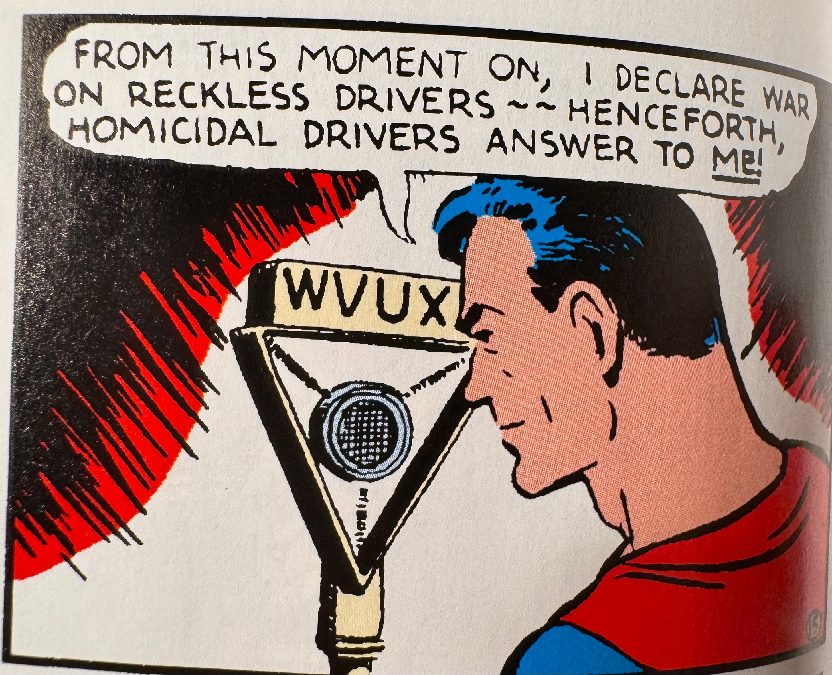
Superman meets Lois and Jimmy on the roof of the Planet building. Superman is in rough shape, but he believes finding Mist is his one opportunity to find the general. Lois wants to know what will he do once he finds him. Will he fight the military? Jimmy shares what the people have been saying about him. Superman is dangerous and that he should go back to where he came from. Superman knows he has scared people and wants to fix that, but he is hyper fixated on finding the general now.
Remember last week when we talked about the major themes and driving motivations for Superman and Lois? Superman wants to be normal. He feels strange and out of place as an alien and wants to be accepted and fit in. When Lois tells him he should take a break from being Superman and be normal I could feel the pain Clark felt. He had finally felt accepted for who he is by Lois and Jimmy last episode. He could be his full self without hiding. One week later Lois breaks his heart.
Battle in the Sky
Clark focuses his super hearing to find Mist again. He tells Mist he’s here to talk and not to hurt him. Mist explains that he is looking to save his sister Silver Banshee. Mist got word the general is moving the prisoners today and if doesn’t get to Silver Banshee now he may never see her again. Superman won’t let him do that… alone.
They arrive at the airfield just as the plane takes off. Mist thinks they are too late, but Superman flies after the plane. He opens the side of the plane and lets the prisoners know he’s there to save them.
Unfortunately for Superman, these prisoners are on a work release program and the fight begins. I think this fight works really well in the air. Because attacks could come from any angle it makes everything feel really dynamic. Plus taking on Silver Banshee, Rough House, Heatwave, and Livewire all at once is no easy task even for Superman. Throw in Parasite and Deathstroke and Superman is at a serious disadvantage.
Lois and Jimmy discover that Vicky has already published her article in the Gotham Gazette and used the story to get a promotion. She was never there to work for the Daily Planet, she just used their resources to write about the Metropolis Menace. They don’t have time to deal with Vicky because Jimmy is notified user Bibbo87 is streaming a live video of Superman’s fight in the park. Bibbo is a favorite Superman support cast member of mine so I hope we get more than just an Easter egg reference to him. Internet commenter Lemaris04 would definitely be a Flamebird fan, she knows about Sub Diego.
The fight isn’t going well for a weakened Superman, but he musters his strength and is able to take out most of his attackers. That is until Parasite Ivo lets loose on him. Ivo won’t stop even when the general tells him to stand down. The general eventually has to resort to the electric collar. The general tells Superman as he brings him in “You’re no hero; you’re the end of the world”.
Lois and Jimmy arrive just as Task Force X leaves. We get our first ending credits without any photos.
Heavy way to end an episode. Faith in Superman at an all time low, Superman in the custody of Task Force X, Lois and Jimmy too late to help their best friend. We still haven’t learned what Zero Day was, I imagine that will happen next week. We’ll also see if my predictions are correct. Join us then for Zero Day Part 2!
Five Thoughts on My Adventures with Superman’s “Zero Day Part 2”
August 28th, 2023
Welcome back, friends, to the penultimate installment of season one. This week questions are answered, loyalties are tested, and a villain is revealed to the audience. Buckle in for an action packed one and remember spoilers ahead!
Superman Thesis
Something the show has been doing well throughout the season is answer the question of why Superman is great. What makes Superman special? They do this by contrasting the cynical take that Ivo and Task Force X have with how Lois, Jimmy, and the Newskid Legion see him. Something that all powerful cannot be all good . . . right? There has to be some selfish ulterior motive to what he’s doing. But throughout the show and especially this episode we are presented with the revolutionary idea that maybe he can be all good. That’s how this character, this idea, has survived all the iterations across 85 years. If he can be good, then so can we. By the end of the episode even one of the main antagonists starts to believe.
So much of our superhero media is all about the fight scene. It’s pretty standard in superhero comics that every issue needs to have a fight. But that isn’t the point of Superman, which he makes it clear in this episode when he has to stop Ivo. He says that he never wanted to fight anyone. He only wants to help. He doesn’t put on a mask to go out at night and beat people up. He puts on a cape to help. He’s the guy who saves the cat from a tree.
Lois and Jimmy start the episode frantically trying to find Superman since he was taken by Task Force X at the end of last week. They run into Flip and the Newskid Legion who insist on joining the search. Flip says that helping Superman like Superman helped her makes her feel less small.
The true threat behind Zero Day: Brainiac
Superman is in Task Force X’s custody being interrogated by the general. They are using Ivo’s parasite draining tech along with the Cadmus red sun field to keep him powerless. The general thinks Superman is part of an invading army. He wants to know when they are coming and how many. Superman is surprised to learn that the general has met others like him. He tells the general he’s lived on Earth his whole life.
The room changes to show us a recreation of Zero Day. There are two large pillars floating in the air with the negative space between them in the shape of Superman’s shield. A young version of the general is on the phone (with Lois or maybe her mom I’d bet) during the top secret mission briefing. When Waller confronts him about it he calls her Mandy again and she doesn’t like it. When he first called her Mandy a few episodes ago I was pretty surprised. No one gets that comfortable with The Wall.
At that moment the pillars activate and open a portal also shaped like the shield. Through it a fleet of robots directed by a masked figure attack the soldiers. The masked figure also has a shield on their chest in the same shape. This portal and the armada on the other side have all been seen by Clark in his visions when interacting with the tech.
It’s an absolute massacre and everyone is killed except Waller and the general. Suddenly there is an explosion on the other side of the portal, it closes, and the robots all deactivate. Could this explosion be the destruction of Krypton? The pillars both fall to the ground and the simulation ends.
All the robots have the Brainiac symbol on them first introduced in Superman the Animated Series. The three dots connected by the two lines has become shorthand for Brainiac since then. That series also made Brainiac an Eradicator like Kryptonian artificial intelligence. It looks like this is where this show is going too.
The general tells Superman he sees this every time he closes his eyes. He has sacrificed everything to prepare for their return, which I took as meaning his family. He explains they took the Kryptonian weapons and made them their own. Task Force X was created to prepare for this imminent invasion. He asks Superman again why is he there. Clark begins to cry and says he doesn’t know. At this point the general starts to believe him.
The general admits his doubts to Waller who is not happy about it. He reasons that if Superman aged like a human he’d be too young to be part of the original Zero Day attack. They call the attackers Nemesis Omega. The general thinks that Superman may be innocent. Waller isn’t having it and calls into question his objectivity. Asks if Superman reminds him of “her” which I bet is Lois. The general isn’t willing to do what Waller believes needs to be done. So Waller turns off Livewire’s collar to allow her to escape. Task Force X doesn’t make mistakes.
Kaiju Parasite
A freed Livewire busts out Ivo, Intergang, and Heatwave. This gives Ivo the chance to finish getting his revenge on Superman. With the Parasite suit back on he starts his attack. He begins drawing power from the building growing bigger with each drain.
Superman tells Parasite that he doesn’t want to hurt him and that he won’t fight him. The general tells Parasite to stand down, but with the help of the other released criminals they take out all the guards. Superman hears Lois looking for him and uses the chaos of the battle to escape. Livewire juices up Parasite to make him bigger than ever and they escape after Superman.
Superman is found by Flip in the same old alleyway. They bring him to the Newskid Clubhouse to meet up with Lois and Jimmy. Superman tells Lois that he knows why he is on Earth. Because he’s a weapon and alien invader sent to kill everyone. That’s why he can shoot fire from his eyes and rip apart steel. He’s made for destruction. He saw it on Zero Day.
The Parasite, now Kaiju sized, begins to wreak havoc on Metropolis. This isn’t the first time we’ve seen a Parasite adaptation make him this big. The direct to video animated movie Superman Man of Tomorrow ended the same way. It works really well in this anime inspired adaptation, especially with the design of the Parasite suit being Evangelion influenced. Despite being weak, Superman knows he needs to try and stop Parasite from hurting anyone.
Lois wants to help Superman — – and Jimmy knows how. He’s got 5 million Flamebird followers now and that reach can get the word out. He starts a live stream and introduces himself as Superman’s best friend (Superman’s pal would have been so much better here). Lois almost says she is Superman’s girlfriend, but stops herself short and says that she is a reporter for The Daily Planet. They speak to the good Superman has done. How Superman goes out every single day to use his power to help the citizens of Metropolis. Now it’s their turn to help him by turning off all sources of power for Parasite.
During the Flamebird stream we see Bibbo and Lori Lemaris again (two of them in fact) along with Lana Lang and Pete Ross. Plus Lombard joins and two people with Cat Grant inspired screen names. I love these little bits.
Superman hears this all as the buildings around him all start to power down. As Parasite starts to weaken the tables have turned on the battle. Ivo blames Superman for turning him into a monster, but Ivo chose to be a monster. Superman gains his x-ray vision for the first time and uses it to pinpoint where Ivo is in the suit. He flies through the giant Parasite pulling Ivo out and stopping the attack. Soon the sun rises on Metropolis and the Parasite suit goes dormant.
Superman returns to his friends and Jimmy gives him an attack hug. He tells Lois he heard everything she said. Lois tells him the world and specifically her world is better with Superman in it. Lois gives him an shoulder punch and calls him Smallville very reminiscent of the Erica Durance and Tom Welling dynamic from Smallville. They tell each other “I love you” and we get a big kiss.
Jimmy grabs Lois’s bag and leaves to gives them a bit of privacy, but uh-oh he finds the sphere from the League of Lois Lanes. He triggers it and watches Overman’s attack.
Checkmate
We get a coda with Waller and the general. His failure to take lethal action against Superman has disappointed their superiors. She has been authorized by the US government and Checkmate to relieve the general of his duties. Waller is head of Task Force X now. She introduces the Omega cannon and gives the general a new job: track down and terminate Superman.
Checkmate is a major part of the spy and covert ops side of the DC Universe. The Task Force X intrigue gets more interesting with deeper ties to other secret organizations. Might we see other Checkmate members? Do they have the same leadership structure of Black and White Kings and Queens like the comics? I am excited to see this adapted here and wonder where they are going to go with it. They could have just said US government, but adding that little Checkmate note makes it that much cooler.
Next week’s finale is titled “Hearts of the Fathers.” Will my prediction come true with Lois and the general? With the general starting to see Clark as not a threat I’m not sure he’s going to come between them anymore. Maybe the general will help Superman take down Waller? And there is another father out there that is still a mystery: Jor-El. What part did Jor-El play in Zero Day?
Five Thoughts on My Adventures with Superman’s “Hearts of the Fathers”
September 4th, 2023
This is it: the season one finale of My Adventures with Superman. Loyalties are tested, secrets are revealed, and Thanksgiving at the Kent farm may never be the same. Hop in for our “yamtastic” five thoughts but look out for Kryptonian invaders and spoilers.
I am not a gun
Clark’s journey this season culminates in him deciding who he is. The episode begins with Clark having a nightmare. He sees the Zero Day attack with his friends as the victims. The leader of the attack opens his helmet and Clark sees himself. Very Luke and Vader in the cave on Dagobah.
Clark goes to see Jor-El in the ship. He tells Jor-El that he’s not like them and he will not be conquering Earth. An interesting change for folks watching with subtitles: Jor-El is translated for the first time. In episode two the subtitles just said he was speaking Kryptonese. If you turn subtitles on you can see Jor-El telling his son that he’d never hurt him. I don’t think Clark was sent to Earth to invade, but the language barrier with his father forced him to discover his own purpose.
Later our trio is heading to work and we learn that Lois’s father is coming to Thanksgiving with the Kents. We know we are going to get our big reveal and it’s further foreshadowed with Clark asking for their help in finding the general. Lois is going to help find the general alright. She’s going to bring him straight to your door.
Jimmy and Lois discuss the evil Superman they saw in the sphere. They agree that it would really hurt Clark to see this. It’s the opposite of what Clark has chosen for himself.
Mild Mannered Reporters for a Great Metropolitan Newspaper
When they arrive at The Planet they are greeted by a surprise promotion! They were so bad at being interns Perry has made the three of them reporters. Their first byline? “City Saves Superman”, which is a fun spin on the usual. Each of them gets something from the other three reporters: Clark gets a kiss from Cat, Jimmy gets a lone wolf from Lombard, and Lois gets a “Future Award Winning Journalist” name plaque from Ronnie. They all head out celebrate the Thanksgiving holiday, but Perry keeps Jimmy to talk about Flamebird.
While I enjoyed the underdog shenanigans, the show wastes no time in moving things forward. This is a show that is not afraid to change the status quo. It keeps the show feeling really fresh and exciting.
When Lois and Clark show up to Ma and Pa Kent’s home they see their article is framed already. It’s up there with childhood pictures of Clark including one that could be with Lana Lang. One of my favorite moments of the episode is here when Ma thanks Lois. She explains that Clark has always kept himself at a distance because of his powers, but now he has Lois. This shows how important this Lois is to this Superman and I think confirms that Lois was right in not doubting her Clark.
Disguised As Clark Kent
When the general arrives, Clark asks what’s the worst that could happen? Well Clark I think the worst thing that could happen is that your girlfriend’s father is the antagonist you’ve been up against who kidnapped and tortured you. “Call me General Lane” he says. This doesn’t come as a surprise to Superman fans, but I wonder if a viewer coming to this show completely new to Superman is just as surprised as Clark is here. They’ve hinted at it throughout the season.
General Lane immediately starts to interrogate Clark. He thinks Clark looks familiar. What could be seen as a dad asking questions of his daughter’s boyfriend takes on a more sinister angle. Luckily Jimmy arrives when General Lane asks if Clark always wears glasses.
Clark gets excellent Superman advice from Pa Kent. If he has an enemy he should turn him into a friend. Plus, you can’t hate your girlfriend’s father.
Everyone starts to pull Jimmy aside to confide in him but he’s done with the drama, secrets, and lies. The show isn’t done with the drama though. Jimmy drops the sphere and when Clark picks it up he sees Overman. If the shock of that isn’t enough it opens exposing Clark to the Kryptonite. The ship reacts to the Kryptonite nearby and Jor-El sees Brainiac activate. Jimmy makes the connection that the green rock is what is hurting Clark and they put it back in the sphere.
Brainiac Attacks
Clark’s ship emerges from the ground and General Lane radios for backup. This is his Nemesis Omega, the attack he’s been waiting for. He believes they are at ground zero of an alien invasion. Clark gets Ma and Pa to safety and returns to deal with the ship.
Lois and Jimmy run from the Brainiac robots. When they are separated, Jimmy discovers the Kryptonite can destroy the robots. Lois reaches her father who is using the Omega cannon against the robots. Lois realizes her father is the general they’ve been searching for. Superman saves them both from the biggest robot yet.
Superman and Lois find Jimmy who explains the Kryptonite can not only hurt Clark, it can destroy the robots. A portal opens up just like on Zero Day. Clark decides he needs to use the Kryptonite to destroy his ship. His sacrifice will save his friends and family and stop the invasion.
Knowing the love this creative team has for all things Superman I’m comfortable pointing out two small visual references here that I don’t think are coincidences. Superman lifts his giant ship in very much the same way he lifts the New Krypton island in Superman Returns. When we see the Brainiac robots chase after him the camera is blurry and then zooms abruptly into focus. There are several shots like this in Man of Steel like when Kal-El’s ship leaves Krypton.
On the ship Superman gets help fighting Brainiac robots from his father. Again we are treated to a translation if you turn on subtitles. Jor-El tells Superman to follow him to the heart of the ship. Superman takes out the Kryptonite and while fighting through the pain punches the ship’s heart. This closes the portal cutting the invading ship in half.
Superman starts to lose consciousness while his father approaches him. Superman tells Jor-El that he had to stop the invasion and protect his family. Jor-El tells him in English to live. He then sends him to Earth in a pod while the ship is destroyed mirroring the destruction of Krypton we are all familiar with.
Then we get the confrontation we’ve been waiting for. Lois standing between her father General Lane and Superman. The dramatic lighting on her face along with the sunset color pallet make this one of the most visually striking scenes in the season. Lois convinces her father to spare Superman. When Waller radios, General Lane tells him it’s a false alarm. When Lois turns around her father is gone.
With Earth safe and General Lane gone, it’s time for Thanksgiving dinner. Clark uses some heat vision on the turkey and Jimmy drops the news he sold Flamebird for $5.6 million. He’s super rich now. This is fun and not without comic precedent.
Kneel Before Zod
Brainiac watches the ship enter the portal from the other side and be destroyed. Voiced by Michael Emerson this Brainiac reports to a Kryptonian Warrior that he has a new planet. Brainiac describes Earth as a planet in rebellion that has destroyed their ships and closed their portals. The Kryptonian Warrior is not concerned. “In the end they will kneel.”
What a tease for season two! Producer Josephine Campbell recently confirmed they were able to make season two along with season one, but we still don’t have a timeline for release. With the ongoing strikes it is tough to predict when the show will come back. What I really want to know is will we get more Crab Kent? Thank you for joining us on this ride, dear reader. Until next time stay tuned to Multiversity Comics!