Superman Day 2024
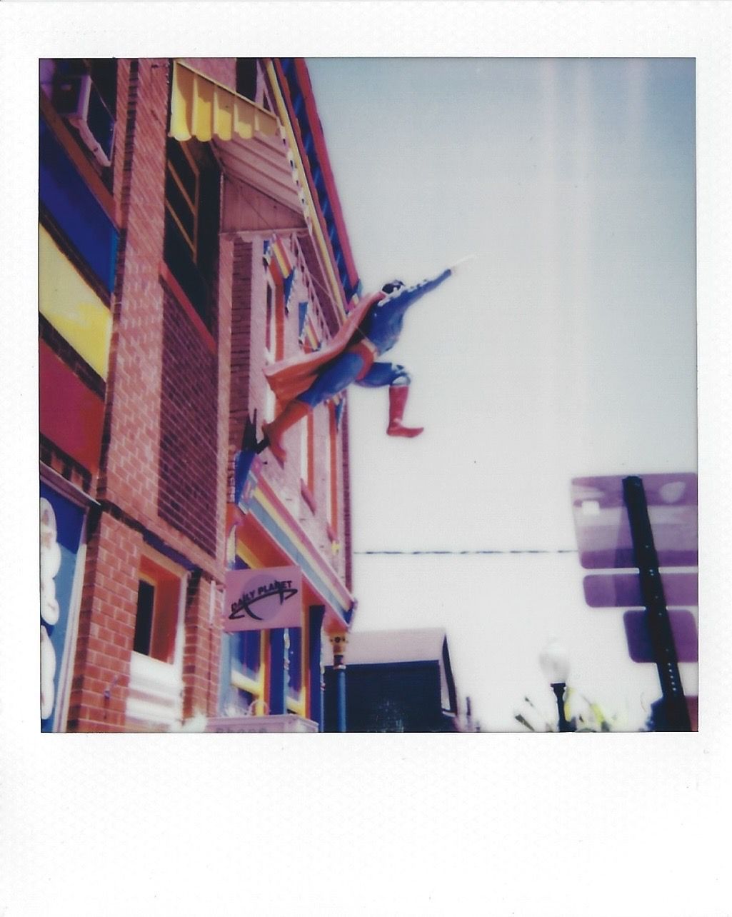
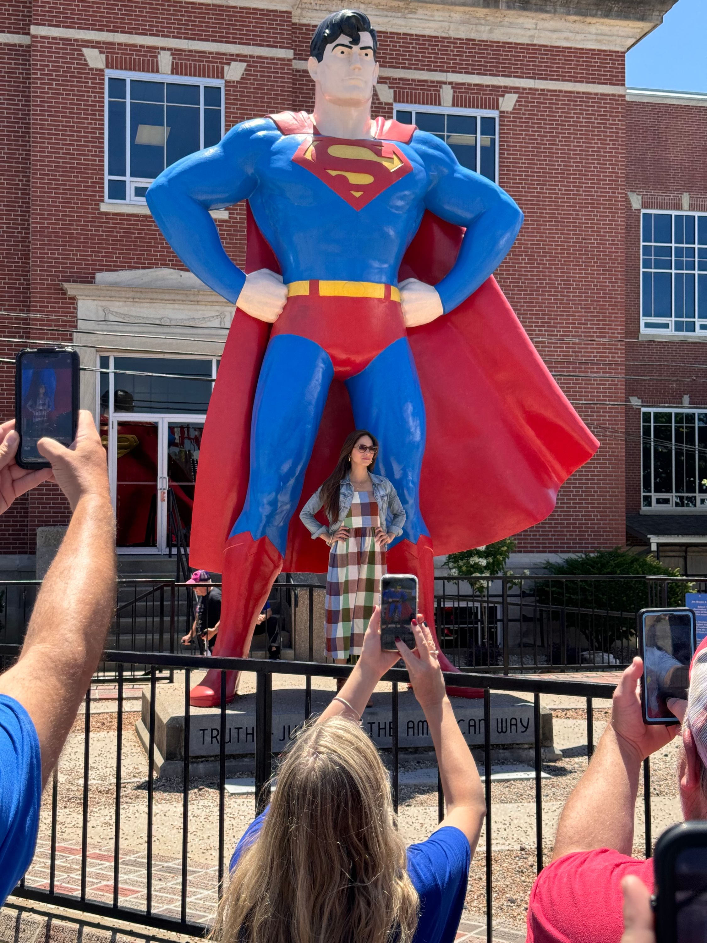
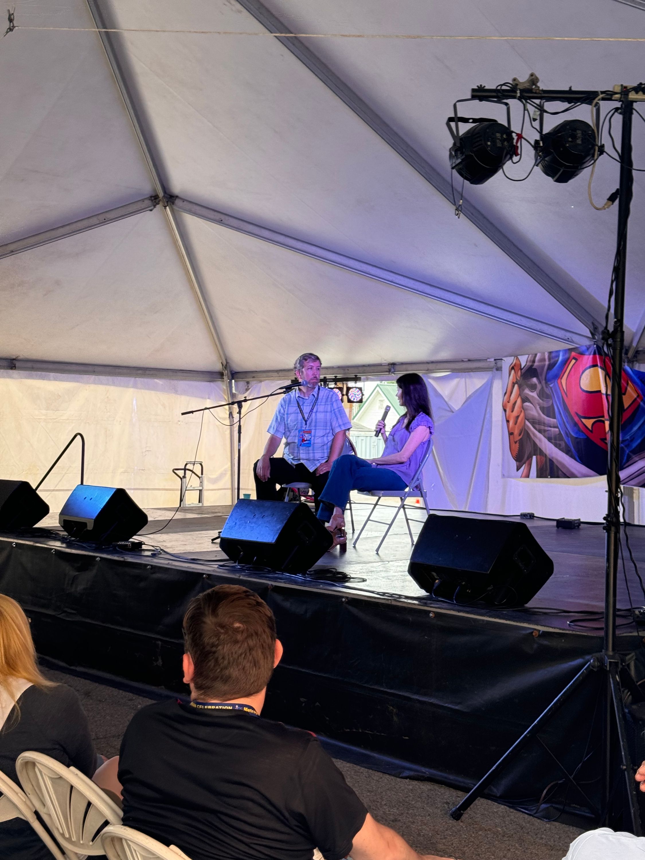
I am back home from the 2024 Superman Celebration; just in time for the 4th Superman related holiday of the year. We’ve had Superman’s Birthday, Superman’s Earth Day, Miracle Monday, and now Superman Day. I think this one is the least special of the days—I certainly don’t need an excuse to celebrate the Man of Steel.
Speaking of Man of Steel, the 2013 release was how we got this Superman Day in the first place. Also speaking of Man of Steel, All Star Superfan podcast has an excellent episode about the John Byrne miniseries. I had so much to say about this mini that I didn’t get it all down in time to send it in to them before they released their episode. Going to try and get an email out to them commending them on another excellent podcast. These guys are my favorite Superman podcast currently
Travel slowed me down, but don’t worry I haven’t forgotten about My Adventures with Superman! I’ll be back later today with my thoughts on episode four. For now enjoy this Celebration photo dump!
Adventures of Superman in Good Quality?
Earlier this week YouTuber James “In Search of Physical Media” dropped the news that Adventures of Superman is coming to blu-ray next year. Huge if true, but no other news sites have corroborated. In the video he explains that the show is getting a brand new 4K scan for this edition. Other than that he was light on any additional details. So I’m left with some questions.
The first question is an easy one. When is it coming? Probably a safe bet that it will be timed around the new movie. It could be slated for when the new movie hits theaters July 11, 2025. It could be a couple months later when the movie comes to home media. I’d guess second half of next year.
My second question: if they are doing 4K scans why is it only coming to blu-ray? Why not 4K UHD? I assume blu-rays are cheaper to produce and definitely have a wider install base. Most VOD platforms don’t offer television shows in 4K either. It would be nice to get these in the best possible quality.
Are all the seasons coming in one box set or will it be spread over several volumes like last time? The show evolved significantly over its first three years so the separation made sense in the earlier releases. Separating them also made each purchase a little bit more manageable. Plus, it required them to have special features for each collection.
Speaking of special features, are we getting anything new? Any new retrospectives? I’m betting they’ll drop the old featurettes in standard definition on the discs just like the Smallville blu-rays. I’d like to get something new though. Maybe with the cast or creative crew from the new movie?
What versions are we getting? The first season episode “Crime Wave” has two distinct versions. One available on the DVD and a different cut on VOD services like iTunes. I’m not an Adventures of Superman expert (I’m trying though, reading some books along with my rewatch) but I gather that other episodes were recut or edited and that’s what ended up on the DVDs.
Which leads me to my final question. Will they give this release the attention to detail the show deserves? Judging by the Fleischer blu-ray release I’m not confident they will. That release expounded upon the errors in the 2006 release despite Warners marketing hyping the restoration effort. On the current edition it’s clear that in some of the second season episodes they use the introduction from season one. So like the Fleischer releases there is a precedence of mistakes. I’m going to hope against hope that they don’t try to make these releases look modern. Yeah it would be great if they had a cleaner print of “The Stolen Costume”, but if they scrub out all the grain and ruin the picture it would be heartbreaking.
Now that this is off my chest it’s time to fly to Metropolis. Unlike Clark, I’ll need to take a plane. Superman Celebration time!
My Adventures with Superman Comics
After writing almost 700 words to try and help someone out on Reddit—and only getting 3 likes—I wanted to continue my coverage of My Adventures with Superman. But we’ve already talked about this week’s episode you say? But there is a new comic book I say!
Back in 2016 Disney released the animated Christmas special “Duck the Halls” as part of a then ongoing series of Mickey Mouse shorts. These shorts are delightful and I highly recommend them. In the Christmas special Donald and Daisy are preparing to go south for the winter while Mickey, Minnie, and Goofy prepare for Christmas. Donald who, as a duck, has never celebrated Christmas, decides he wants to stay. Hijinks ensue. Ducks can’t handle cold winters! The main chunk of the special is the gang going through Mickey’s list of must-do Christmas activities to make it the best Christmas ever. How is that related to Superman? Well in this issue Lois and Jimmy are planning to do the same thing fo Clark!
It’s Clark’s first Christmas in Metropolis, but before that he’s got to deal with a new threat that almost knocked down the Daily Planet. Clark can be forgiven for thinking this is Ivo/Parasite again considering the character’s design. Even if Parasite is still frozen in the middle of the city as seen on page three. I didn’t even think of frozen Parasite when Ivo was back in Task Force X custody at the start of season two. I wonder if that will get addressed in this series.
I loved the misunderstanding Superman has with this new unnamed character. So far this Superman has solved his problems with punching bad guys in robot suits (or bad robots). This robot suit looks like a villain, but actually needs his help. I like the idea of Clark learning to talk before punching. Great opportunity for character growth.
I also like the MAWS-universe version of Bloodsport. He’s got a very DCEU inspired design and you can’t go wrong with Idris Elba. It looks like he’s working for a rival faction of Checkmate. It’ll be interesting to see how this pans out with the Checkmate that was mentioned on the show. I also wonder if things that happen in the book will reflect in the show since they do have Josie Campbell writing. I know it would be tough to reference a character seen only in the comic. They don’t have editors notes on cartoons and they can’t expect every viewer to have read the book.
I liked the art on the book by Pablo M. Collar (colors by Nick Filardi). I’ve seen their art previously in some DC anthology books, but this is the first time I’ve seen them on a full issue. The art evokes the characters designs from the cartoon while also being in their style. A tough needle to thread I’d imagine.
My shop knows me so they held all the variant covers for me. I especially like the Riley Rossmo variant with Mxyzptlk; I’m a Mxy mark. The main cover by Carli Squitieri is right out of the show (although not set during Christmas like the issue). Gavin Guidry’s variant has been one of my iPhone wallpapers since it was first announced. It’s an iconic Superman & Lois image. I believe the “Character Design” variant is credited to Warner Brothers animation which is a little weird. A person drew the cover, you should credit them. Even if it was a team of people! Credit them!
Overall an excellent first issue and addition to the universe!
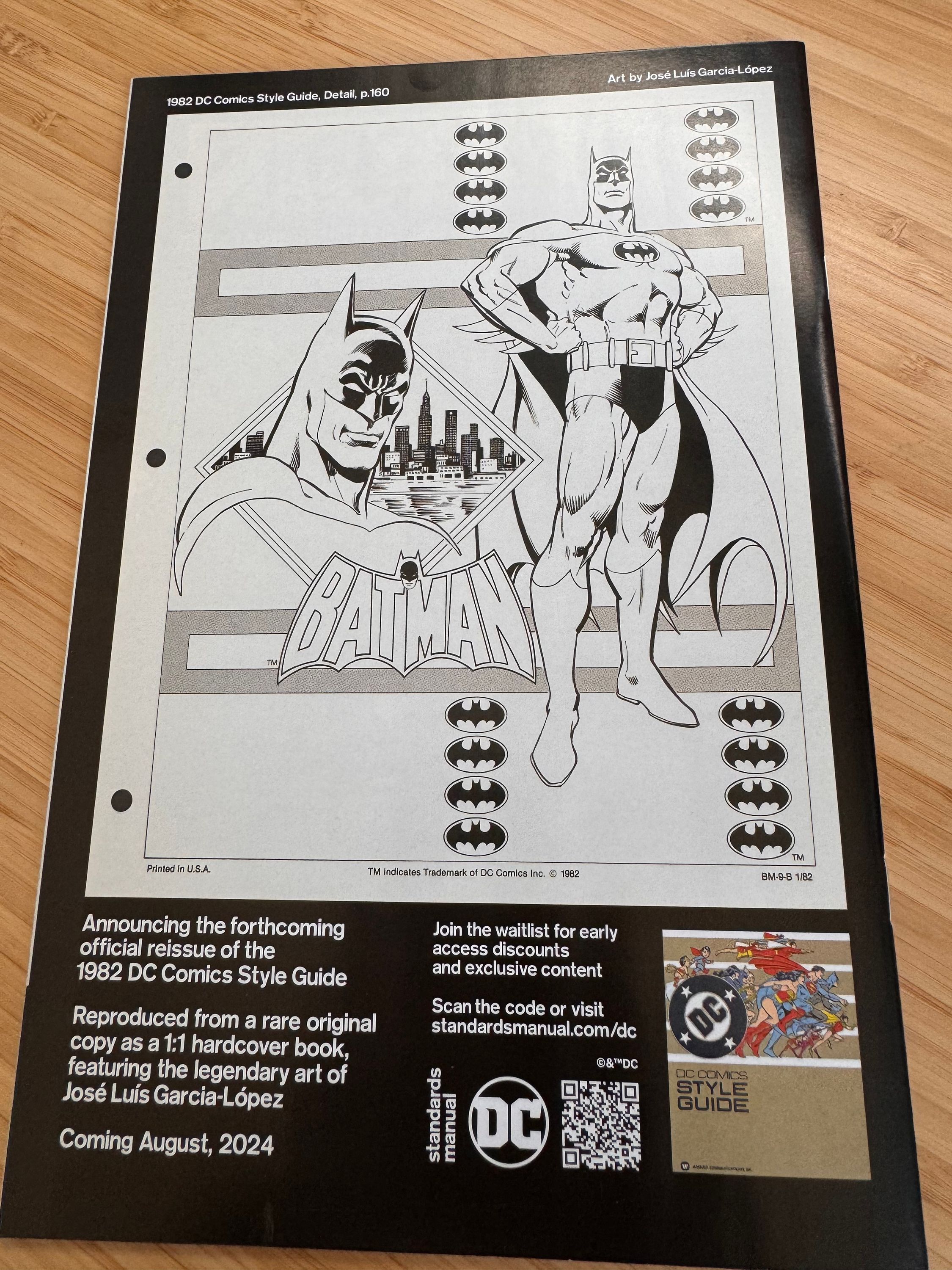
DC Comics Style Guide
Tuesday post! Lots to cover before Superman Celebration this week. Today it’s José Luis García-López’s Style Guide. Praise be his name.
Yesterday press releases went out to comics media about the upcoming reprint of the 1982 DC Comics Style Guide. All across the media we got stories with the lede “DC Comics has announced the long-awaited reissue of its 1982 DC Comics Style Guide”. Even my beloved Superman Homepage got in on the action.
The problem? They ran stories with this exact same news last month. The preorder has been available for weeks. The last issue of Justice League vs. Godzilla vs. Kong had an ad with a QR code to preorder on the back cover. A book that shipped two weeks ago.
Strangely, it was the only comic I got with that ad on the back; usually all books in a week have the same back cover ads. Doc Shaner had a different version of the ad on the back of a Green Lantern issue; but my copies of Green Lantern and Green Lantern: War Journal from April and May had different ads.
I understand that publications wanted to run the latest press release from DC, but it was weird to read it without publishers providing any context. There are new details in there, but no mention that this had already been announced. Or that they already linked to the preorder a month ago. Each website just copies the press release verbatim and passes it off as their own original writing or reporting. I almost felt like I was dropped into Earth-2 reading announcement news articles about a book that I had already pre-ordered.
13th Dimension gave some good context in their post last week.
The original Style Guide was looseleaf, so there are a ton of copies out there that are an amalgam of different years; the source for the company’s edition — officially licensed by DC — is one such version.
I have an original copy in my collection, but as mentioned it’s looseleaf. Not every page is included in every copy. A Facebook user “José Luis García-López Fans” shared some great scans and their version includes many pages (like the awesome Supermobile) not in my copy.
Despite these breathless articles, this isn’t the first time DC has made some of this work available commercially. The DC Through The 80s: The End of Eras hardcover has some reprinted pages; although they are smaller than the originals. We also have the upcoming July variant covers. Surprisingly, none of this work is included in the two excellent “Adventures of Superman José Luis García-López” hardcovers.
I remember as a kid in the 90s wondering why no Superman merchandise had the Superman I was reading in the comics. I saw the same few Superman images everywhere, the same ones I had seen since before I was reading on VHS tapes and Super Powers toys. I just called him the “marketing” Superman. It wasn’t until years later when I learned about the Style Guide and gained a newfound appreciation for JLGL’s phenomenal work. I am eagerly anticipating having this hardcover in my collection.
We’re back for episode three of “My Adventures with Superman”! We’ve got some new characters, plus the show continues to push our main three forward. Less of a recap this week than my assorted thoughts on what we saw this episode.
Before I start I’d like to point readers to a great podcast with one of the show runners Jake Wyatt. There are lots of promotional interviews around hyping up this new season, but this is one of the most in depth interviews I’ve heard about the show. He talks about the conception, influence, and creation. Along with giving credit to all the great collaborators he’s had. I highly recommend a listen.
Superman Homepage has another interview with Josephine Campbell airing tonight. I’m looking forward to it, their interview last season was great. She’s also writing this week’s tie-in comic.
Last week I assumed the title was referring to Luthor. After all, he ended the episode as Task Force X’s new chief scientist. If I had given it 10 seconds more thought though I would have landed on John Henry Irons. He is the character that gets the suit of armor—although Al isn’t the Fullmetal Alchemist; his brother is. Steel has been a favorite character of mine since his debut in Reign of the Supermen, so I always enjoy when he shows up. He even mentions his niece Natasha is a Flame Bro.
Like his debut in the comics Irons starts out working for Amertek, but he ends up working against them. Thomas Weston in this version is just a light weight version of Ivo from last season though. He has a pretty similar arc. Has a new technology, doesn’t listen to his advisors because he only cares about the glory, consequences. This show loves their shitty billionaires I guess.
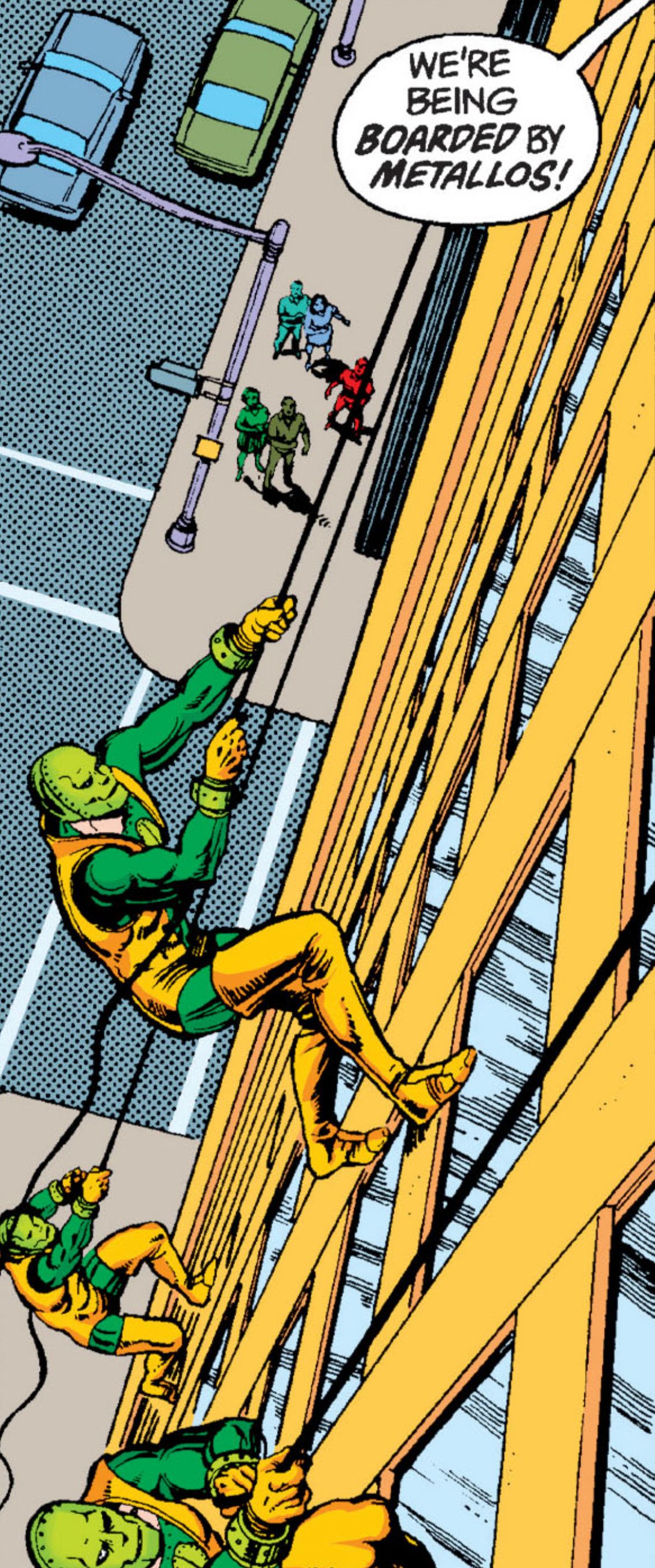
Rather than give us a new villain directly like Parasite, this time we get Steel, possibly the Lexor suit, and the show’s take on Metallo.
Not quite “The Metal Man” or “The Man with the Kryptonite Heart” this show’s interpretation of Metallo is an army of robots. They aren’t wildly different than the Brainiac drones or any of the Kryptonian inspired tech Livewire was dealing with last season. Definitely no T-800 influence on this one. The main difference between these robots and others we’ve seen is their unstable power core which is important for this episode and I’m betting the future of the show.
I liked the multiple Metallos and it worked for the show’s focus on technology based foes. Mechanical Monsters are perfect for Superman in a kids show because he can really let loose without hurting people. Plus there is a comic precedence for multiple Metallos.
The episode ends with Luthor in control of the Metallos and of John Henry’s Steel armor. I’m willing to bet Luthor will solve their power core problem by using Kryptonite, truly living up to being a Metallo. Not sure if we’ll get Corben though. I also bet Lex will use Steel’s armor to make a Lexo suit. Just needs a coat of paint.
Livewire is back!
I’m a big Livewire fan so it was good to see her again. I’m still enjoying this show’s interpretation of her as well. I wish she had a bit more agency here. Working for this small time character as an enforcer is below her. I hope there is more in store for her.
Superman adaptations have a history of being additive to the mythology. From Kryptonite to Perry White to flight to Kryptonian crystals and Jor-El with the S. Livewire is a great example of that. I wonder what this show will end up adding rather than adapting. Maybe the League of Lois Lanes will be the show’s lasting legacy.
Other Cyborgs
It’s clever with the show’s focus on tech-based villains to introduce interprations of three of the big cyborg characters in DC. Hank Henshaw in episode one being Cyborg Superman, the main villain of this episode Metallo (despite this version not being a cyborg—yet), and finally Silas Stone father of Cyborg from the Teen Titans and Justice League. It’s mentioned his son is young so maybe we aren’t getting that character directly, but still a mention.
Balancing character development
One of the things that showrunner Jake Wyatt mentions in the aforementioned interview is they wanted to make sure character development for Lois, Clark, and Jimmy did not suffer in season two as they expand the world. I’m glad to report so far they have been successful.
Jimmy who last episode was giving advice to Luthor; gets some advice from Irons. He’s learning what it means to be a leader in his new role running the Flamebird division of the Daily Planet. Side note: I need Jimmy’s wallpaper and Flamebird sound for my phone ASAP.
Lois and Clark both have new secrets from each other that they both want to share, but life keeps getting in the way. Lois with her job offer from rival Vicky Vale and Clark with his search for cousin Kara Zor-El. Both have the power to hurt our heroes as secrets often do. Plus we have the General who will undoubtedly cause some relationship strife.
One thing that didn’t click with me though is Clark was hard on himself for not being able to defeat the Metallos himself and destroy the power core. It really didn’t feel like a failure to me. He worked with his team. Lois, Jimmy, and Flip with their flying newsroom, Irons with his hammer, and Clark with his new power. I did like Clark’s article at the end. Clark understands he needs to work with his Superman Family to do the most good. He wouldn’t have gotten this far without Lois and Jimmy.
New Powers!?
One of the many great things about My Adventures With Superman is how the act of helping people unlocks his powers
[image or embed]
— Truth Justice and Hope (@aboutsuperman.bsky.social) Jun 2, 2024 at 8:49 AM
I couldn’t say it better myself. This episode has another example of that.
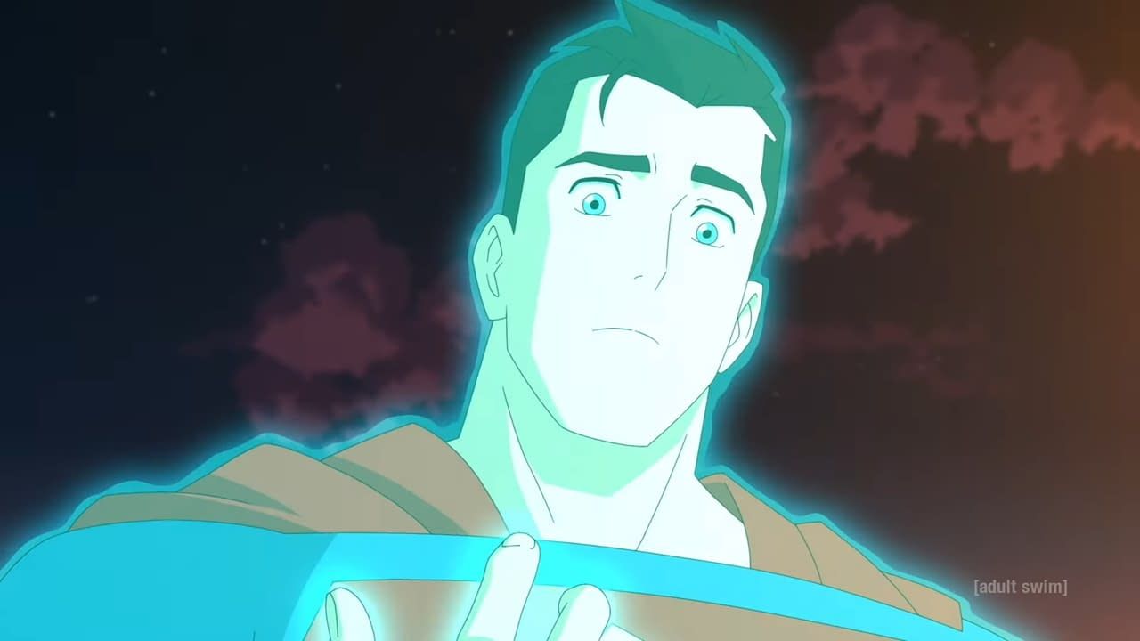
In the 90s the writers no longer wanted Superman’s costume to be his Kryptonian blankets. They wanted to be able to have his cape get torn up, but the costume stay in good shape as bullets bounce off his chest. They came up with an explanation that he had an aura around him that would cover his costume, but not his cape. They expanded on that with Conner/Superboy and his tactile telekinesis powers, but it wasn’t really explored as a new power for Clark. MAWS expands on this a bit. It seems he can extend that field to protect others or as he shows in the end of the episode hold in an explosion.
Two Lanes Diverged
Looks like next week we’ll get some Lois and the general drama which I’m looking forward to. Tune in again for the next thrilling episode with Superman!
My Adventures with Superman Season Two Premier
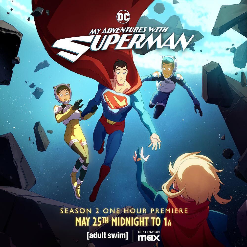 My Adventures with Superman is back for season two. Since my beloved Multiversity Comics is shutting down at the end of the week, I figured I’d continue my articles here. Like on Multiversity they will be a mix of recap and review. I won’t use their exact “Five Things” format, but it will inform the style. This week’s debut was two episodes More Things in Heaven and Earth and Adventures with My Girlfriend. Lots of Superman lore dropped in episode one. Let’s get into it.
Trailer Spoilers
I was pretty irritated when the trailer spoiled what felt like major reveals. I get they wanted to highlight some new villains (like Atomic Skull and Damage), but they also dropped Supergirl and the Lex Luthor reveal. Thankfully all of those are shown in the first two episodes so hopefully we have lots of surprises ahead of us.
I don’t have any affinity for Damage so his appearance here doesn’t move me, but I dig Atomic Skull. I have fond memories of the Man of Steel issue that introduced him Post-Crisis. One of the best issues of the triangle era. His design here is similar to modern takes on him (no yellow mask and costume). His mouth doesn’t quite move when he’s talking though. Not sure if that is an animation budget limitation or creative choice.
I look forward to seeing how the show adapts Supergirl. Lois is already mistrustful of other Kryptonians and when Clark tells her there is another Kryptonian she isn’t keen on finding Kara. Anj who writes the Supergirl Comic Box Commentary is really critical of different Supergirl takes. Until I started reading their commentary I never thought too much about different characterization and I hope the show doesn’t let them down!
There Are More Things in Heaven and Earth, Horatio
Nothing wrong with a little Shakespeare to get us started. Like Hamlet, Clark also learns there is more to his world than he initially realized. He starts with a dream or more likely a Jor-El induced vision. It starts with his identity struggles, but quickly shows a Kryptonian ship in the arctic.
Clark finally has a real conversation with Jor-El after finding his ship in the arctic. It took a while for the programming to learn English. Jor-El explains that Krypton had a large empire until it faced an enemy they could not defeat. I am going to assume this is a Darkseid and Apokolips tease. This space-faring Krypton reminded me a bit of Man of Steel. They had a large empire before retreating back to Krypton and harvesting the core until its destruction.
Jor-El confirms Krypton was destroyed and Clark is the last survivor. Well, Clark and his cousin Kara who was also sent away at the last minute by his brother Zor-El. Clark is stunned to learn he isn’t alone. Not only is there another Kryptonian, but she is family. Jor-El tells Clark to find the beacon that came with the Zero Day ship to find Kara.
Jor-El also explains that the Zero Day ship coming through the portal was an unmanned “ghost ship”. A drone without any Kryptonians. The ships are run by the Brainiac system. Brainiac on Clark’s ship is trying to wipe out the Kryptonite destroying the ship, but is using a bunch of power fighting off Lois, Jimmy, and the uninvited guests Task Force X.
We do see at the end of the episode there is more to these Kryptonian unmanned ships than Jor-El lets on.
First Big Surprise
Last season we left off with Clark putting Kryptonite into the core of his ship to close the portal and preventing a Kryptonian invasion. It’s Hank Henshaw that points us to Clark’s ship current location in the arctic!
The show’s villains have been mainly centered around Kryptonian tech; minus Mr. Mxyzptlk of course. Henshaw is a perfect candidate for some Kryptonian tech being the Cyborg Superman and all. I have read some complaints that all the villains are related, but most villains in four seasons of Smallville got their powers from Kryptonite. This is a different spin on that and it works for this interconnected narrative. It’s less of a freak-of-the-week scenario and more serialized.
Henshaw thinks the ship is a meteor and is tracking it at Star Labs. Clark recognizes it right away and makes the connection to the vision he had of his father.
Henshaw isn’t our only surprise in the first episode. We also get a nice Can You Read My Mind reference from Clark, which was a cute nod.
Jimmy spends it faster than he can earn it.
Jimmy ended the season super rich thanks to his Flamebird pivot to video. We get a fun little net worth chyron showing how fast he blows through those millions. He starts the season with $5,497,386 but after buying $163,378 in Valentine’s Day cards and $804,003 on a private plane he ends episode one with only $4,530,005. Starts episode two with $4,360,006 not sure where that $170K went, but he uses $605,924 to get a boat to get to Stryker’s. It only takes him two episodes to get down to $3,754,082.
Fortress of Solitude
Clark’s ship’s final act is to create his arctic Fortress of Solitude. It’s a cool way to end the first episode back and set up the show’s take on a major piece of Superman lore. The design is informed by the Kryptonian tech we’ve seen, but with a Superman ’78 ice castle vibe. I dig it.
Jor-El has a teary goodbye with his son as the last of his programming is wiped out by the Kryptonite. He’s proud of what Clark has become.
Newskid Legion as Daily Planet interns
I’m glad they’ve found a way to keep the Newskid Legion involved. They are now Jimmy’s Flamebird team! The more Flip the better. It also keeps the Jimmy Lombard pairing that was so successful last season. Giving Jimmy other things to do keeps him from being a third wheel or comic relief. Lois & Clark can have adventures and the show still has something for Jimmy to do.
General Lane is going to be a tough father-in-law for Clark
The main plot of episode two is Lois & Clark rescuing Sam Lane from Stryker’s Island prison. They are pointed in the right direction by a little boy named Billy who can’t find his father. His father was a volunteer librarian at the prison; when he noticed inmates going missing he went missing too.
Waller has been experimenting on inmates at the prison. When Lois breaks out her father and he realizes this, he is again put at odds against Waller. Waller isn’t the top of the food chain though because she is clearly working for someone at Checkmate. Waller admits sabotaging their mission last season to make Sam look weak to Checkmate.
Sam is not happy Lois came to rescue him and he’s even less happy that she brought the alien Superman along. Where is your weird boyfriend Clark? After the rescue Lois suggests Sam live with Jimmy and Clark in what I bet will be a great Odd Couple situation.
Lex Luthor
The show gets the pronunciation right, just like The Animated Series. Sorry, Rosenbaum, it’s not Luther.
As we speculated last season: Alex is really Lex Luthor. Diseased maniac to some, greatest criminal mind of our time to others. He gets some sage advice from newly minted millionaire Jimmy “Don’t wait for someone to give you a chance; make one. Carve your own path.” Lex takes this to heart and goes to work with Waller as Task Force X’s new chief scientist. After a Wilhelm Scream he easily takes down Parasite since he designed the tech in the first place. Ivo ain’t got nothing on Luthor.
Task Force X knows about Kryptonite
They see Superman struggling against it on the ship and how it affects the Kryptonian tech. Deathstroke ends up getting some in his sword somehow and this is going to cause some major problems for our Man of Steel.
Next week we get another episode titled after an anime “Fullmetal Scientist” which I hope will feature our favorite should-be-bald-but-isn’t nemesis.
WBD Wish List
Good Miracle Monday, Superman fans!
Shortly before four in the afternoon on the third Monday in the month of May, the people of the city of Metropolis learned the meaning of joy - the first thing many of them saw was the red-and-blue figure of Superman drawing a line across their sky, and he became the symbol of their joy.
It felt like a miracle.
Miracle Monday - Elliot S! Maggin
As we approach the 2024 Superman Celebration I’ve been rewatching various Superman adaptations in preparation. This inevitably starts me down the path of thinking about Warner Home Video. But I wanted to keep today positive! So here are the top video releases I hope we’ll get next year to coincide with the year of Superman and the new movie.
Lois & Clark on Blu-Ray
Let’s start with the low hanging fruit. HD masters exist; they’ve got the old special features from the DVDs. Just give this to us.
The Adventures of Superman on 4K
Maybe a bigger ask, but definitely possible. This might be the most historically significant television series ever. They were making mini movies with legit special effects all the way back in 1951. This show debuted the same year Canada got television stations, that’s how early it was. Would we have Star Trek without Adventures of Superman? I doubt it. This was shot on film and deserves the best treatment and restoration possible.
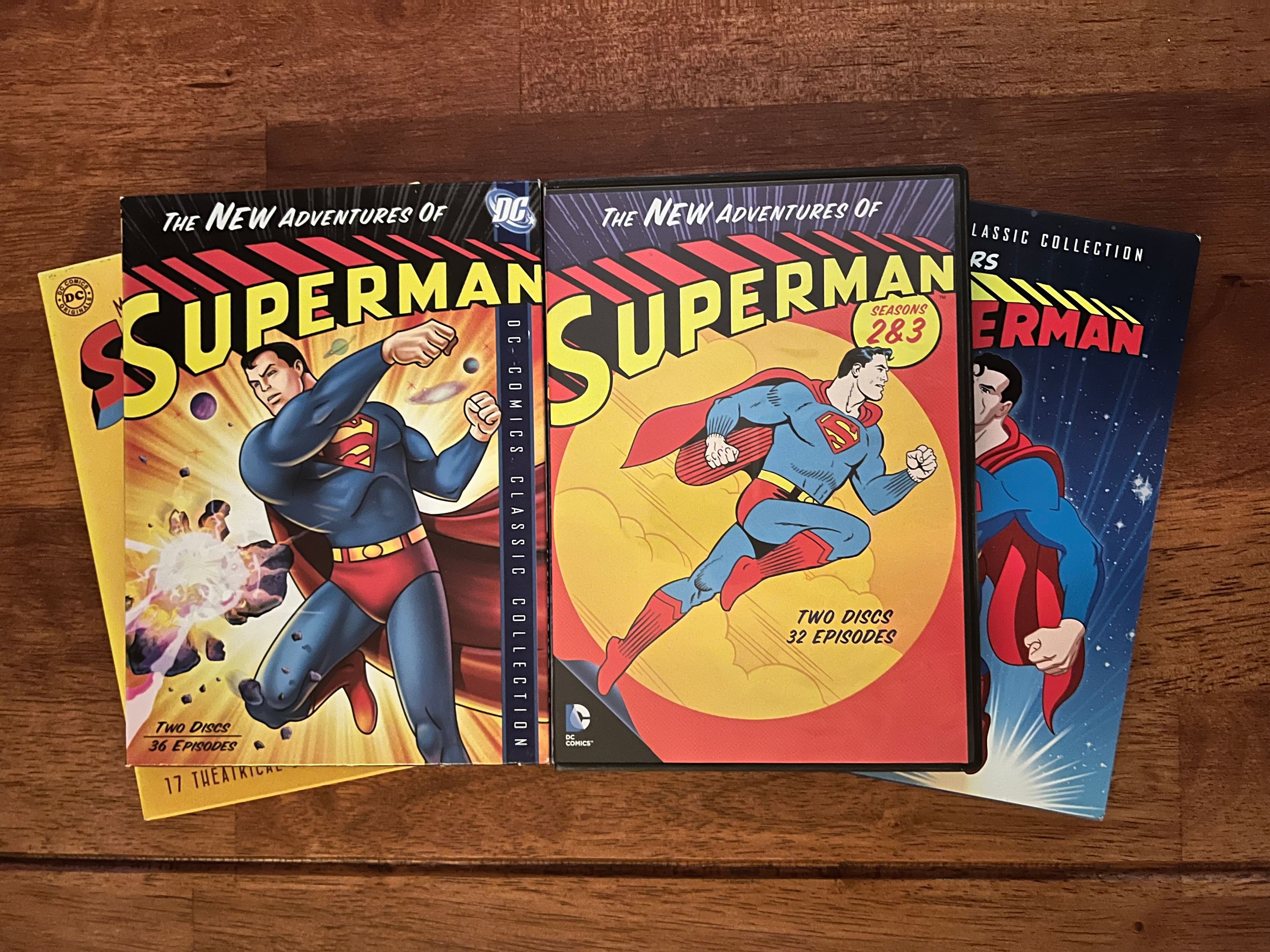
The New Adventures of Superman (Filmation cartoons) on Blu-Ray
We got the Batman cartoons on Blu-Ray so this doesn’t seem like a big ask. But this time can we please get the Superboy shorts as well?
Supergirl on 4K
After the disappointing German release earlier this year lets show this movie some love. Theatrical, International, and Directors Cuts please. I’d settle for the Directors and Theatrical cuts in HD.
Superman Returns on 4K
Unlikely due to some of the people involved here and the fact that it was shot in HD and finished in 2K. Home video has come a long way since 2006 though and I think we could get a better version of this. People expected it in the 4K set we got last year considering the DVD and blu-ray sets included this with the Reeve films.
Fixed Superman the Movie on 4K
This doesn’t seem like it’s on the plate at all. Since it was rumored and then at the 11th hour didn’t happen last year it seems that Warners is uninterested. Like the Reeves show though this movie has historical significance. Big budget superhero adaptations owe everything to this movie.
Fleischer Shorts on 4K
After the divisive release last year they would earn a lot of goodwill doing this one right. Even if they feel like this presentation is the most accurate at least give us the intros and outros without errors. Again the historical significance can’t be overstated. Important for its animation and its pre-noir style.
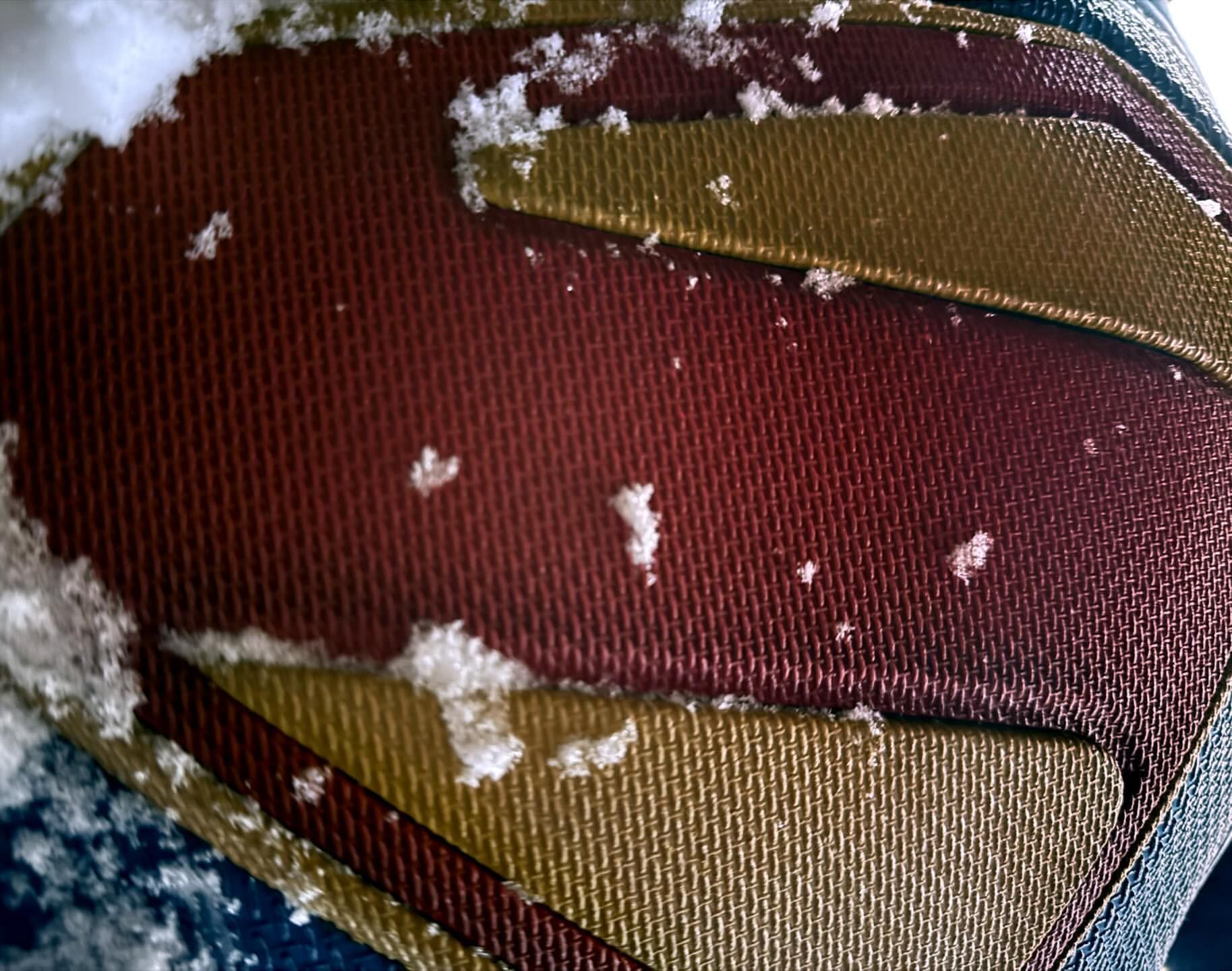
David Corenswet is Superman
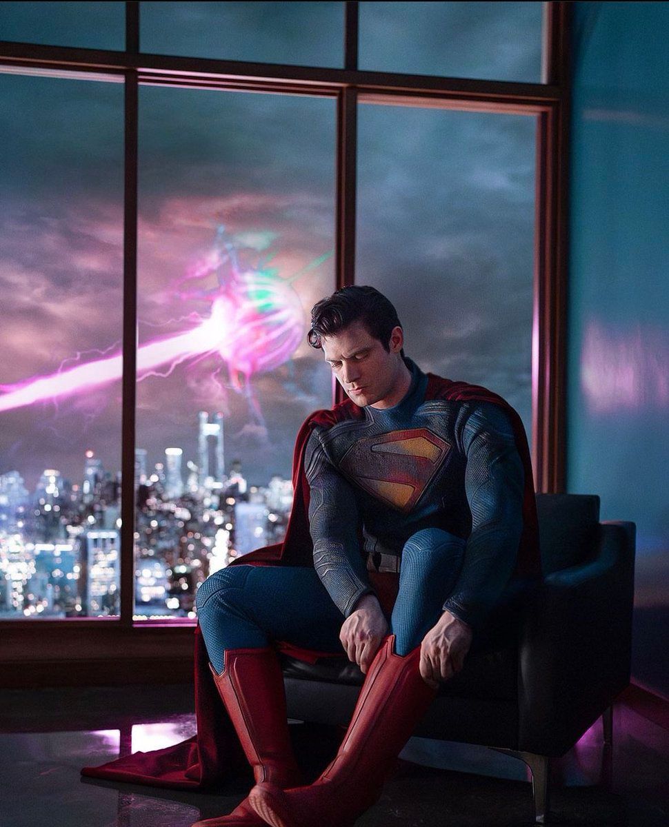
Director James Gunn shared the first picture of our new Superman on social media today. I’ve talked costume reveals before but this one holds a special significance. This is the start of a whole new cinematic universe. A lot is riding on these tights.
Inspirations: The New 52 and The CW?
Starting from the top the first detail is the high collar. This was one of the defining features of the New 52 costume. Corenswet’s suit features a much higher collar than live action suits of the past. This new costume may not be quite as high as the comics but it’s definitely inspired. The design of the collar also influences the cape attachment. The cape connects on his shoulders on either side of the collar just like in the New 52. Not sure how Clark is going to hide this under his Daily Planet clothes though.
Maybe the most controversial bit of the New 52 costume is the lack of trunks. Like with the first Man of Steel costume reveal, Corenswet is positioned in a way where we can’t see if he has trunks. You can zoom in and see some red, but until I see him standing up straight, hands on hips, I’m not ready to declare victory in the trunks or no trunks battle. I do personally hope this ends our no trunks streak for good.
Corenswet’s suit also has the detail lines from the new 52 costume. In the comics they are part of the armor, but here they are visual details breaking up the blue. This is where The CW comes in. These detail lines are very much a part of the Supergirl and Superman costumes from those shows. They are entirely different from the belt and cuff designs seen on Cavill’s suit.
Finally, the boots. They remind me of the boots Tyler Hoechlin wore when he first appeared on Supergirl. They have the rectangular blocks on them in a very similar way. Hoechlin’s later boots were a more standard leather affair just like Henry Cavill’s. I wish these had more of the V shape to them, but it’s close.
The Material
From our first shot at the shield and in fitting with current super hero costume trends we knew this suit was going to be a thicker material and not tights. We also knew there would be a texture to the costume like we’ve seen in both Man of Steel and The CW costumes. There are no surprises here, but I do like the folds in the fabric. The fabric does remind me of this Guardians photo which I guess is unsurprising considering the source.
The cape
The color looks dynamite. I personally prefer a shorter cape, but I know the long cape is probably more cinematic. I highly doubt we’ll get the shield on the cape. That ship sailed with the animated series and the amount of extra work it would take to animate.
The pose
I’m puzzled by their decision to go with this pose. I do think part of it is to obscure the trunks, but it’s such a passive pose. Sitting down and putting your boots on. In comparison to Cavill’s first photo in front of the bank vault which is the most dynamic debut we’ve seen. Hoechlin, Routh, and Reeve all got Superman standing poses; even though Hoechlin doesn’t do the Superman and put his hands on his hips.
The hair
Holy crap I love his hair. It’s perfect. He’s got the curl. No notes. Cain, Hoechlin, and Cavill not having the curl definitely detracts from their costumes. For Cain it’s terrible because his Clark hair is so much better than his Superman hair (yes I know the show is Lois & Clark). It breaks my heart with Cavill because it looks like his hair does that naturally!
Solaris?
Probably.
“entirely in-camera”
Todd Vaziri does a great job of pointing out when filmmakers try to hype their films as having used “no-CGI”. Gunn’s comment that this photo was “entirely in-camera” feels like another version of that. There has never been Superman on screen without some form of visual effects. From rotoscoping in the serials to rear projection and optical effects on television to CGI in Superman III. Superman on film has always pushed forward what was possible with visual effects and set the standard for what is possible. Saying something is entirely in-camera while there is a sky beam in the background is disingenuous at best. Don’t get me started on every old generation saying the new Superman isn’t any good because it’s too focused on special effects. When I read Kirk Alyn saying that about the Donner film I laughed out loud.
Now I want to see this guy in motion!
Revisiting the Superman Wordmark
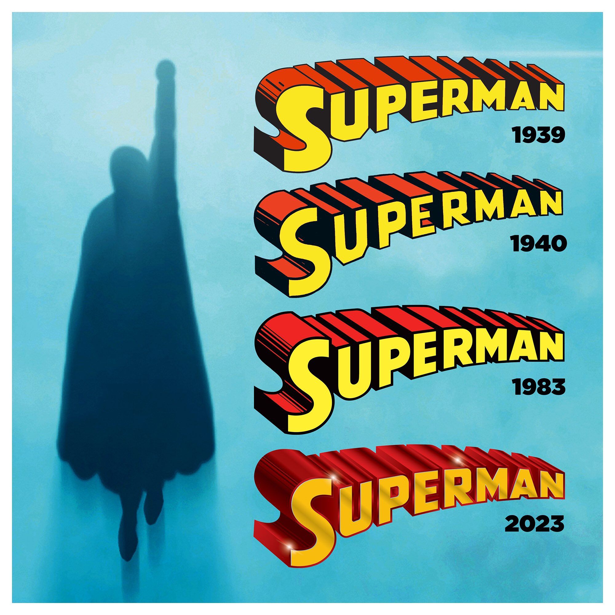
Readers of this blog will know I have a bit of an obsession with the iconography around Superman. As a character that’s been around for 85+ years the logos and wordmarks have approached an almost religious/idolatrous level of complexity and evolution. With fervent believers on each side of course.
For the second Superman Day of the year I thought I would revisit the wordmark that was updated last year. A few months after it debuted last year I wrote about the wordmark and it’s history over the preceding decades. At the time I wrote that I did not like this new iteration and that I preferred the version debuted back in 1983.
Over a year later, I’d argue this new wordmark has failed. I’ll give two specific examples why I think so.
This morning DC sent out a marketing email for Superman Day telling people to “shop our new merch drop!” The wordmark they used for the email? Of course it’s the post-83 version:
In fact there is no current piece of Superman merchandise that features this new wordmark. If the powers that be were fully onboard with the change they’d have rolled out all kinds of products with it. Especially when the main toy complaint with Superman is that he doesn’t have any other costumes or accessories like Batman. New designs give them new things to sell!
My second and most damning piece of evidence: the new house ad for the “House of Brainiac” crossover. One could easily argue that the merchandising arm of Warner Discovery isn’t tied in to the day to day aesthetics of the comic books so the above miss is excusable—although I’d argue that they should be very concerned with how their flagship character and property are being presented. But there is no argument that DC’s inhouse ad design team shouldn’t be aligned with current character logos. In last week’s Green Lantern #10 which features a tie-in story to “House of Brainiac” we get a two-page spread advertisement for the story that has the correct modern Action Comics logo—which I also don’t love—but has the classic post-83 wordmark—specifically the version from the DC Connect preview from last year with the extra gloss. How could they miss that in the ad for what they are promoting in a part of that storyline?
I went back through the last year of Action Comics and found the post-83 version used seven separate times. That’s overlooking the two early house ads for the Superman relaunch since they were likely put together before the issues were finalized. This new wordmark isn’t used in the pages of Action Comics until this month’s issue with the new recap page that was introduced as part of relaunch/rebrand.
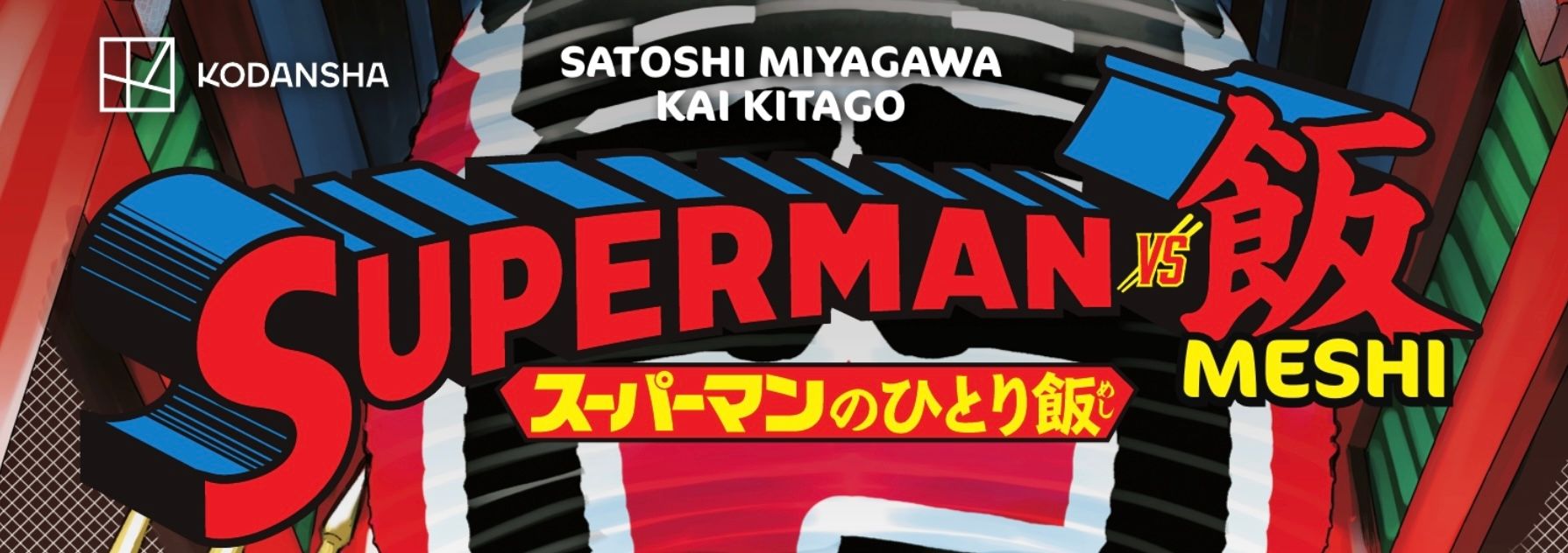
For additional context some of the other Superman books published in the last twelve months include: Superman Space Age which used a pre-83 wordmark matching it’s Pre-Crisis era story. The Return of Superman special used the period appropriate post-83 wordmark. Superman ’78 used the movie-styled wordmark, again appropriate for the subject matter. Finally, the Superman vs Meshi manga used a redrawn version of the post-83 wordmark.
It seems the only books that have had this new wordmark on or in them are ones written by Joshua Williamson and I wonder if it was him that was the driving force behind it. There doesn’t seem to be any traction around the company to make this new version stick.
I’d love to ask designer Darran Robinson about it, but it appears all his social media and web presence have been removed.
Looks like I posted too soon yesterday; we got some big Superman news for his birthday later in the day. When I was on my way to see Dune Part Two my wonderful partner mentioned “they are going with the Kingdom Come shield.” I know that they used the Kingdom Come shield for the name cards during the table read, but beyond that it was still speculation. She pulled up director James Gunn’s Instagram and I resisted the urge to pull over to take a closer look.
The live-action theatrical shield has been on a parallel evolution path with the comics. In the late 1940s the comics were just starting to solidify the shield to the “standard” we’d recognize today. Specifically look at the round bulbous serif on the bottom. An early example we can see in 1948’s Superman #53 released as the ten year anniversary issue. 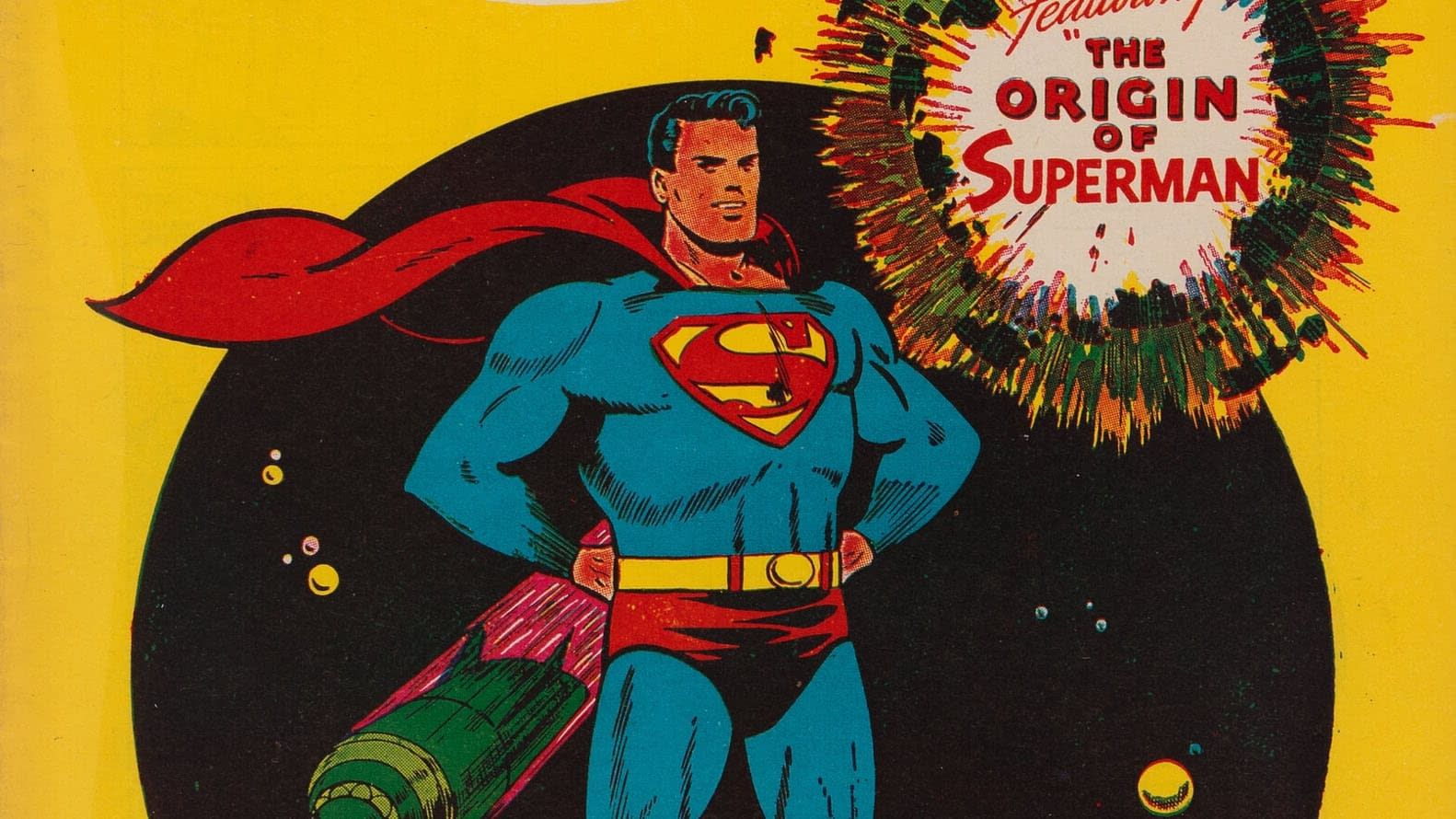 When Kirk Alyn hit the big screen in 1948 his S skips this round serif going with the shield that had been more common throughout the 40s. George Reeves and his Mole Men stuck with a very similar style S—although the color TV show years did flatten the top line.
 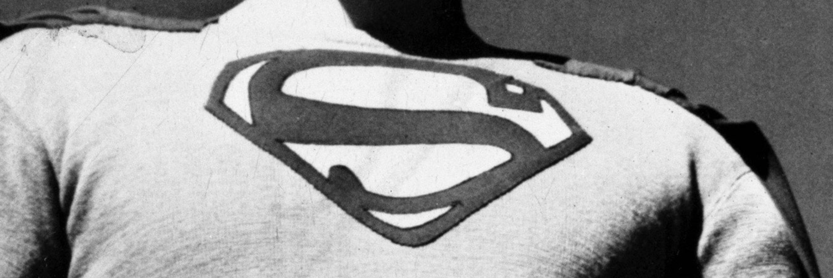 Fast forward to Christopher Reeve in 1978 and his shield also eschews that rounded serif. While the movie marketing material has it, Chris’ costume does
not. The size and shape are also adjusted with thicker red lines along with a new angle on the top serif. I find it interesting that I often see fans describe this costume as the classic despite this S being unique. Being a Salkind production the Supergirl shield stays close in line to this one.
Fast forward to Christopher Reeve in 1978 and his shield also eschews that rounded serif. While the movie marketing material has it, Chris’ costume does
not. The size and shape are also adjusted with thicker red lines along with a new angle on the top serif. I find it interesting that I often see fans describe this costume as the classic despite this S being unique. Being a Salkind production the Supergirl shield stays close in line to this one.
We don’t get another Superman theatrical release until Brandon Routh dons the cape in 2006. Again this shield evolves off the previous one. Missing that serif, but also getting much darker and smaller. The spandex era was over at this point so this S is no longer just sewn into the costume. The darker maroon almost brown color instead of red was this movie’s attempt at being modern. Hindsight is not kind to these colors.
That iteration only got one theatrical flight before Henry Cavill took the mantle. For the final time (so far) we skip the round serif, but gain a large serif at the top. I find this to be reminiscent of the early 1940s logos that these spun off of in the first place. Subsequent Cavill shields add a strip of Kryptonese text in the middle.
Corenswet’s new S breaks with this evolutionary path and gets its inspiration elsewhere.
With 1978’s Superman: The Movie, Jor-El wears the shield for the first time. Rather than standing for Superman, the S is now a family crest. The Superman name comes after the S in the movie. This is now an alien family crest that just so happens to be in the shape of the Latin letter S; the first letter of the character’s name. 2003’s Superman Birthright miniseries takes this to the next level. Explicitly calling the shield the Kryptonian symbol for hope. When Man of Steel was made ten years later they took this idea and ran with it. It informed their redesign of the shield making it a bit more “alien” while still being recognizable as an S. I think this story element and influence was taken to the next level in the recent animated series My Adventures with Superman. The shield for this show sticks with classic comic colors but simplifies the shapes into straight lines. It can easily be read as an S, but is also believable as an alien
symbol unrelated to human letters. This has been taken in the completely wrong direction with General Zod’s Kryptonian symbol of a Z in the comics. It makes no sense.
Now the Kingdom Come of it all. The late 90s was the height of the Dark Age of comics. Gritty, violent superheroes were all the rage. The question the book asks is how does a character from the Golden Age like Superman fit in this world? Is he “relevant” for today’s climate and sophisticated reader. Superman returns to a world that has largely forgotten about him with a new shield. Black replaces the yellow and the design is far simpler, more alien, and less obviously an S. This Superman previously wore the standard comic book S of the time, but his return in this changed world is decidedly darker. In trying to show the way to a new brand of heroes he veers into authoritarianism before ultimately failing.
I love this book, but the question “does Superman fit into modern times” is almost as old as the character! People were saying that in 1978 when the first movie was made and people are still saying that today. How many times do we have to ask this question and get the same answer? I hope this movie isn’t trying to ask this same question.
When The CW wanted to bring back Brandon Routh to the cape as an older Superman for Crisis on Infinite Earths it was decided it should an adaptation of the version we saw in Kingdom Come. He was given the backstory from Kingdom Come minus some important bits like Magog and his exile. Fitting with this tragic backstory is the red and black S. While this costume is a very close adaptation of the comic version it is still influenced by the Routh’s Superman Returns costume. There is a raised plastic element to the shield and the suit is textured rather than a flat blue fabric. In the comic we never see Superman in costume during the denouement. The shield is always red and black. In fact, the epilogue from Justice Society #22 and the pseudo sequel The Kingdom also never feature a red and yellow version of the Kingdom Come S. On television though we got a farewell/homage to the Reeves/Routh version of the character with him flying over Earth
and smiling at the camera. The black in his suit is replaced with yellow, but the shield maintains the abstract design. 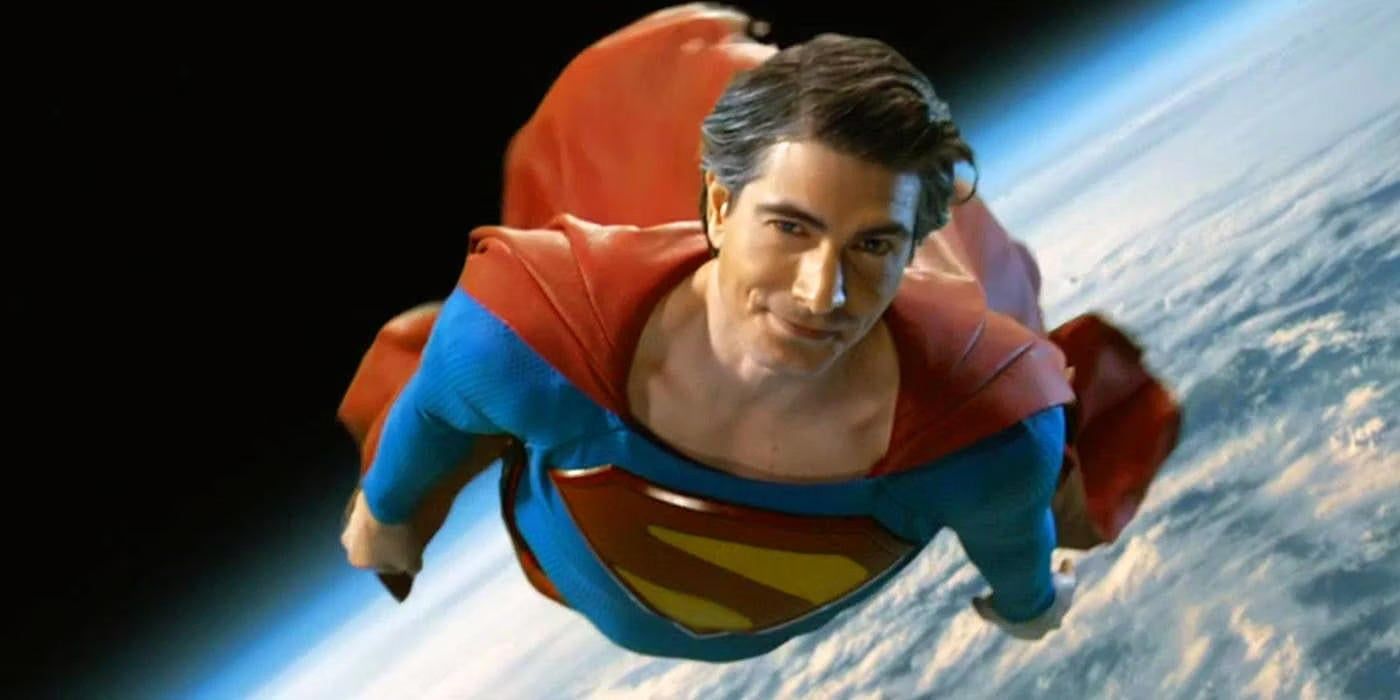 This new S is closest to that final Brandon Routh S; with the textures and materials most like Man of Steel. Rather than being made of a separate material like Crisis and Superman Returns the new shield is made from the same material as the costume like Man of Steel. This new shield also adds a yellow border further differentiating it. This S is not the Kingdom Come S. It’s Kingdom Come inspired, but it would be inaccurate to say it’s the Kingdom Come shield.
I personally don’t think this is a good choice for the S for this movie. I have never loved the idea that the S is a Kryptonian symbol and I think the biggest reason to use a design like this is to lean into that. I just want it to be an S. Maybe it becomes a symbol of hope in the universe after Superman’s appearance. I like that better thematically than him being born with a symbol of hope. I understand we’ve had 45+ years of it being Kryptonian, but the more alien we make it the less Superman it feels to me. This specific shield design was originally earned as part of a story that ties to years of continuity. It’s an old Clark. This is new movie is early days for this Superman. I think John Byrne explained the S really well in the Man of Steel miniseries. Clark saves the spaceplane without a costume, gets named Superman by Lois in the Daily Planet, and that name inspires the symbol. His mom makes the costume, him and Pa Kent make the S. But the biggest reason I think this
symbol is a mistake is it comes with too much baggage. Every theatrical adaptation has had it’s own unique take on the shield signifying it is something new. Especially, Superman Returns and Man of Steel. Using an alteration of an existing comic design doesn’t make it instantly associated with the new movie. You post a black and white version of this and it could be Kingdom Come it could be Crisis on Infinite Earths or it could be this movie. You post a black and white version of the Man of Steel shield and you know what it is.
I haven’t touched on my feelings on everything else we know about this movie so while we are diving deep lets look at the rest of what we know.  I like James Gunn. I think he is a good filmmaker and storyteller. I think he’s coming from the right place in making this movie based on everything he has said about it. He’s mentioned how important it is to his relationship with his father and he is concerned with the legacy of the character. There are things about Gunn that make me nervous though.
The first is his penchant for taking a lesser known character and just completely changing them to fit the story he wants to tell. It’s fine if you don’t have any love for a particular character (like Vigilante in Peacemaker), but can really hurt (like Adam Warlock in Guardians of the Galaxy).
He’s also taking a usual suspects approach to some of the cast and crew. The Guardians films are great, I’m not denying that. But do they have the best cinematography and best music in the film world right now? I don’t think anyone would say they do. I want this movie to be transcendant. I want it to be next level. It can’t just be another superhero movie. It needs to start a whole new universe and at the same time continuing a character legacy going back almost 90 years. This isn’t Star Lord and Rocket Raccoon. Using the same cinematographer and composer might be comfortable, but are they going to bring this to the next level it needs to be? We know he’s pals with Nathan Fillion, but do we need Fillion as Guy Gardner in the first new Superman movie? How about his brother as Max Lord?
Final point on Gunn, is the Brightburn of it all. Yes Gunn didn’t write or direct this movie, but he had a hand in producing it. Not only was this a movie I didn’t like, the evil Superman trope is one of my least favorite ideas in fiction. It shows a fundamental misunderstanding of what makes Superman special. Now I like The Boys and Invincible, because those stories aren’t simply about “what if Superman went bad”. They are about what would the rest of the world do if there was someone with Superman’s powers without his moral compass. It works as metaphor to actually powerful people and how we handle abuse of power. Versus an Injustice which has a focus on how cool it would be for Supes to rip someone in half. It is a videogame.
Our main cast for the movie? The big three of Lois, Clark, and Lex? They are great. The minute Rachel Brosnahan was announced I started watching Mrs. Maisel and she’s fantastic. She is like Lois Lane jumping off the page into real life. David Corenswet has a great look and was great in Pearl. The dude is giant, which really sells it for me. I’ve liked Nicholas Hoult in everything I’ve seen him in and he’s already shaved his head. Win, win, win.
The rest of the cast? No complaints besides why are all these characters in a Superman movie? Seems like a random bunch and seems like maybe too many characters for this movie that we want to focus on Big Blue! Miss Teschmacher and Otis tie it very closely to the Donnerverse so it’s strange he went with them rather than Mercy Graves or someone new. I know lots of the choices are dead ringers for their comic counterparts (looking at you Skyler Gisondo as Jimmy Olsen) which is cool, but I like when they throw curveballs too. Lawrence Fishburn was inspired casting as Perry White.
Just after I published I saw the report that Wendell Pierce has been cast as Perry White. Looks great!
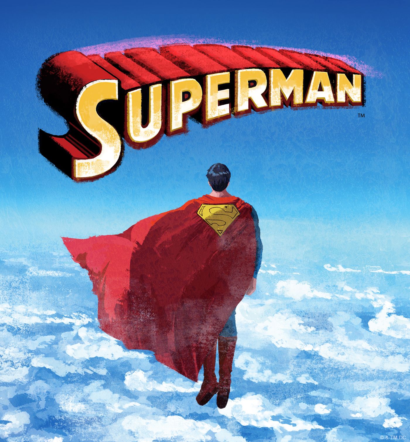
Last bit I have to say on this movie right now is the about the title. I’ve never loved Superman Legacy as the title, but I do like the sentiment. When Superman Returns came out it felt like the perfect title. It was a continuation of a long dormant franchise, it was about Superman coming back after a long absence, and it echoed Tim Burton’s Batman Returns. Man of Steel was also perfect. A reboot with a title echoing The Dark Knight (which was also part of a reboot of Batman). Superman: The Movie made sense for the first one and even echoed Batman: The Movie (1966). Yes, I always call it “The Movie” because I like the 1970s vibe it gives and it’s on some advertising despite not being officially the title. Changing the title of this movie to simply Superman is undoubtably going to cause confusion. But it’s putting the flag in the sand saying this is going to do for Superman what Batman (1989) did
for Batman. I hope they are right.
PS Maybe we shouldn’t have been surprised by this shield at all since Gunn basically told us almost a full year ago on BlueSky.
Superman’s Birthday
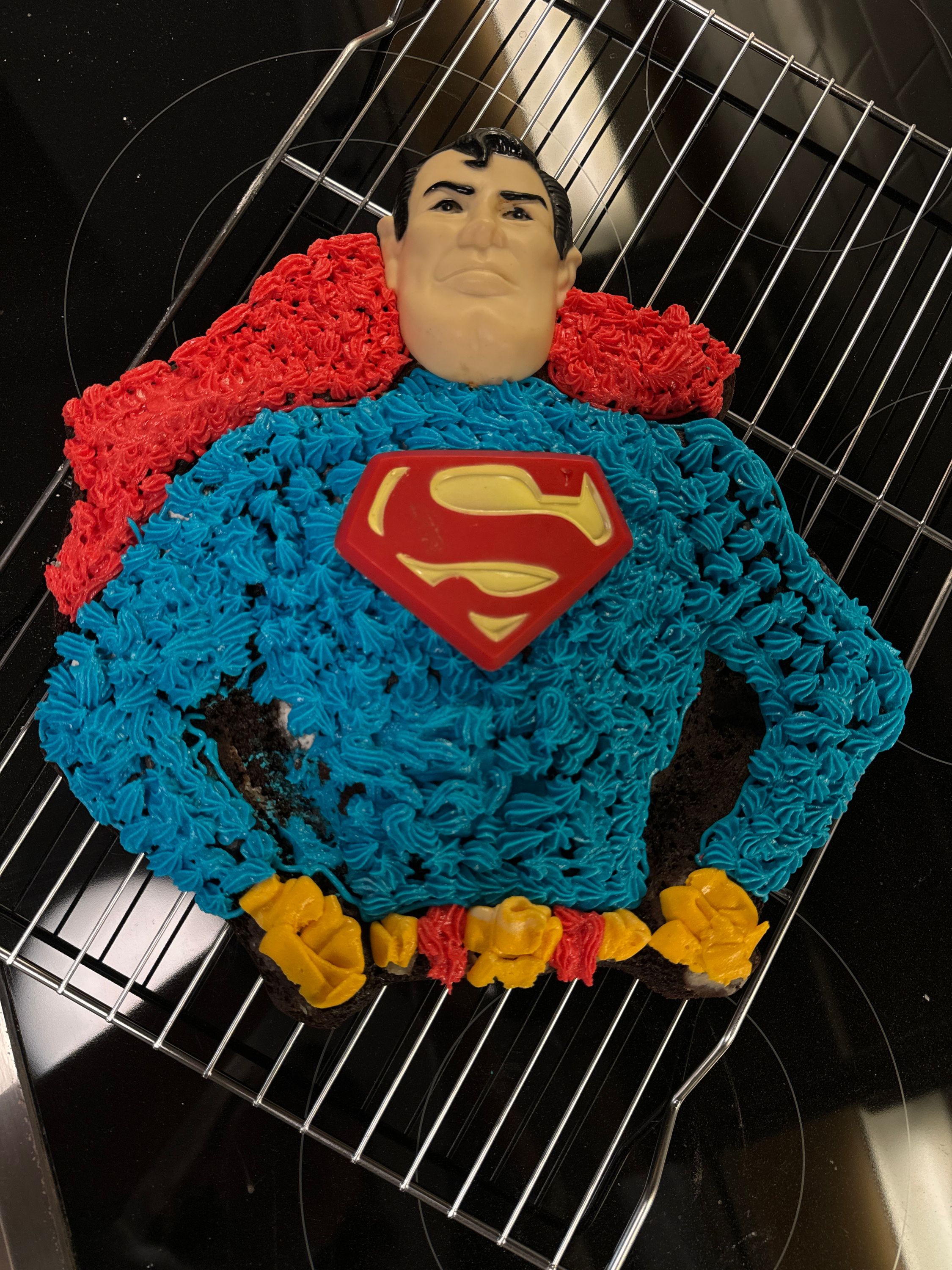
I couldn’t let the once every four years Superman’s Birthday go by without a little celebration.
Last May on a Superman collector’s Facebook group, someone posted for sale a Superman (or Batman) cake pan with original accessories and instructions. Originally made by the Wilton company in the late 1970s. I have vivid memories of having this cake as a child and loving it. The price was right, so I picked it up.
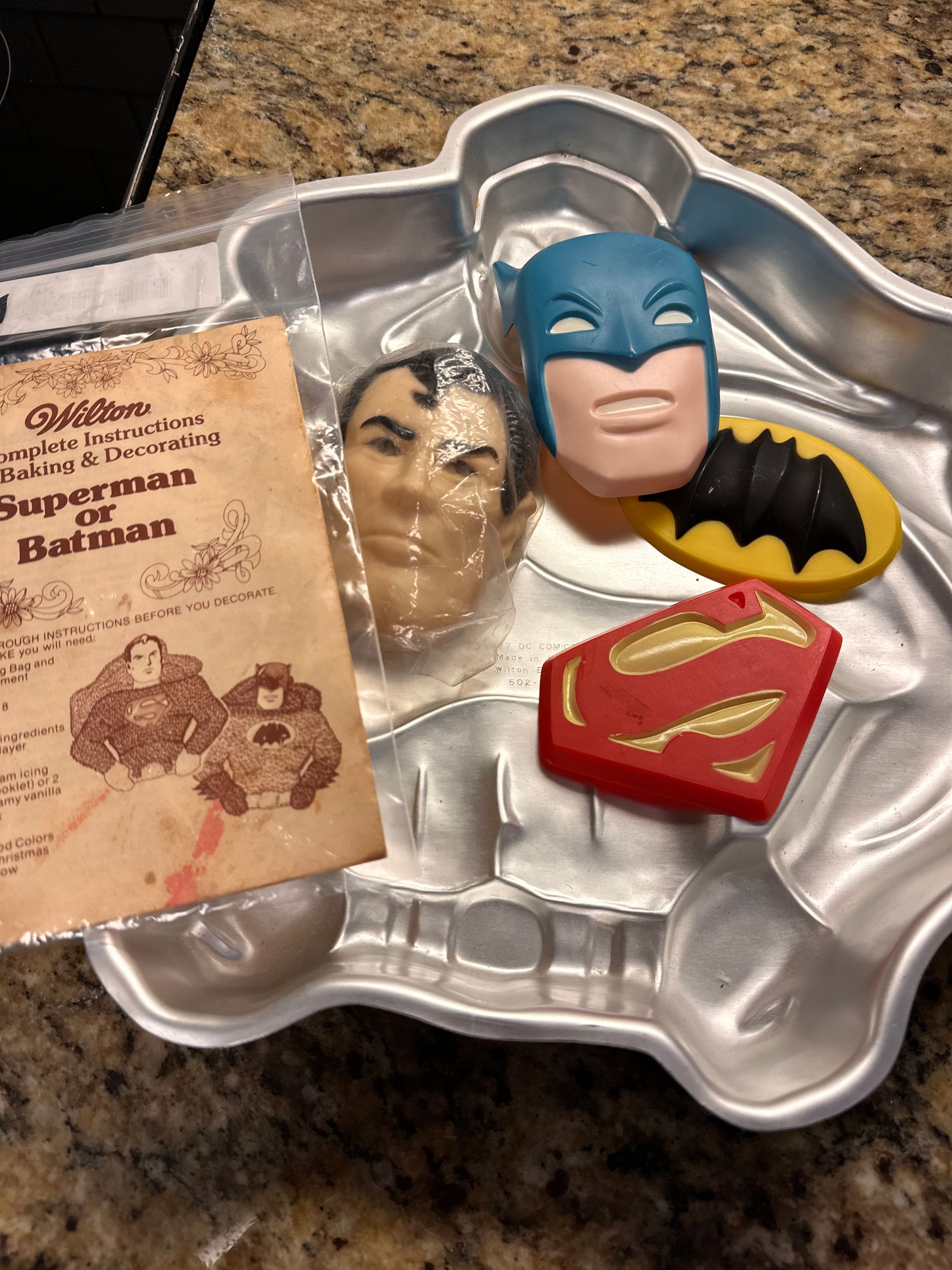
I’ve been waiting for the right moment to use it and what better time than Superman’s birthday?
- It’s the 22nd leap day since 1938 so the Man of Tomorrow has plenty of good years ahead of him
- We are rapidly approaching the 86th April 18 since 1938
- This year will be the 11th Superman Day June 12th (originally Man of Steel day) since DC announced it in 2013 to coincide with the release of the Man of Steel movie
- Finally, the best Superman holiday of them all, Miracle Monday, was first celebrated with the release of the book May 18th, 1981; 43 years ago this year
Supermen
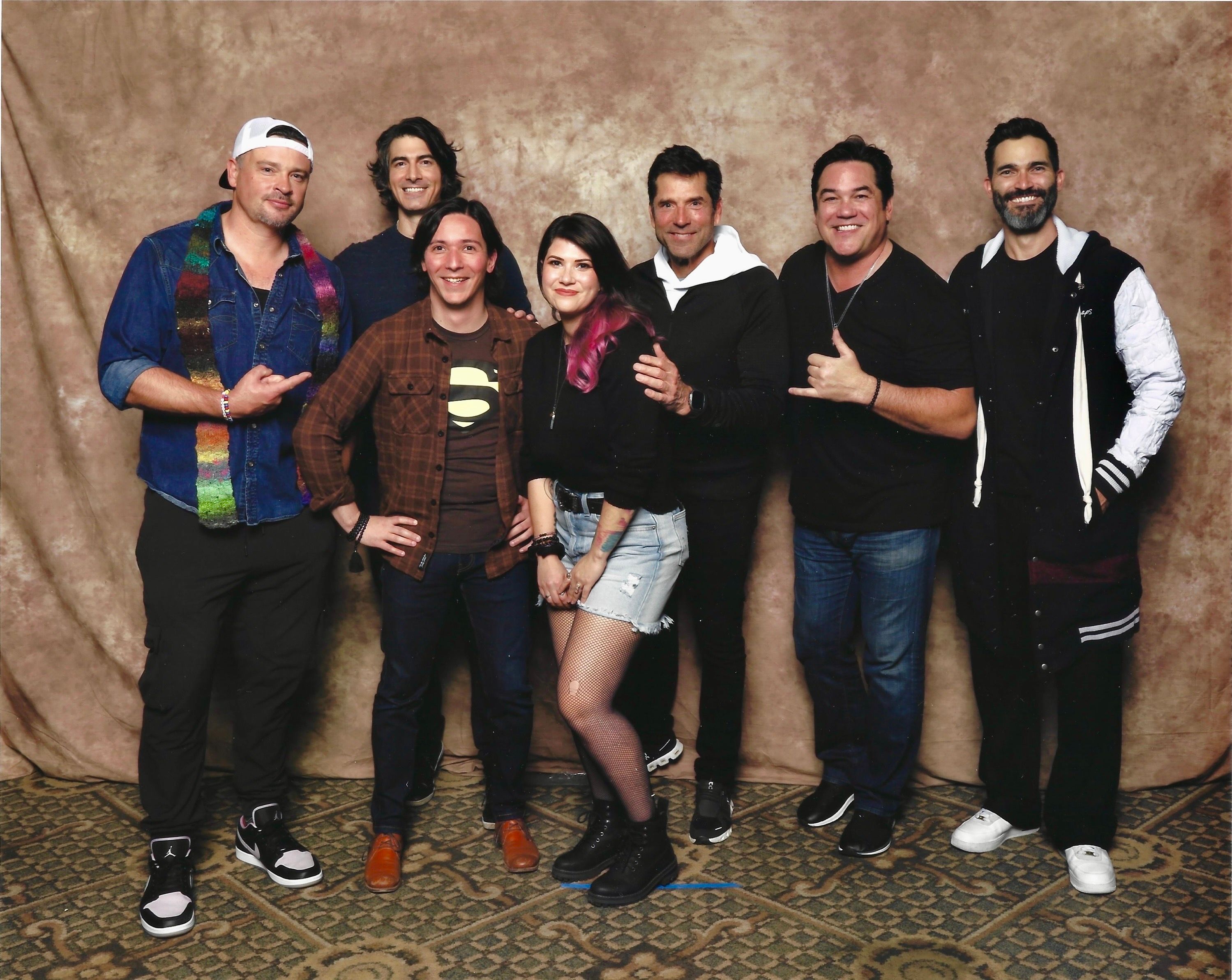
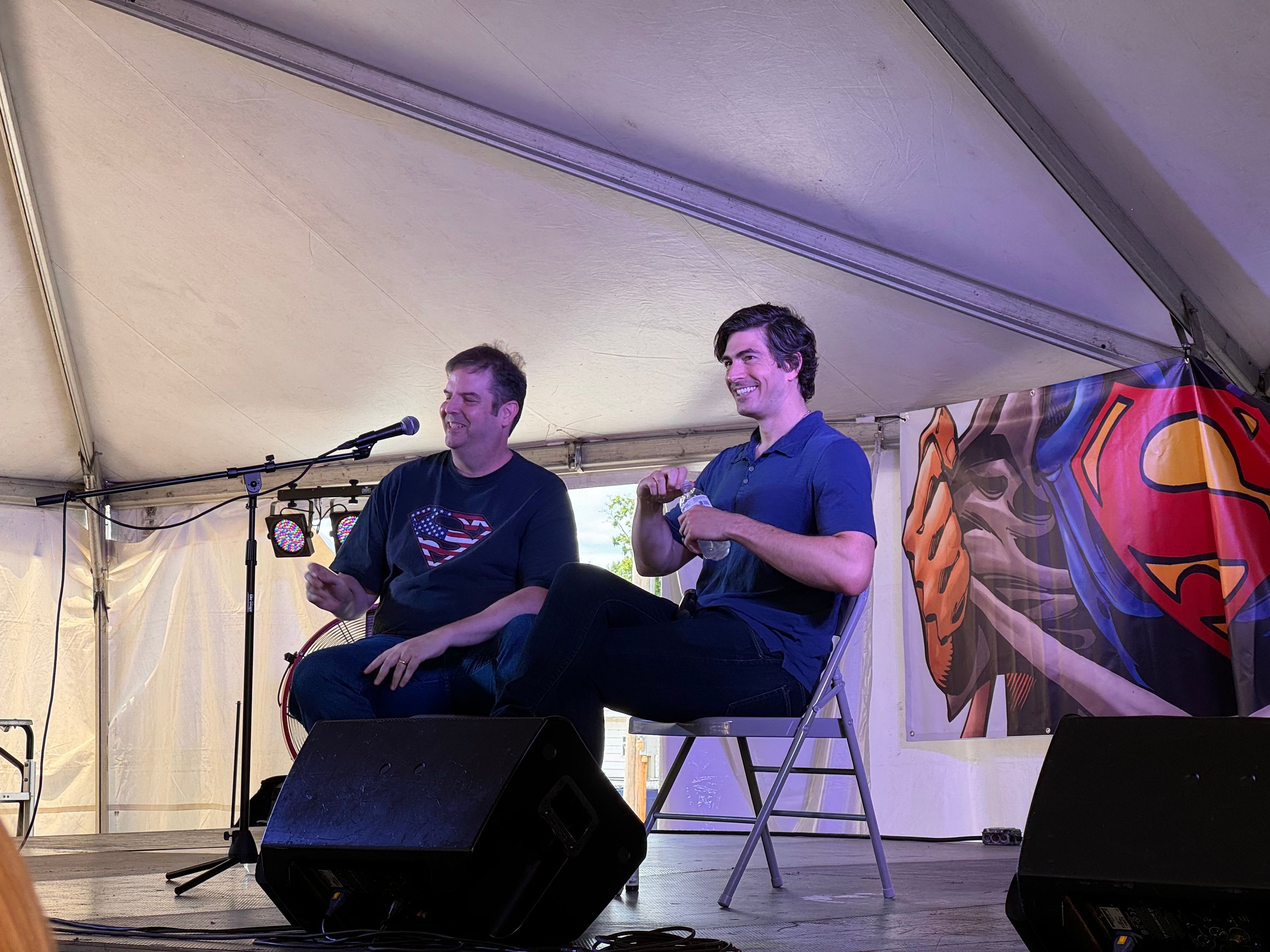
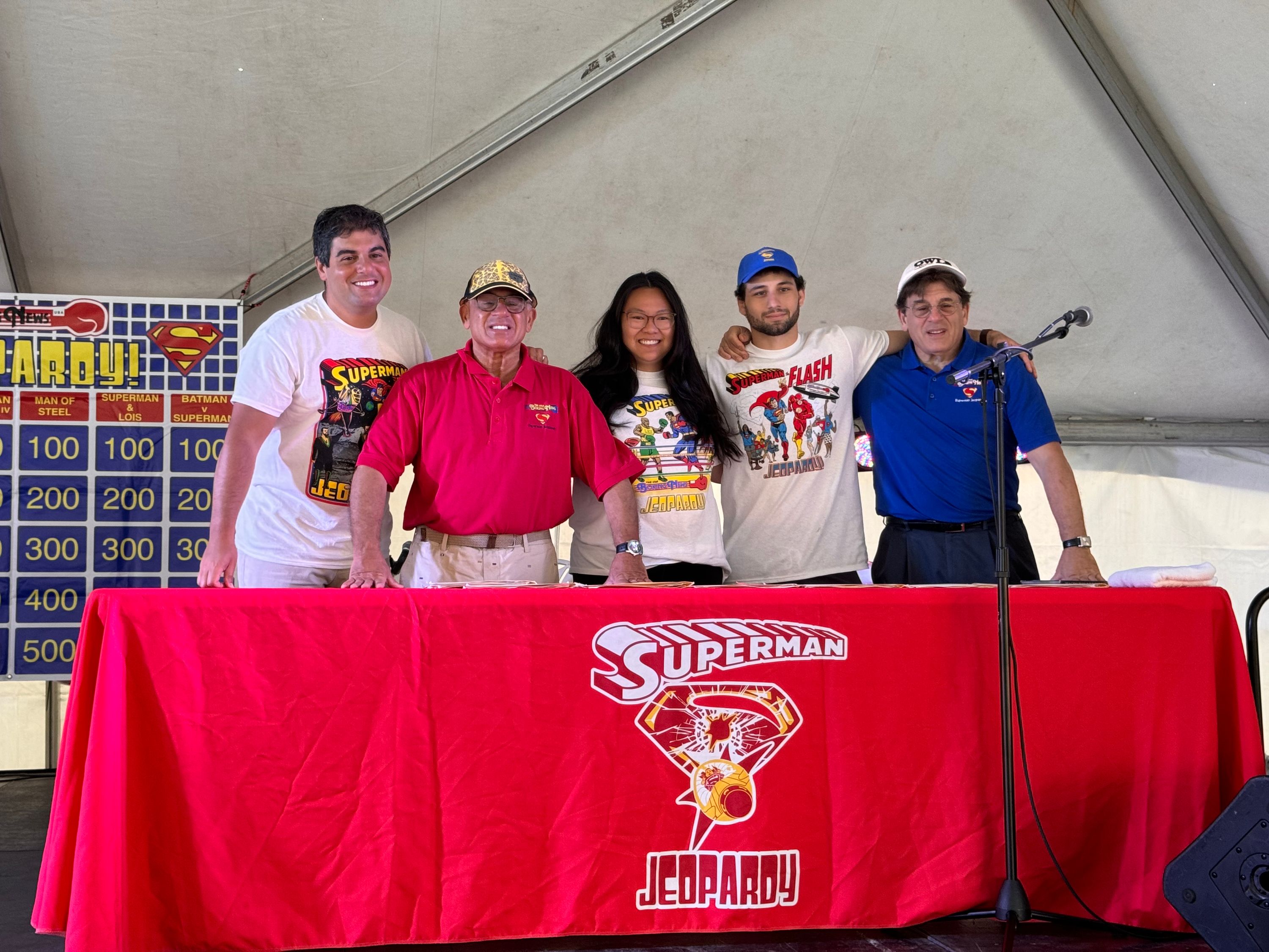
Over the weekend I went to the Rhode Island Comic Con. The main draw was, of course, the above picture with Tom Welling, Brandon Routh, Gerard Christopher, Dean Cain, and Tyler Hoechlin; but there were lots of other Superman-related actors in attendance as well. If we consider Doom Patrol and Titans Superman related, there were 23 actors from Superman projects and one director (plus Brent Spiner who was cast but then dropped as the President on Supergirl and Tim Daly who cancelled). I tried to prioritize who I was meeting since there was no way I would be able to meet 22 people in one day!
Our first stop was the Smallville Fathers and Sons panel with Tom Welling, Michael Rosenbaum, John Schneider, and John Glover. The panel was short and there wasn’t much insight shared beyond what we get on the weekly Talkville podcast. Schneider did talk a bit about his return for the final episode which was cool to hear. Overall the panel they did at the Superman Celebration last year was better and more fun. Last year I went to Smallville Nights twice so I didn’t do that again this year. With time being as it is, I didn’t get photos or signatures from the two dads, but did walk by them on the convention floor.
Back in 2021 Stacy Haiduk and Ilan Michael Smith from Superboy were at the aforementioned Superman Celebration. I met them both and got a photo signed with a spot for Superboy Gerard Christopher right in the middle. I’ve been waiting patiently for a chance to meet Mr. Christopher and get his signature and this was finally my chance. He was super gracious to us. We talked briefly about his recent interview on the All-Star Superfan Podcast which I loved. We bumped into him later in the day and he was still so friendly and I loved that New York accent. Real stand-up guy.
After meeting Gerard we went around the corner to meet the Super Sons Alex Garfin and Jordan Elsass. We ended up waiting for them at their table for more than 30 minutes but then had to give up. I assume they were late because of the poorly organized photo ops. We looped back around at the end of our day and finally caught them. They both felt like their characters to me which is super interesting. Jordan mentioned how tough it was to live in Vancouver just like Jon Kent would complain about living in Smallville over Metropolis.
While we were waiting for the boys we did see John Ratzenberger across the aisle. He’s been in so many movies that I love him in, but of course his Superman the movie claim to fame is close to my heart: “Absolutely impossible, sir. They have the new B20 low level avoidance systems.”
The very last stop of the day was the Brandon Routh panel. Since I had met him at the 2018 Celebration I didn’t do any additional meet and greet with him separately. This panel also paled in comparison to Celebration. This is pretty disappointing considering since 2018 he’s had the opportunity to revisit the role which is something he expressed great interest in. His answers were more limited due to the ongoing SAG-AFTRA strike than it seemed the Smallville guys were. It didn’t help that he was running late and the panel felt very rushed.
The overall convention experience was one of the worst I’ve seen. I’ve been to many cons over the years both large and small (from New York Comic Con to LadiesCon in Somerville) and I’ve never seen a more poorly organized set up. First thing when we walked in at the security check was a no outside food rule. It’s absurd that I couldn’t bring in a pack of Twizzlers and would be forced to buy food there. I have several dietary restrictions which makes eating out a complicated endeavor. The next issue we ran into was with the panels. The two I went to were in a separate building requiring a second security check every time. The audio at the panels was absolute garbage. It was hard for us to hear what the panelists were saying and it was hard for them to hear questions from the audience. The camera set up dead in the middle of the room was terrible placement. They told everyone to hold photos until the end of the panel but then each time rushed the
panelists off stage. Crappy experience. The photo op experience was also poorly managed. The photo ops were up on the 5th floor of the convention center. Everyone looking for their photo op congregated in a foyer as a big sea of people. The sea of people needed to be funneled through a double door choke point into the ballroom with designated lines for each photo op. When you heard them call out the name of the photo op you had to raise your hand and push through the crowd to find the line to stand in. It was also extra confusing because there were two Supermen groups (one without Gerard Christopher). They were about 20 minutes late to call out the Supermen group photo and there was another 20 or so minute wait before we got in front of them.
Once the photos started it was fast. You got about 15 seconds there to take the photo and go. There was a problem with our first photo so they called us back for a second one which gave me an additional few seconds with them. It was so cool to see them all together. Scrolling through social media I always see bad photoshop jobs putting these guys in the same place and here I was seeing it for real. This was also a great way to see Dean Cain without paying for his autograph. Dude really bums me out. Plus it was a way to see Welling, Routh, and Hoechlin all again and not feel bad for wasting money! When I sent the photo to my father he told me I looked like I had just won a million dollars. Can’t describe it better than that.
The people I missed? Anna Diop and Ryan Potter from Titans; April Bowlby, Diane Guerrero, and Stephanie Czajkowski from Doom Patrol; Anson Mount and Evangeline Lilly who were on Smallville; Harry Lennix from Man of Steel; Nolan North from Young Justice; Phil Lamarr from Young Justice and Supergirl; Denise Crosby who was on Lois & Clark; Chad Coleman from Superman & Lois; and Amy Jo Johnson who directed an episode of Superman & Lois.
My Adventures watching My Adventures with Superman
A few weeks ago I finished writing my recaps of each episode of My Adventures with Superman for Multiversity Comics. After a brief hiatus I wanted to write about the experience and my feelings on the show as a whole now that the first season is complete. Figured I’d put my six hours flight to good use.
The conceit they go with for television recaps is to organize them into “five thoughts”. It was helpful to have a structure like that because it prevented me from writing a boring beat-by-beat recap of each episode. While each piece did include a recap I was able to structure them around themes and my ideas. It even let me put in some Easter eggs of my own. While each article was a lot of work it was ultimately rewarding to be able to write about a great new Superman adaptation for an audience.
One of the things the show did really well is demonstrate how great Superman really is as a character. It’s been brought up in both a Superman Homepage interview with producer Josephine Campbell and on the Always Hold on to Smallville podcast but the moment where he says to Lois that he didn’t know if he was bullet proof but knew she wasn’t will be remembered like the Regan scene in All Star Superman. Quintessential Superman.
The show shows us in no uncertain terms how special it is to have someone with the power of Superman who chooses to use it for good. The opposite of the old absolute power adage. Characters like Ivo, Waller, and Alex (definitely Luthor) are all well chosen to demonstrate the opposite. None of them can fathom that Superman uses his abilities for good. This is key to getting Superman right and this show nails it. Even when they dip into the alternate evil Superman well it’s done to reinforce how special Superman really is. Because not everyone with this power would do what he does. Also note the main evil Superman we see is Overman from Grant Morrison’s Animal Man not Ultraman or any other variant as I’ve seen speculated.
At first glance it may seem that Clark is the real person and Superman is the made up identity in opposition to the famous Kill Bill scene. But I think that when you look closely there are three personas. There is Clark Kent the reporter. This Clark needs to hide who he really is to fit in with his coworkers and the rest of the world. There is Superman the hero. Lois and Clark explained it well when Clark said “Superman is what I can do”. Superman is Clark at his most selfless best. Then there is the Clark that he can be with Jimmy and Lois when they discover his secret. It’s the Clark from the farm in Kansas. This is the real person. I love that the show handled it with as much care and depth as they did. The “who is the real person” debate has been had for ages and I’ve always felt it was more complicated than a duality. The best written Superman stories often show this.
The show goes a step further by exploring Clark’s identity by making him afraid of being different. The first episode is titled “Adventures of a Normal Man” which he wishes he could be. This reminded me of Smallville, where there were many moments when Clark just wanted to be a normal Kansas kid. I loved the way MAWS used his fears of being different along with the General Lane story. The revelation that his home planet of Krypton might be an invading force and that is why he’s special is so shocking to Clark. The moment where Lois tells Clark that he could try being normal for a while hits Clark so hard. Throughout the season he becomes more comfortable with who he is and confronts his identity head on.
I read once that Donner said if they could make the Lois & Clark relationship believable the whole movie would be believable. They clearly took that to heart here and made the Lois & Clark relationship the core of the show. This relationship is so key to the character and it gets the attention it deserves. Unlike the last solo Superman show which I think made the core relationship an after thought.
The best part of TAS is the way they adapted the villains. Taking a page out of the Batman shows book they depicted some of the most iconic interpretations of the rogues gallery. MAWS didn’t quite live up to that mark. The choice to tie all the antagonists to Zero Day and Kryptonian technology is an excellent one. It makes it personal for him and pays off when he discovers their purpose. But I don’t think there is a reason for any of these characters to keep their tech after they’ve been caught. I also don’t think they chose the best characters. Heatwave? Mist? Livewire in particular is overshadowed by her TAS counterpart. Maybe like Superman & Lois they were given a list of characters they could use and it was very limited. I hope this is something that James Gunn fixes now that he’s in charge since it’s been a problem since Smallville. TAS has possibly the best versions of Bizarro, Parasite, Metallo, and Mr. Mxyzptlk. Tough to compete with that. I will say this Mxy was a ton
of fun and it allowed them to really pay homage to different eras of the character. I like the idea that there is one Mxy that just looks different depending on the universe he’s in. Much better than when they do that with Darkseid.
A great part of our modern internet era is our ability to see behind the scenes of this show in a way that wasn’t quite possible in the 90s. Artist Kris Anka has shared some of his designs for the Superman costume. Producer Jake Wyatt said they wanted Jor-El to look like Big Boss. We’d be lucky to get this insight into TAS in DVD special features back then!
Speaking of DVD I am hoping and praying we get a physical release of this show. Warners is a horrible company in so many ways (lots of which we can thank the constant mergers and acquisitions of the last 30 years for) but one thing they do get is their fans still like physical media. Even Scooby Doo and Krypto Too got a DVD release. Maybe they’ll wait until after season two airs. It would be nice to have a complete twenty episode blu-ray set. Even better would be if this show continues past the two seasons, but that seems unlikely just due to WB being bad.
Adventures of Superman
First things first: I’ve got a small announcement. The blog will be going on a hiatus while I write weekly reviews for Multiversity Comics for the new animated series My Adventures with Superman! I’ve written for the website before and I’m excited to be covering this highly anticipated series.
In celebration I thought I would take a look back at the “Adventures of Superman” title and how it’s been used over the years.
Back in February 1940 radio listeners were treated to the first episodes of “The Adventures of Superman”. 15-minute serialized episodes airing several times a week. Long time Superman fans will know the importance of the radio show in Superman’s history; it’s responsible for introducing many of the elements we’ve come to associate with the Man of Steel.
Later that same year the cover to Superman #7 described our hero as the “world’s greatest adventure-strip character”. This text remained on the cover through issue 20 and with issue 24 it was briefly changed to “America’s favorite”; World War II nationalism and all that.
This was also the title used for George Lowther’s 1942 novel; showing “The Adventures of” was catching on and had staying power.
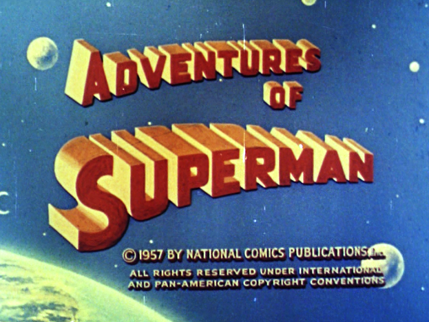
A decade later and in the new medium of television we would get a continuation of sorts of the radio show. Adventures of Superman starring George Reeves remains a favorite of mine and many fans. It’s hard to overstate how influential this show was to a generation of viewers. To this day this might be the most well known Adventures of Superman.
Fast forward to the mid 60s when Filmation introduces us to The New Adventures of Superman. This emphasis let viewers know this was a new thing and not the show that had been in reruns for years. Beau Weaver who voiced Superman in the 1988 Ruby Spears cartoons mentioned this being an issue for his cartoon. Since it was only called Superman it didn’t let anyone know it was new!
And the naming of the show was unfortunate. It was called simply Superman. Better branding might have resulted from naming it Superman: The New Adventures or The All-New Superman. A listing in TV Guide or the newspaper TV listings that read simply “Superman” did not spotlight it as a new series, did not distinguish it [enough] from reruns of the old George Reeves show or even from Super Friends.
Jump ahead another decade to the comics of the 70s. DC wanted it’s new direction of the Superman books to really stand out. They started with a big number 1 despite it being issue 233. Number 1 issues are often big sellers and it let readers know this is a good jumping on point. More to the point though this Neal Adam’s cover read “The Amazing NEW Adventures of Superman”. This stuck around through issue 241 and from 242 to 247 it read “The Amazing Adventures” dropping the new.
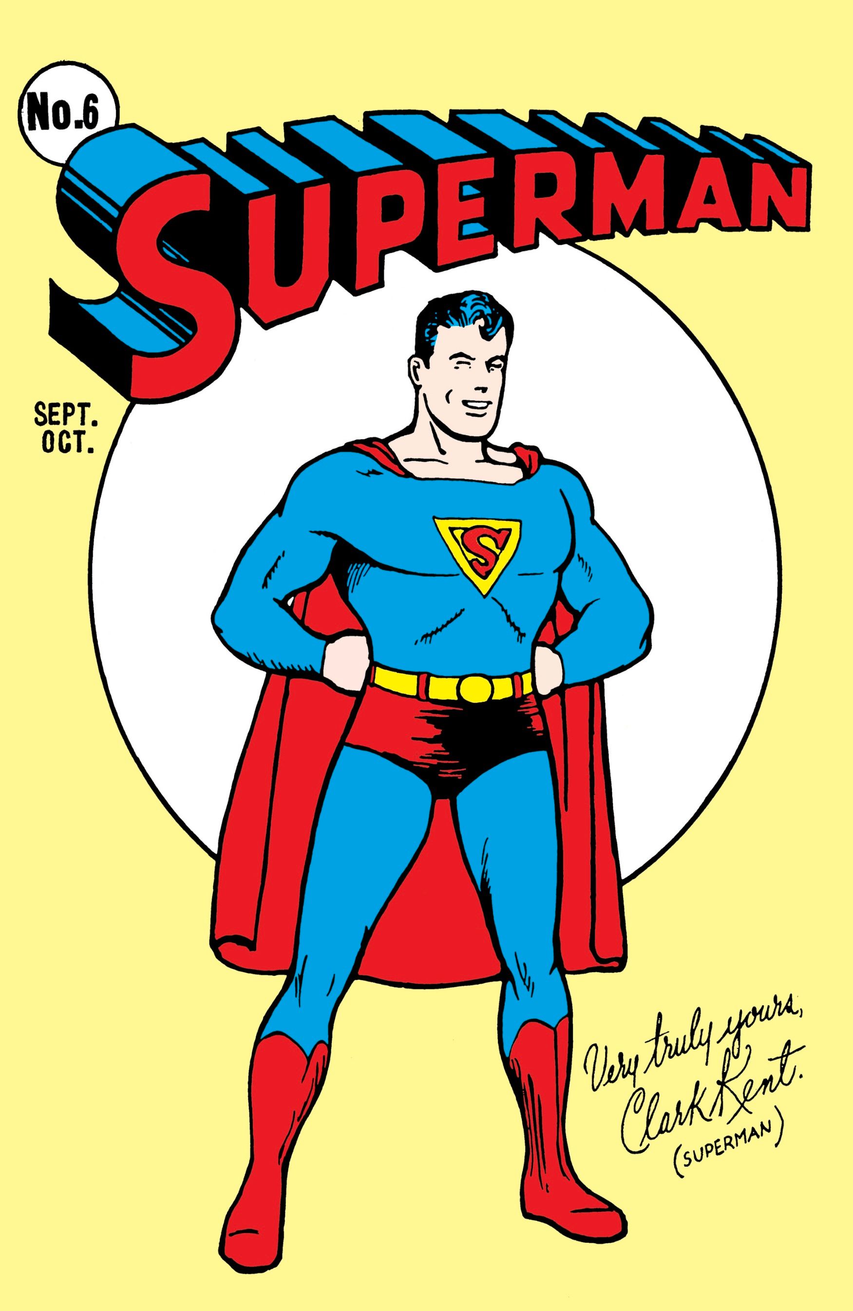
In 1987 DC gave John Byrne a new Superman #1 after his Man of Steel miniseries to mark the new era of the Man of Tomorrow. DC didn’t want to lose the legacy numbers from Superman volume 1 though. So we got the first comic officially titled “The Adventures of Superman”. The first logo had Superman inverted from how we were used to it reminiscent of the Fleischer cartoons. The comic creators of the time were heavily influenced by the television show and this was only one small nod they included. This logo lasted until issue 456 with all but one cover by Jerry Ordway.
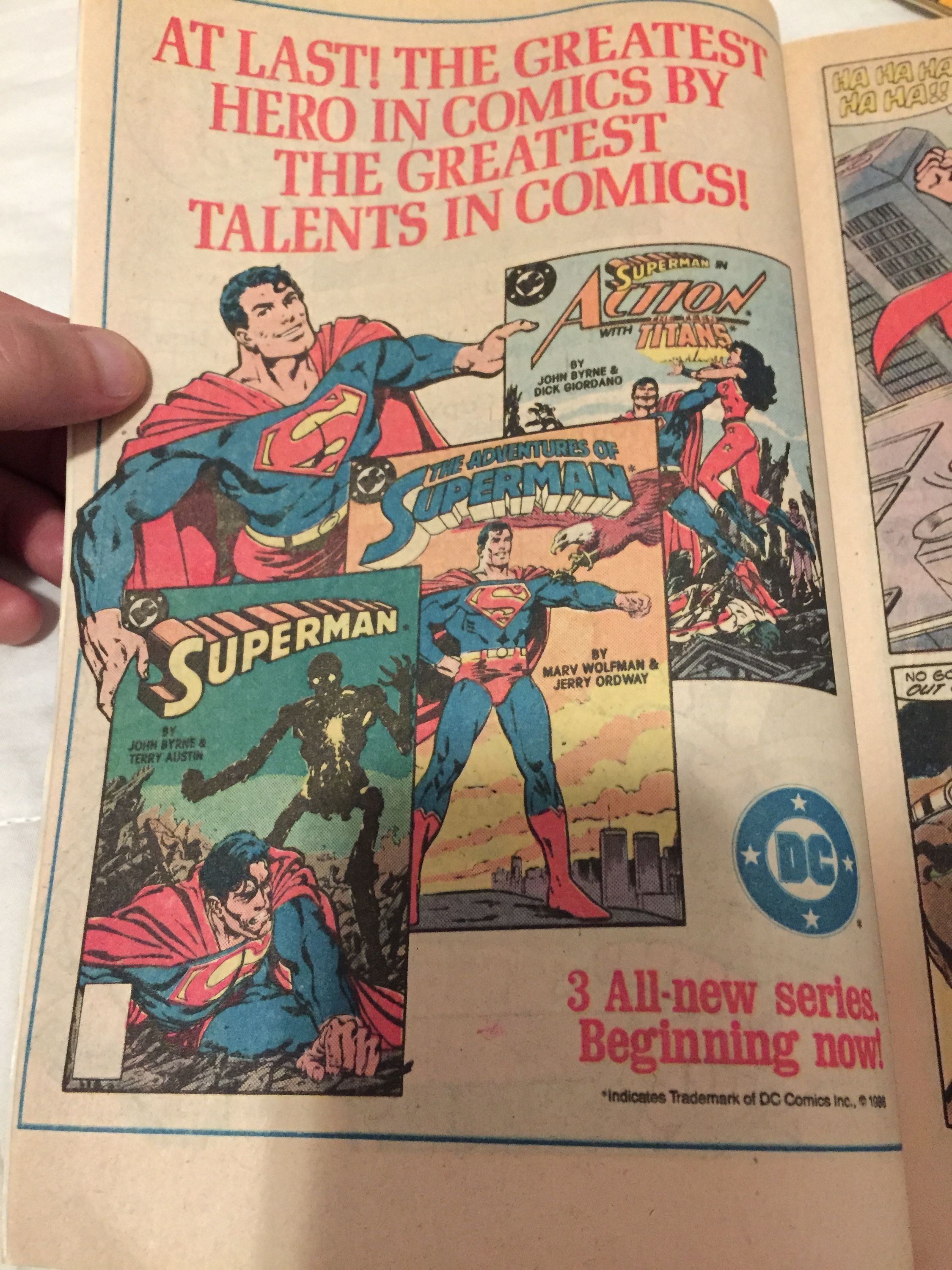
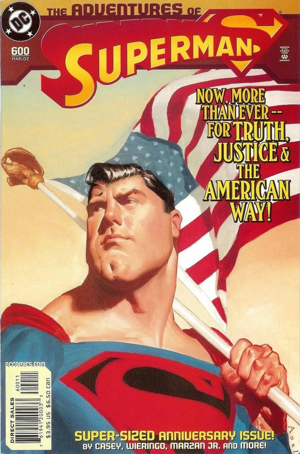
After this the logo took the standard Superman wordmark from 1983 and added a flat “The Adventures of” on top of it with a drop shadow. This stayed consistent until we got the electric Superman in issue #546. It returned again for issues 558-575. We then got one issue with the electric Superman logo mixed with a preview of the new “The Adventures of” text. Stylized like the Superman logo but included the little extender on the A from the first logo. This version stuck around until 598. Issue 600 brought us what I affectionately call the SUPERMANS logo due to the S after the word. This lasted until 626.
Then we drop “The” and it’s just Adventures of Superman. Similar to the 577-598 look, but with the extender on the D instead of the A (since the A starts the title and not THE) and a more stylized S. It lasted this way until The Last Adventures of Superman #649. This was the end of The Adventures of Superman for a bit as the title became just Superman again. Check out the cover gallery at the DC database to see them all.
The next time we’d see Adventures of Superman on a comic is for the short lived digital first series of out-of-continuity stories. So many of these are great and I wish they sold enough to warrant an ongoing non-canonical Superman anthology book.
Most recently, Jon Kent’s current series takes on the storied Adventures of Superman title, but with a Jon Kent subtitle. This is just a miniseries and is a follow up to Superman: Son of Kal-El.
Finally, we have our honorable mention Lois and Clark: The New Adventures of Superman. They took Beau Weaver’s advice to heart with this mid 90s show and emphasized this wasn’t your dad’s Superman show.
Superboy and Supergirl had adventures too over the years. The Superboy television show changed it’s name to The Adventures of Superboy for it’s final seasons–along with the tie-in comic. We had a Supergirl book titled the “Daring New Adventures of Supergirl” and had an “Adventures of Supergirl” book that tied in with the recent CW television show.
I love the idea that Superman’s “exploits” are so commonly known as adventures. We always say he fights a never-ending battle, but calling them adventures sounds so much more positive, exciting, and forward thinking to me. Let’s hope “My Adventures With Superman” continues in the tradition of the Superman we love in more than just name.
Fleischer Follow-up
Last month I wrote a review for the Blu-Ray release of the 1940s Fleischer theatrical shorts. In it I tried to be as detailed as I could. I spent a lot of time on the presentation like the packaging, menus, and video quality. I noted an error in the intro of Volcano. Overall the clean bright image really won me over. Especially when I compared it to some shots of the earlier releases in my collection.
Well, this weekend someone went on a damn-fool idealistic crusade and detailed every single error in this new version. They used the Bosko release as the reference for most of it, but have some other comparisons as well including an old laserdisc release. They have identified 66 Picture and Sound Errors. Some of them were included on the earlier official DVD, but some of them are new to the Blu-Ray making this the most error-prone release yet.
A big theme that stuck out to me is the restoration reuses intro and outro audio—likely from the cleanest source they could find—but the originals had unique intro and outros for each short. They weren’t just cut and paste jobs; they were each made with care. I noticed the abrupt music ending in a few shorts, but they were the same on the official DVD so I assumed it was correct. I didn’t compare it to the Bosko which is clearly better. I wish that I had taken the time to really compare these side by side, but I’m glad someone did. This YouTubers attention to detail is what Warners is lacking.
Much of the early chatter around the release said that Warner Archive should have handled the restoration rather than Warner’s traditional home video department. I see the logic in the Archive department working to put out the most historically accurate versions of less commercially viable projects. With the regular home video department focused on a more mass market. I understand why they made the picture quality as clean as possible without the grain to appeal to a wide audience. But actual errors in presentation are inexcusable.
If you care about the nitty gritty details I recommend watching the whole comparison. His full review is also worth checking out.
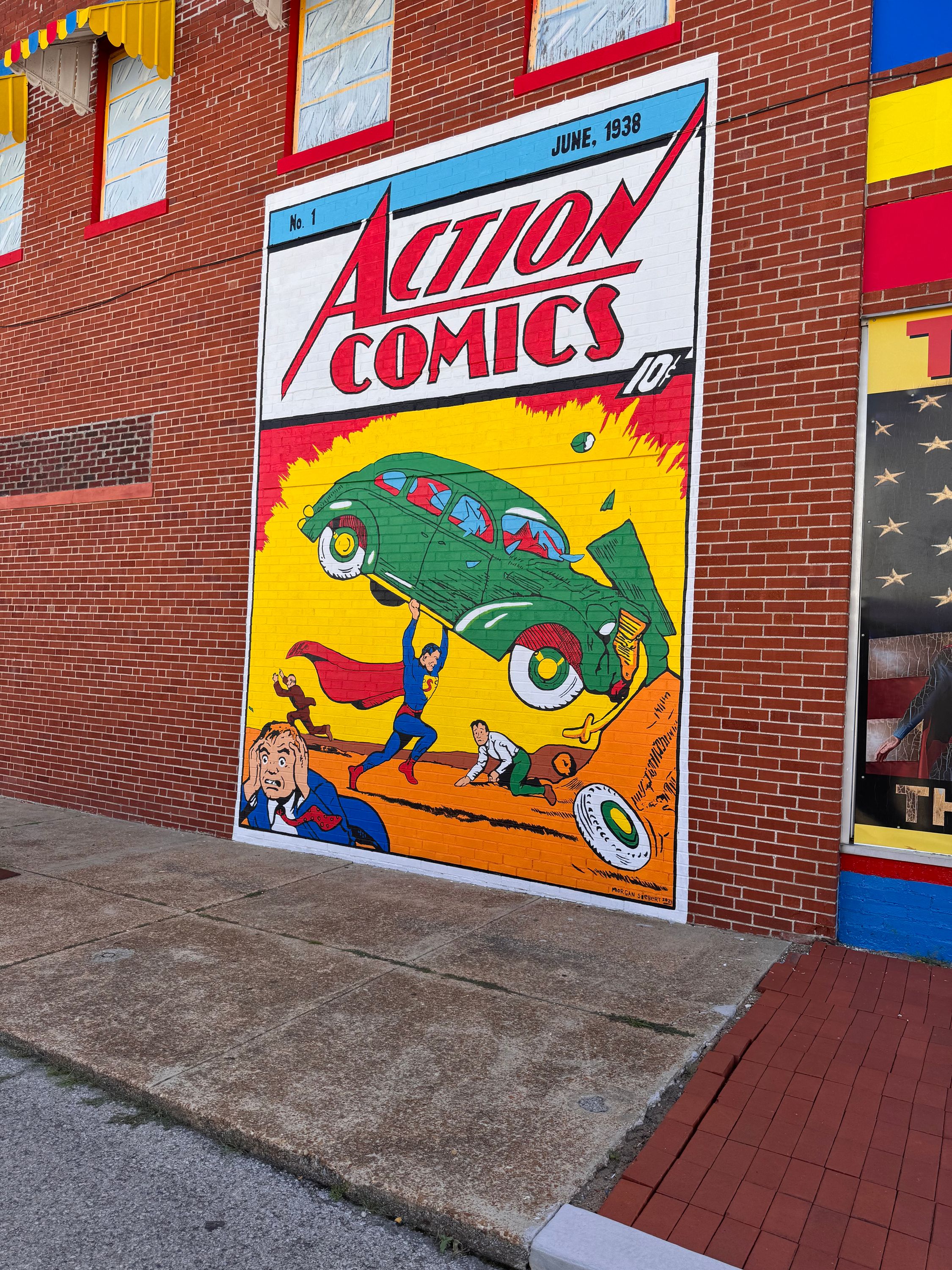
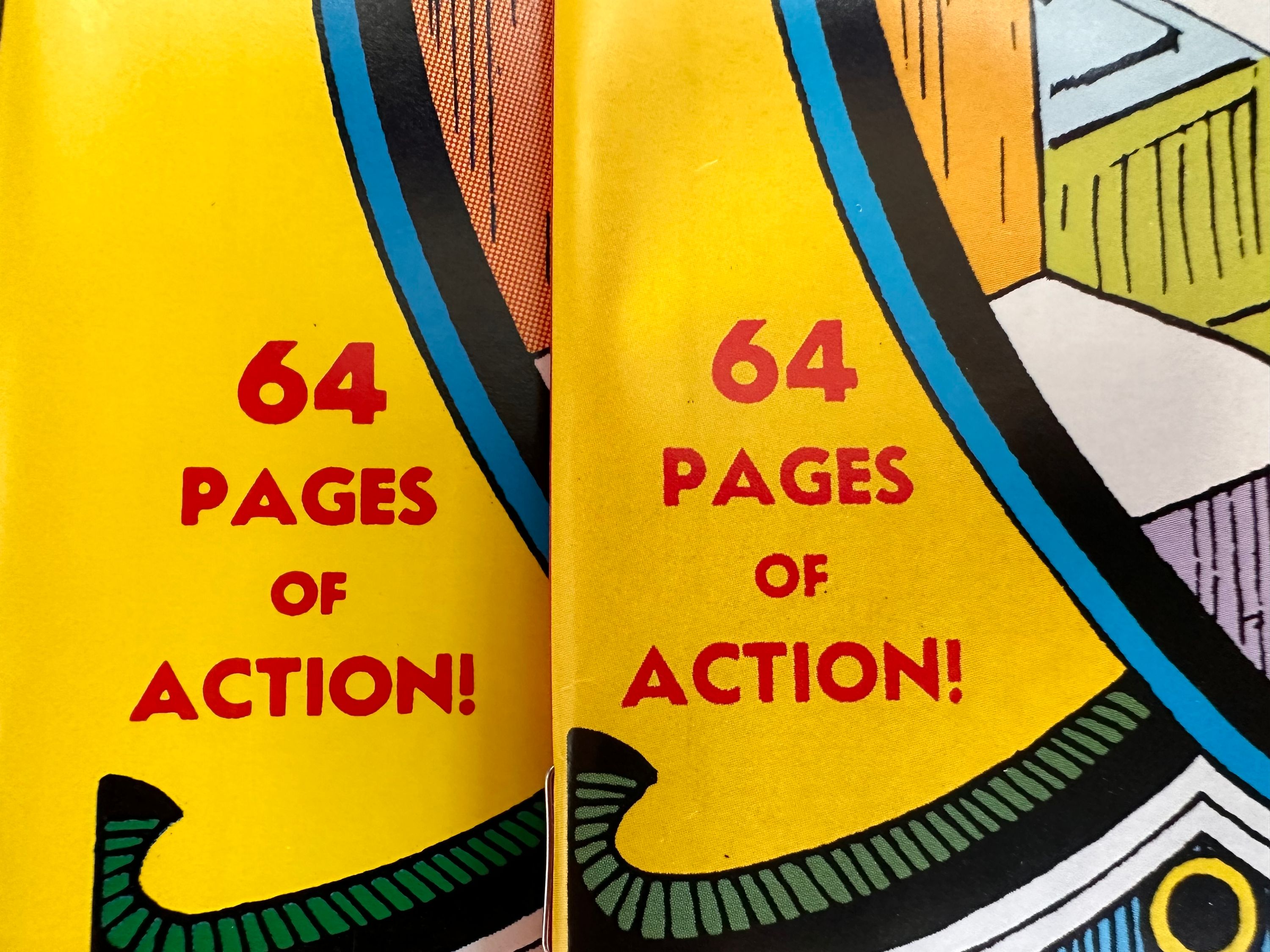
Another new Superman #1
It’s Superman Day and I’m just getting home from the Superman Celebration. I had a wonderful time this year as always and highly recommended for every Superman fan.
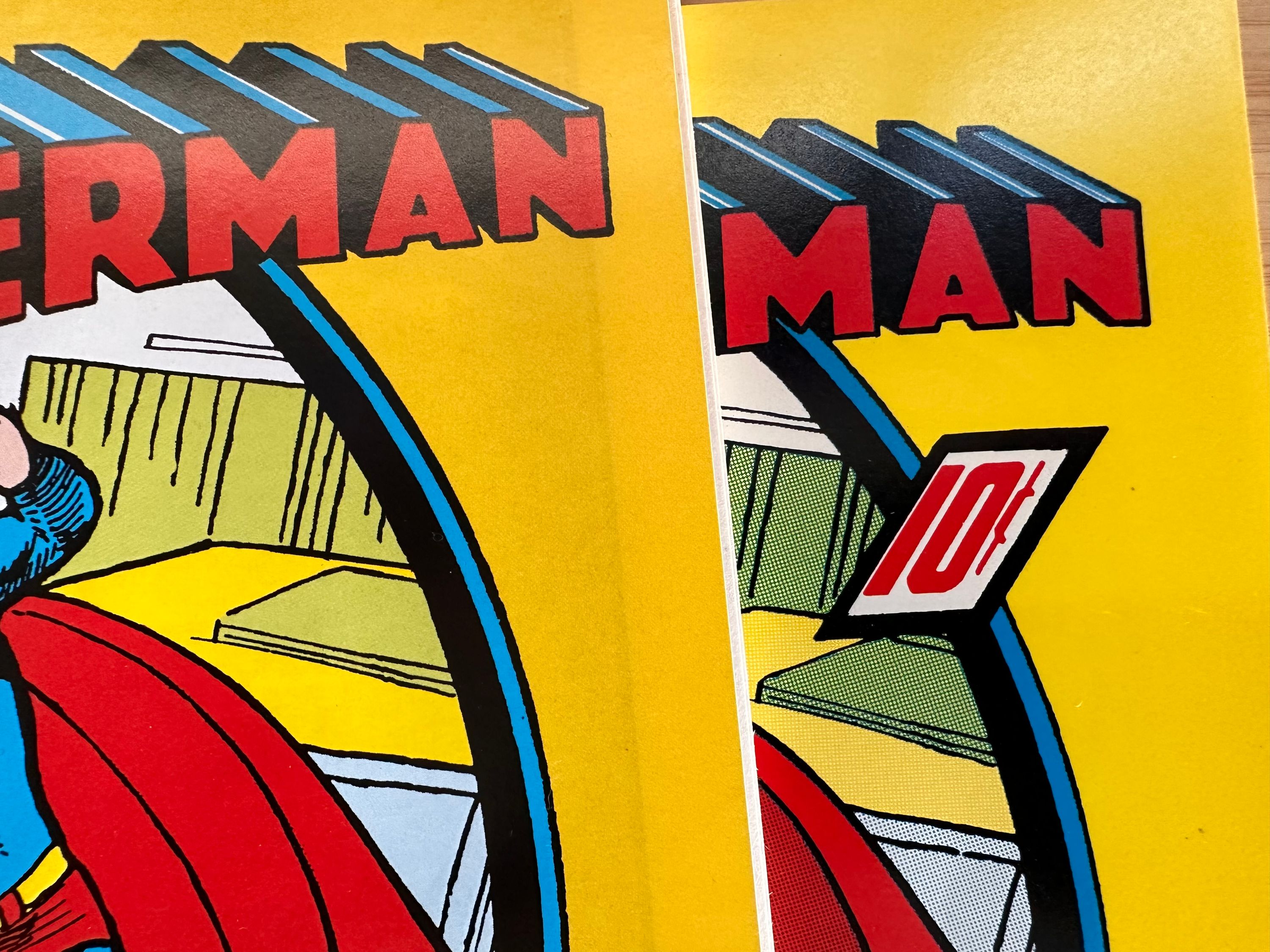
Earlier this year DC published a new “facsimile edition” of Superman #1. This made me want to revisit my earlier post on the issue and how there have been changes to it over the years.
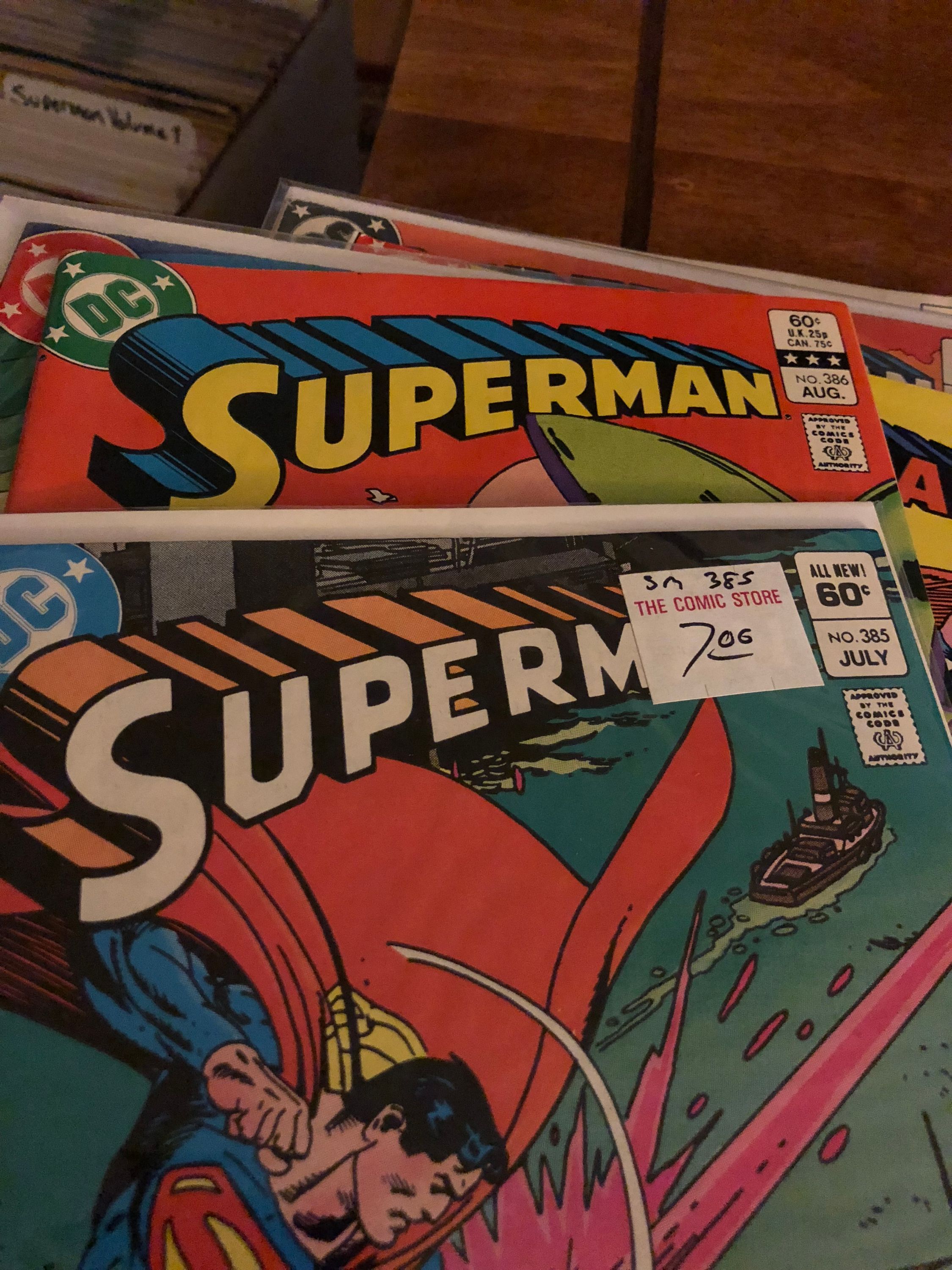
From what I’ve seen there are seven different versions of the cover. I’ve given them all handy names for clarity.
- OG. This is the original as published in 1939
- Licensed. This version is used on merchandise that features the cover. In my collection I have a notebook, magnet, and short comic box. The differences from the original are the color of the roof top, the fully colored in logo top, there is a red rather than yellow border on S shield, his costume is a darker blue, and the 10 cent price is in black.
- Archive. This was first seen in the recolored Archive hardcovers (as noted in my previous post) and also seen in the Golden Age Omnibus and Chronicles trade paperback series. - The suit is a lighter blue, the building behind him isn’t colored, and the text isn’t red.
- Millenium Edition. First seen in DC’s Millenium reprint lines. This is the version they used for the newest facsimile except without the foil. Because this was originally for a foil cover there is a gradient on the yellow at the bottom which really stands out on the new facsimile edition. Additionally, the roof under his hand isn’t colored pink and he has a red belt loop.
- Masterpiece - This version from 1999 was packaged with a hardcover book and statue; and is a very accurate reprint. The logo is missing a tiny black line on the S, everything is colored with Ben-Day dots, and his skin tone is very light.
- Famous first inside cover. The inside cover from the Famous First oversized edition in the 70s. Superman’s hair is darker blue and there is more white on the logo
- Famous first outside cover. The inside cover from the Famous First oversized edition in the 70s. It is missing the tiny black line on the S and the blue in the logo doesn’t line up exactly.
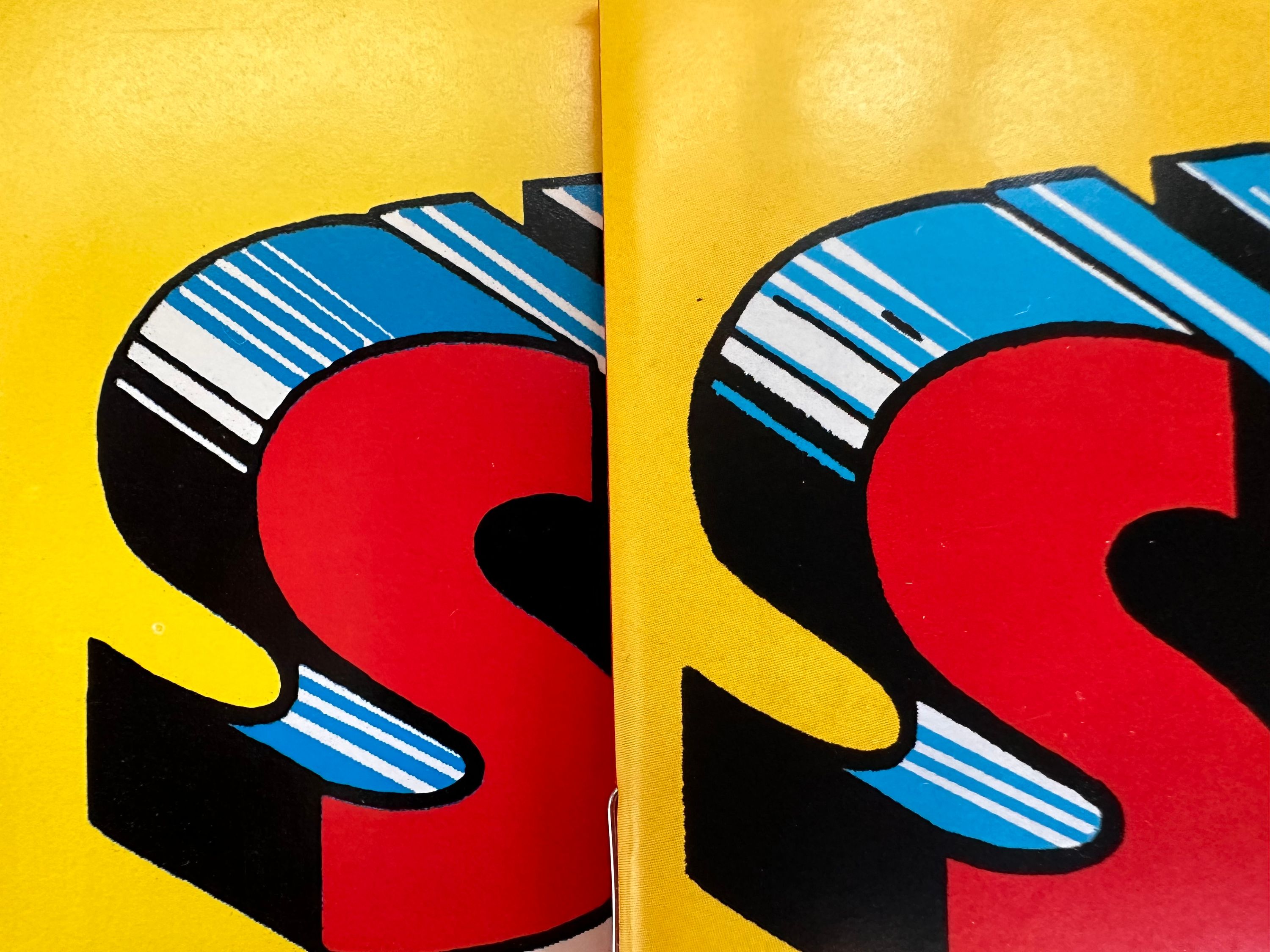
I love the giant Famous First reprints, but I think the Masterpiece version is my favorite coloring. The Millenium version is decent but I hate the gradient and they should not have used it for the facsimile. Also the facsimile is modern comic sized which feels off, is missing the 10 cents price and has copyright text on the bottom. The Archive recoloring is bad. Kind of shocking that they marketed this as an accurate recolor in these beautiful expensive hardcovers but did such a poor job. Licensed is fine for consumer products, I get the changes they’ve made because it makes it look more like the modern costume. They are going for recognition.
I’ve only identified three versions of the interiors as detailed in the earlier post: The Original (which is the same as the Famous First and Masterpiece versions making them the most accurate), the Archive recoloring (which is reused in the new facsimile), and the Millenium Edition (also used in the Chronicles trade paperback, and Golden Age Omnibus).
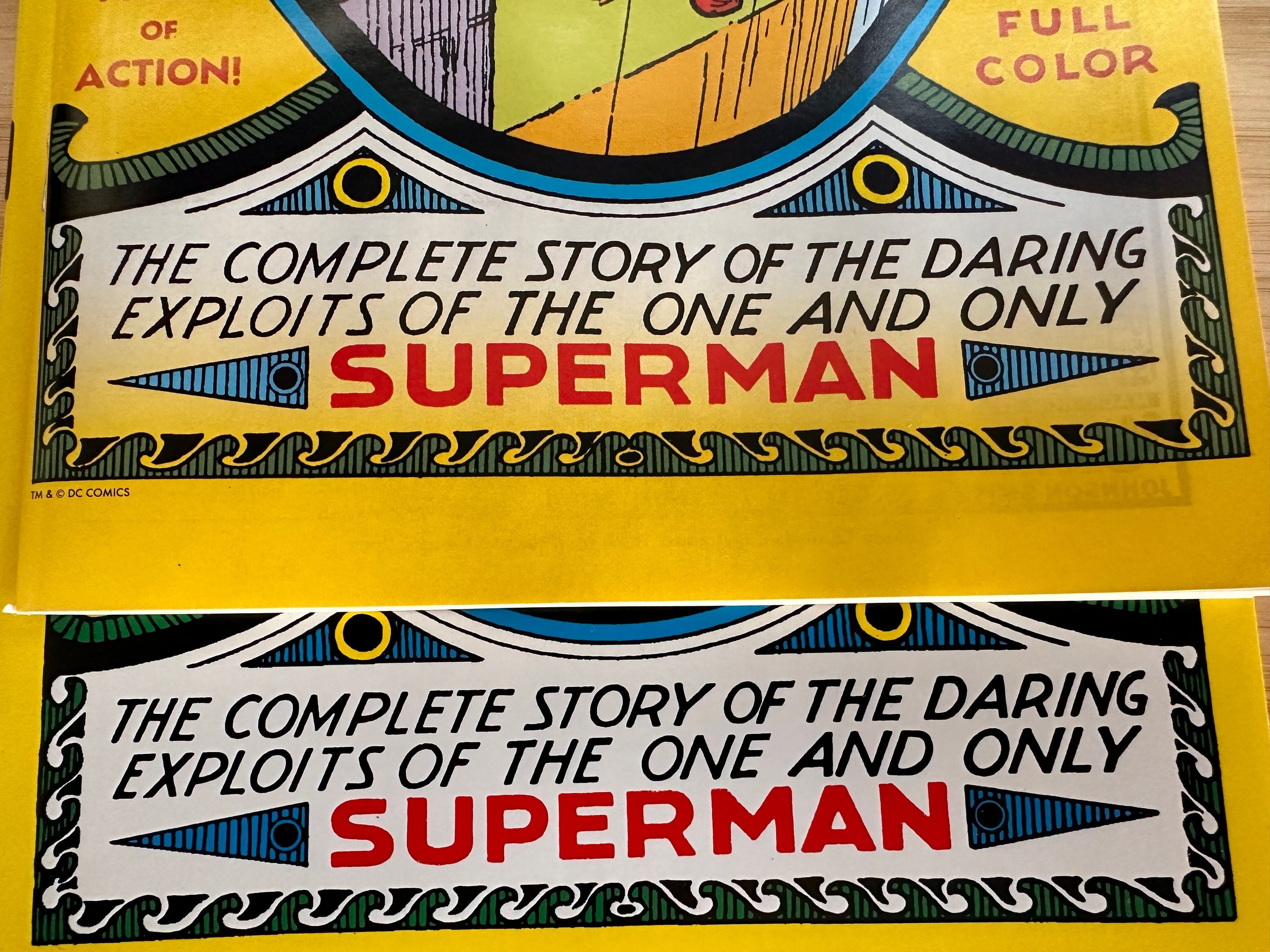
Here are some detailed shots comparing the new facsimile cover to the Masterpiece cover: 
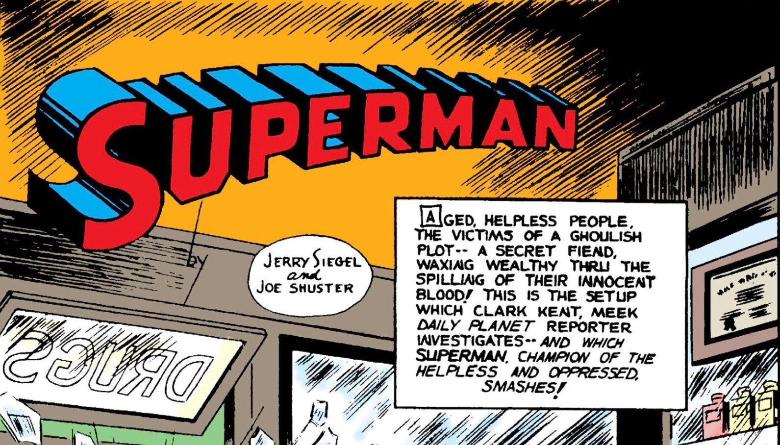
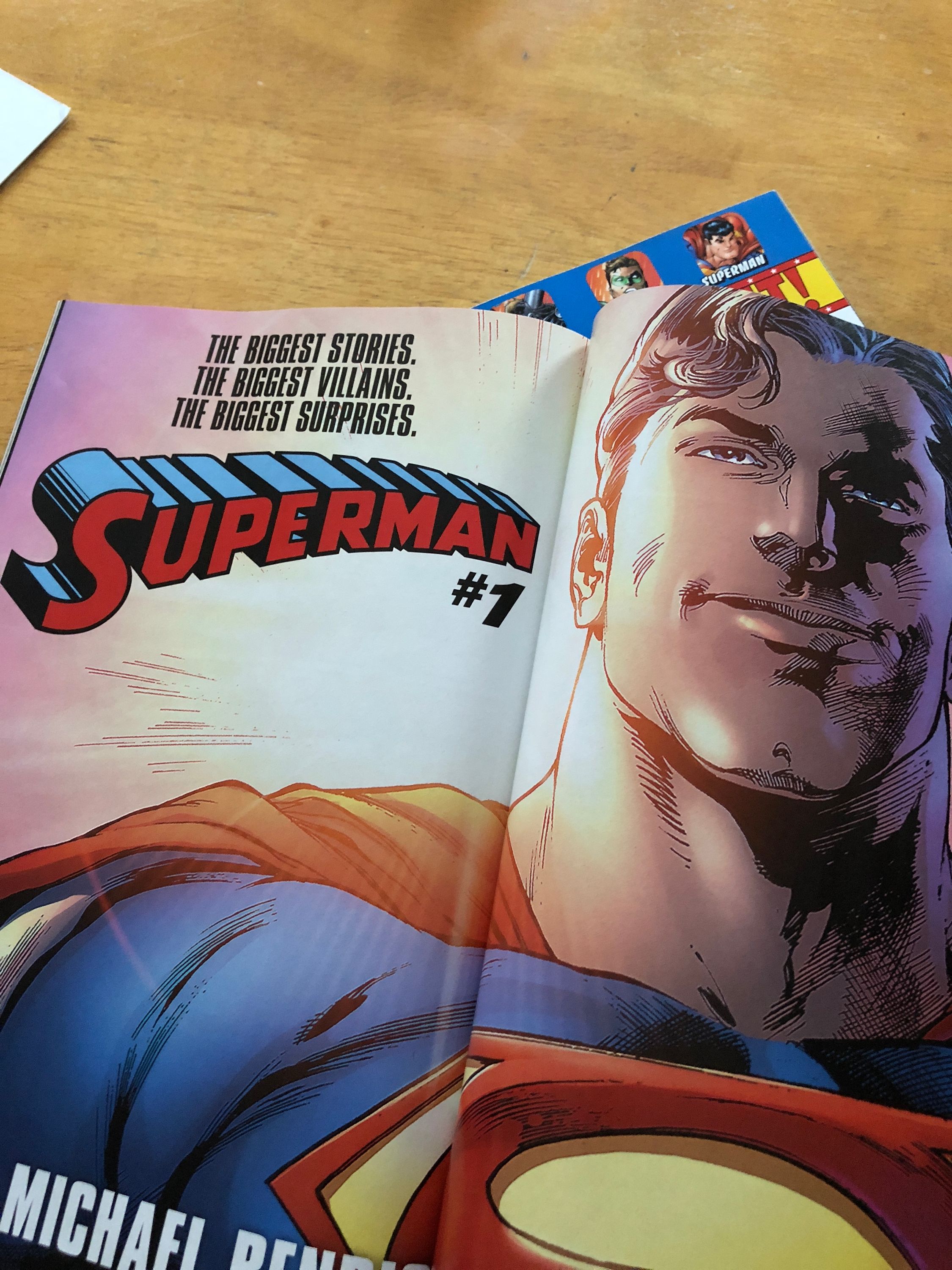
Superman Wordmark
Earlier this year Superman fans got something we haven’t had since 1983: a new Superman logo wordmark. For the last 40 years we’ve been using the logo that debuted in Superman (Volume 1) #386.
With the debut of Superman (Volume 6) designer Darran Robinson (his website was darranrobinson.design but that seems to be down) has redrawn the Superman logo. He posted the following image to social media announcing the redesign, but this doesn’t tell the entire story.
Those first few years there was lots of variability. The wordmark first appeared with our hero in Action Comics #1 in the very first panel:
The wordmark was inconsistent over the next couple of years, looking like it was handdrawn each time. It was typically used on the first panel of every story and then finally on a cover in Action Comics #12. But it’s the cover of Superman #1 that really stands out. That’s where that first version comes from in Robinson’s image.
Over the next few covers of the quarterly Superman title and in the issues again we saw lots of inconsistency, likely due to different artists drawing it by hand. That is until we get Superman #6. The logo was finally standardized and consistent (and the 1940 version from Robinson’s image).
Although this didn’t hit the interiors for a while as even in Superman #6 the first panel has a logo that looks handdrawn.
Now I say handdrawn for these as if to imply they had other options in 1940. No computers here. But the new logo created for Superman #6 was then machine reproduced for covers and issues moving forward. The first appearance of this logo on an interior panel looks to be Action Comics #29.
This logo would remain in use all the way up to 1983. Now there are some notable exceptions including the Fleischer cartoons, the Adventures of Superman television show, and even Superman the Movie. But outside that this is the logo you’d see on every comic book and related piece of merchandising.
When we changed over in 1983 the older logo was banished. Being seen only sporadically over the next 40 years. Some notable places include period correct DVD releases of the Adventures of Superman and the Filmation New Adventures of Superman. The Superman “classic” merchandise line. The new Super Powers toy line (even though the original line had the post ‘83 logo). A house ad for Bendis’ Superman #1 relaunch. And the most recent use: Superman: Space Age. It jumps out to me every time I see it as feeling old.
Now of course the post ’83 logo has had many variations. Computer generated versions made to look shiny starting with Superman (volume 2) #178, the infamous electric version in the late 90s. But over all we kept coming back to a really standard version (albeit in many colors). All from a company who changed their logo three times in the interim.
When DC published their “Connect” previews issue it still had that ’83 logo, with some computer shine added to it ala the aforementioned Superman 178. So when the book shipped I was surprised!
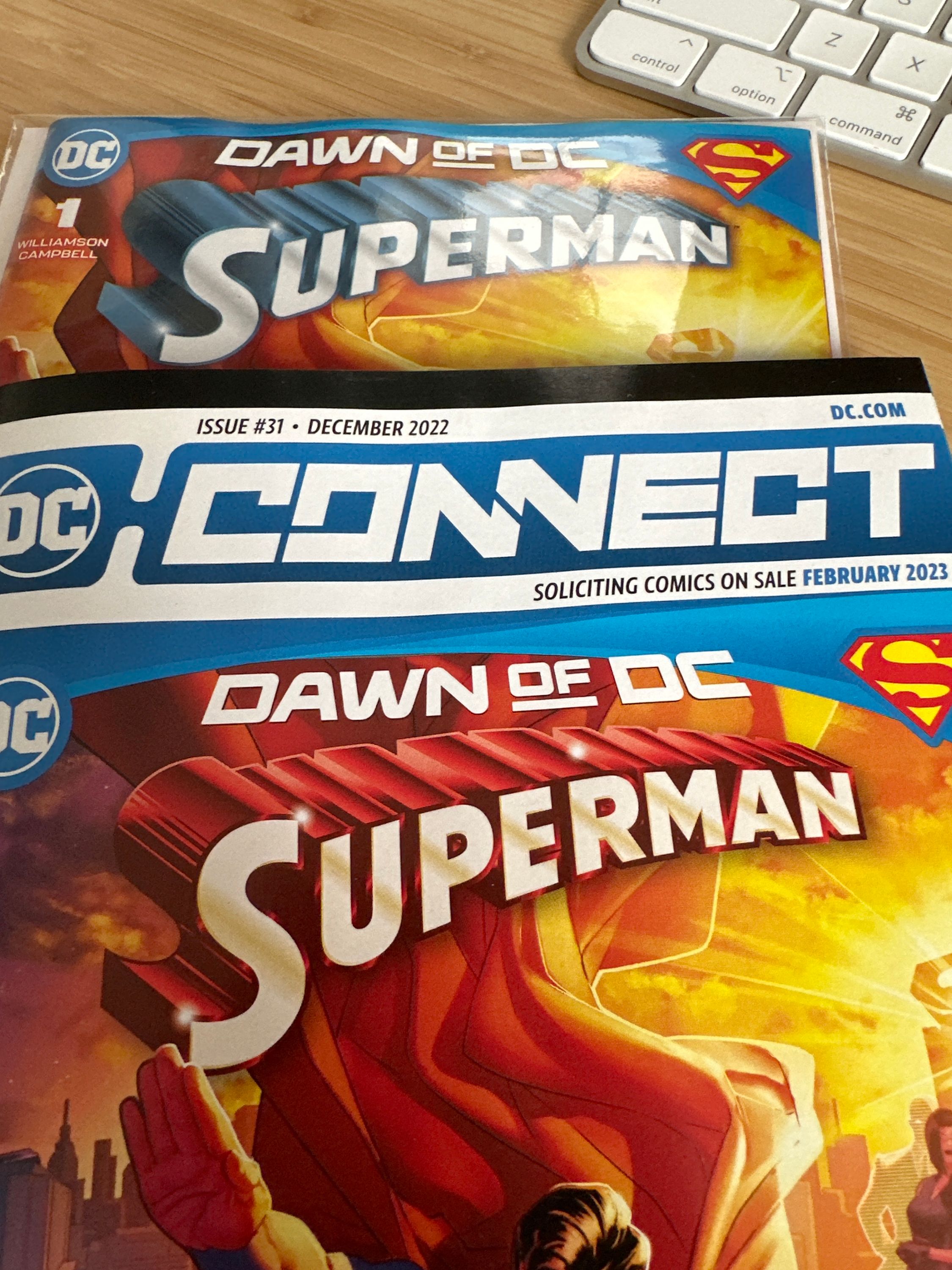
Now why have I written 800+ words on a logo that has only subtly changed over the last 85 years? Because I really don’t like this new version. I’m fine with them adding some Photoshop shine to it, but I think the 83 logo is perfect. I fully admit that it could be because it’s the logo I’ve lived with my entire life (I was born in 83). But I don’t like the squared off U, P, and R. I do see how it aligns with the earlier logo, but that logo feels old. The rounding of those letters feels smooth and pleasing to my eye. Plus when it was originally drawn in Action Comics #1 those letters were rounded. I think they were only squared off for consistency and ease of duplication.
I am personally not a huge fan of the trade dress in many recent DC books. Lots of them have little to no regards for the history of the characters or their logos. The recent Son of Kal-El, Superboy Man of Tomorrow, and Adventures of Superman Jon Kent logos do nothing for me. I actually do like the My Adventures with Superman logo from the upcoming cartoon for a couple reasons. It is reminiscent of the Action Comics font, cartoons often have unique logos (Fleischer & The Animated Series), and the incorporation of the new S design.
I’m not anti-change in my Superman books. I love when they change the status quo and challenge us as readers. But I hope this change goes the way of some of the other big Superman changes and is rolled back.
Ultimate Superman the Movie release
Since I was so disappointed in many aspects of the new 4K box set that was just released I thought it would be fun to dream up the ultimate home version of just Superman the Movie. Maybe it’s something that would come for the 50th anniversary in five years.
For packaging inspiration I took a look at another Warners release: Blade Runner. It’s an equally legendary film from the same studio so it’s a good comparison. Several high end boutique labels put out special editions of this movie. It’s notable to say, like Superman, there are several cuts of Blade Runner fans are interested in. The following deluxe editions only include the “Final Cut”. But there are also Workprint, US theatrical, International theatrical, and Directors Cuts which have been released in the past. It seems these labels are more concerned with the collectibility of their packages rather than the best possible release of a film. The exclusion of these cuts makes me think these boutique labels should not be the ones to handle the final release; but they can provide inspiration.
Manta Labs do these fantastic Steelbook sets for their releases. They also did a Batman v Superman edition so Superman the Movie isn’t out of the question. Each release has at least two different slip covers and they offer a “one click” box that includes both versions with extras. The first slip cover has a lenticular image on both sides and the other is plain each with different art. The actual Steelbooks are the same and typically feature classic poster art. The Blade Runner edition even offers a third lenticular version. They include character cards and post cards. Most of their releases have an “in universe item” for example a little monolith from 2001. The Superman version could have a Fortress of
Solitude crystal.
Titans of Cult also does great special edition Steelbooks. They come in a big plastic case with unique art and an extra item. Blade Runner comes with a pin and coasters. A Reeve style Superman pin would be sweet. Titans does unique art for their releases, not something that already exists like posters or concept art. If they came up with something great this could be cool but the existing art is already fantastic.
Vice Press Film Vault special editions have an acetate slip-cover detailing the title’s numbered entry in the collection and artwork printed on a rigid clamshell outer case with a magnetic clasp. Each set contains a digipak housing the film, a branded envelope, deluxe art-cards, and an etched and individually numbered crystal display plaque, bearing each film’s title treatment and motif. Like Titans they all have unique new pieces of art for the cover with a matching poster. Some editions have an in-world artifact which in this case could again be a fortress crystal. Blade Runner comes with large format art cards featuring concept drawings, behind the scenes imagery, film trivia, and original theatrical poster artwork. Would love to get those for Superman, the lobby cards are fantastic.
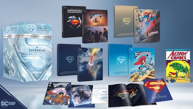
I love the steelbook cover that we got. This is maybe the best possible cover, but it would be nice to have some more art on the back. The S with a Roman numeral 1 is boring. The ideal back would be the Bob Peak art with Superman and Lois. The Reeve flying poster would be second best, but it doesn’t scream back cover. The Peak painting has a flying away feel which would be good for the back.
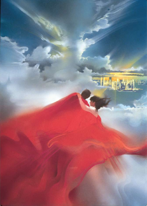
If we go the single steelbook route rather than a box set we’d need a slipcover so a good book could be included with it. A slip cover with the standard poster on the front and the Superman and Lois Bob Peak painting on the back could be awesome.
Aother option is a lenticular slipcover. We got the lenticular card with the Kryptonian supervillains in the Phantom Zone in the latest box. That would make a great back cover. On the front we could have the flying poster lenticular or even some version of the regular (bad) 4K art lenticular. It would be less bad in a lenticular image.
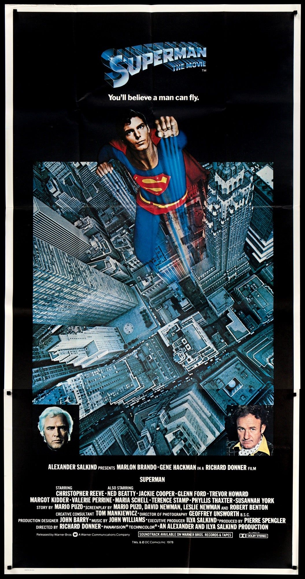
With a nice slipcover the Steelbook itself can be metallic with an embossed marketing S just like the mylar poster. Maybe the back has the Superman the Movie text again like the mylar posters of the time. This would set it apart from the existing Steelbook. The look would be similar to the recent Disney minimalist Steelbooks.
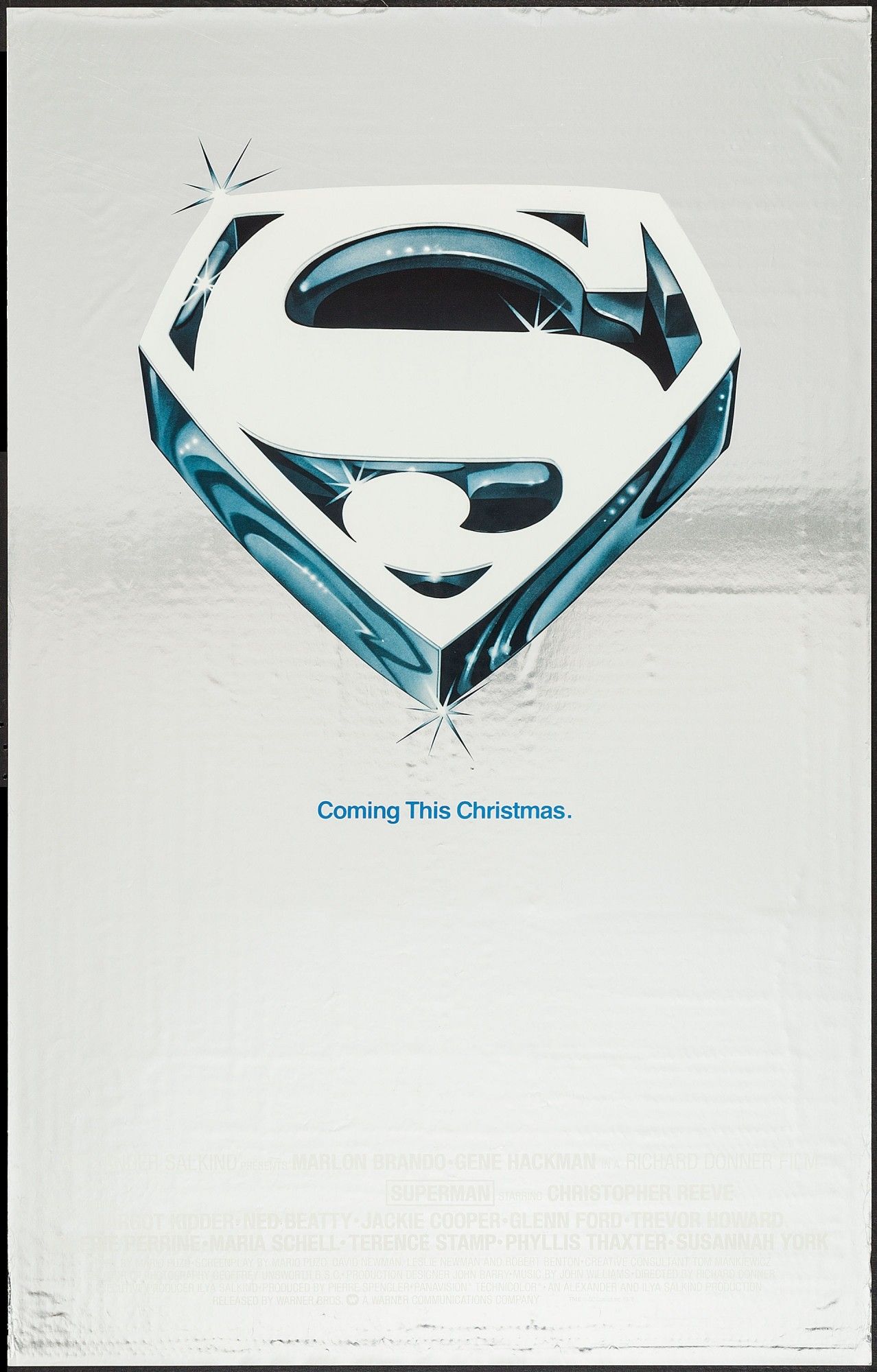
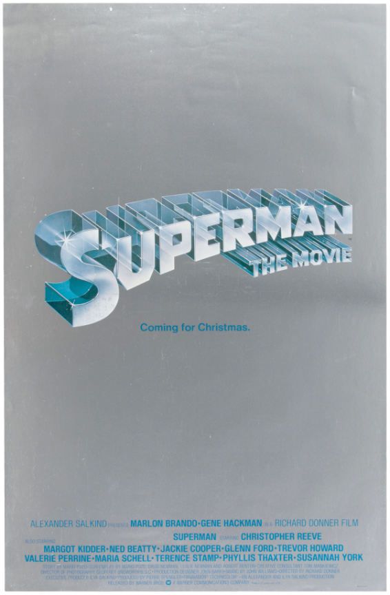
The main poster itself on the slipcover might not be enough for Warners to release though. They like to have the name of the movie and the star big on the cover so it stands out on shelves. Maybe the J Card around it with all the details and the name of the movie could make up for the cover being minimalist.
For extras this set should include reproductions of the lobby cards. I’d like an booklet with essays similar to Criterion releases filled with behind the scenes photos maybe from Caped Wonder. The book in the latest box isn’t good enough for this release. Just photos from the movie is easy. So much great behind the scenes content exists and if we are going to have a book the opportunity should be taken for something special.
Now for the good stuff: the discs!
Disc One: Theatrical Cut
New 4K scan of the theatrical cut with Dolby Vision. Plus I want the theatrical four channel audio mix in lossless. Throw in the Atmos track if you want since modern viewers would like an Atmos option. This makes it an upgrade over both existing 4Ks in both video and audio.
This disc should include the existing commentary by Pierre Spengler and Ilya Salkind
Disc Two: Special Edition
Preferably a new scan in 4K Dolby Vision but fine if it’s the same Blu-Ray. The theatrical version is the canonical version so it should get the best treatment. This disc should include the Atmos track since this is the version the new sound effects were made for.
This disc should include the existing commentary by Donner and Mankiewicz along with the music only track in hi-res lossless stereo, similar to previous releases.
Disc Three: Extended Cut
Three hour TV cut again preferably a new 4K Dolby Vision scan, but fine if it’s the existing Blu-Ray. I personally love this version and am so glad Warner Archives gave it to us. Any complete package should have this version. This cut is almost a bonus feature so the movie audio track isn’t super critical. It’s not the reference version of the film.
Since a creator commentary doesn’t exist for this version that wouldn’t be possible. But there does exist a commentary track by Caped Wonder Jim & Jay from their podcast September 2020.
Disc Four: Extras
All the existing extras:
- The Making of Superman The Movie TV special
- Taking Flight: The Development of Superman
- Making Superman: Filming the legend
- The Magic Behind The Cape
- Theatrical trailers and TV spots
- Screen tests
We should get some new extras created for this set:
- New documentary featurette about the restoration
- Reeve legacy reunion panel (I’m sure video of this panel exists and would be a nice inclusion)
- La-La Land soundtrack restoration featurette with Mike Matessino (the recent La-La Land release of the soundtrack is incredible, an interview with Matessino detailing this would be awesome)
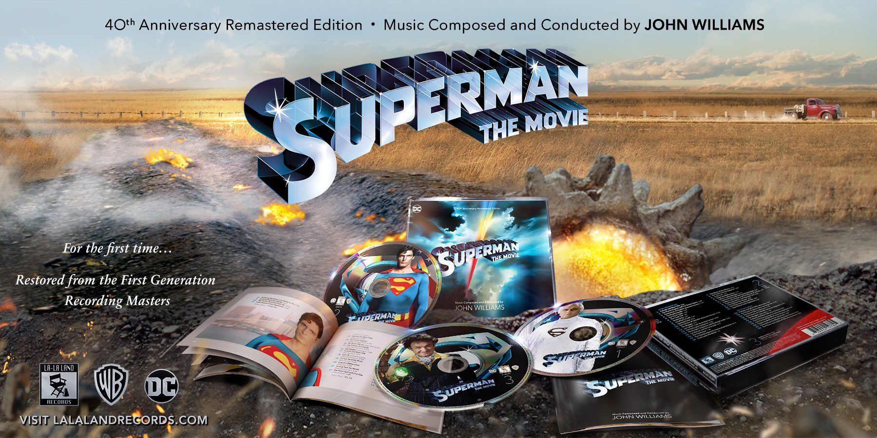
Importantly, I don’t want a promotional featurette with unrelated talking heads saying how great the movie is like we got on the Fleischer disc. We don’t need the Bugs Bunny cartoons, Fleischer shorts, or Superman and the Mole Men as much as I love them. This set should be tightly focused on this movie.
Max Fleischer’s Superman Blu-Ray Review
My history with these shorts
Back in the late 80s and early 90s I remember visting discount stores with my parents and seeing bins of VHS tapes with Superman on them. Back then I didn’t know if they were old or new, but I always wanted them. I never knew if I already had cartoons on them or what was available, or even how many existed. There was no internet for me to consult. I had no concept of public domain releases. These various VHS releases and the Super Powers VHS the Filmation cartoons; along with my HBO taped copies of Superman the Movie and Superman IV were all the Superman media I had access to. At 8 or 9 years old I remember loving these. I watched them all the time with no idea they were already 50 years old at that point.
Fast forward to the DVD era in the very early 2000s. At this point I knew what was up. I understood that these were theatrical shorts created by Fleischer and later Famous Studios in the early 1940s. I knew that the shorts were in the public domain which explained the multitude of VHS collections I saw as a kid. I knew I wanted these on DVD so I found two DVDs collecting them all. They were titled Superman vs The Monsters & Villains and Superman vs Nature & War. The DVD package described them as the “digitally restored classic collection”. Later I discovered the Bosko release. The Complete Superman Collection Diamond Anniversary Edition claims they were restored to their best possible quality. “The images are superbly clear and the original mono soundtrack is nearly flawless” states the back cover. I remember it being touted at the time as the best version of these shorts available. Soon after though came some official releases that got my attention.
2006 was a banner year for fans of Superman media. The release of Superman Returns started a big archival DVD release project that eventually got us everything from the theatrical serials to Superboy to Lois and Clark. When Superman and Superman II were released on DVD separately and in the Ultimate Collector’s Edition tin we were treated to the first official DVD version. The DVDs claimed the shorts were “remastered from superior original vault elements.” It’s not exactly clear what vault elements these are, but I assume from watching them that they are 35mm theatrical prints. You can see the cue to end the reel at the end of The Mechanical Monsters, which I assume wouldn’t be on the negatives just the prints. We also get the first featurette “First Flight”. These versions were eventually released on a standalone DVD in April 2009. At this point we got the additional featurette “The Man, The Myth, Superman”. These official releases were definitely better than the Bosko disc
specifically in brightness and color. I assumed this was the best we were going to get. The shorts were old and not well preserved. Since they are public domain it didn’t seem like something Warners was going to put money or more time into.
With the release of the Superman Motion Picture Anthology blu-ray set we got the same standard definition versions as extras along with the First Flight featurette. Again putting SD versions on here dashed my hopes we’d ever get HD versions. The new 4K box comes with the same blu-ray discs from this set, so the same SD versions released again.
A glimmer of hope came when the DCU streaming service briefly offered these up in HD. Frankly this came and went so fast I didn’t get a chance to watch them all and I don’t remember the quality.
Now, 2023, the blu-ray. This exciting news.
Warner Bros. Discovery’s advanced remastering process began with a 4K, 16-bit scan of Fleischer’s original 35mm successive exposure negative. Staying true to the original theatrical aspect ratio of 1.37-to-1, the highest quality raw image was then scanned and then entered into the recombine process — utilizing special proprietary software to merge the successive exposure Technicolor negatives into a single RGB color image. The end result are pristine animated shorts that have been restored to the animators’ originally intended production quality.
This is real detail. Much better than “remastered from superior original vault elements.” Then came the first review. Uh-oh. Too much DNR? Compression artifacts? Other reviews had conflicting stories. Was this going to be a smoothed out mess or was it the way these shorts should be? Dear reader I had to find out myself.
The actual release
First, the presentation. This new Blu-Ray edition is in a standard plastic blu-ray case. The plastic is flimsy, but this is because a portion of it is cut out to use less materials. I’m all for that even if it does make the collection feel cheap. All 17 theatrical shorts are collected on one BD-50 disc. I should mention that the DVD release came with a premium slipcover that makes it feel like a much nicer set.
The cover uses the same Superman carrying Lois art as the DVD edition, but a new World War 2 background is added. Soldiers, planes, guns, spotlights, the works. Strange decision considering the most skippable shorts are the ones relating to the war. They fix the biggest mistake with the DVD packaging here though: 1941-1943 not 1942 as the DVD states. The cover introduces a new problem though. The wrong Superman wordmark logo was chosen for this. The DVD edition used the wordmark from the shorts which I think was the right choice. It might not be the most instantly recognizable version, but being a wordmark it’s not like there would be consumer confusion on what they were buying. All the movie boxsets use a generic font so it isn’t like home releases are required to have the wordmark. The one they’ve chosen for this release is the version used in comics and merchandising from 1983 until this year when the comic wordmark was updated for the new #1 issue (more on that at a
later date). In Superman #6 from the fall of 1940 the Superman wordmark had been standardized and used until 1983. If they wanted to use a traditional wordmark instead of the version from the shorts they should have used this pre-83 version. But they could have at least used the 2023 version. Weird that this 2023 release uses a wordmark that ended use in 2022. Smacks as lazy to me.
The back is very standard. We get a short description, a list of the special features. The image here is pretty ugly, they definitely made a bad choice of frames here. It’s presented out of context like the cover as well; bursting through a wall. In the short Clark had just changed into Superman and looks to his right before taking off to the left.
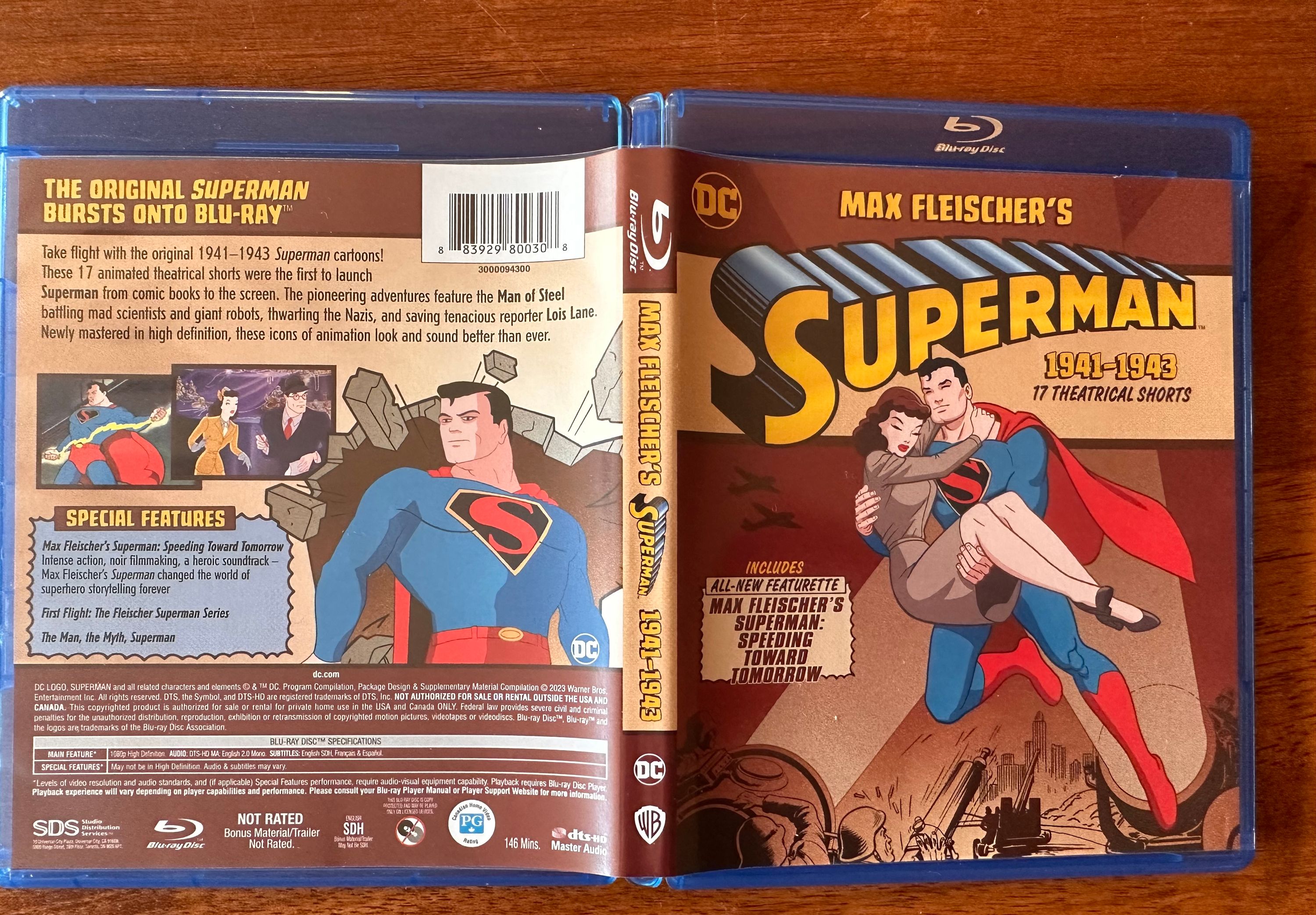
Some strange decisions were made on the inside. Since blu-ray cases are transparent they decided to print on both sides of the cover. But because chunks of the plastic case are cut out the presentation gets jumbled. A final Superman image taken out of context is presented here and like the back cover was also not a great choice. He looks more like the imposter Superman from Showdown; which coincidentally is where this image was taken from.
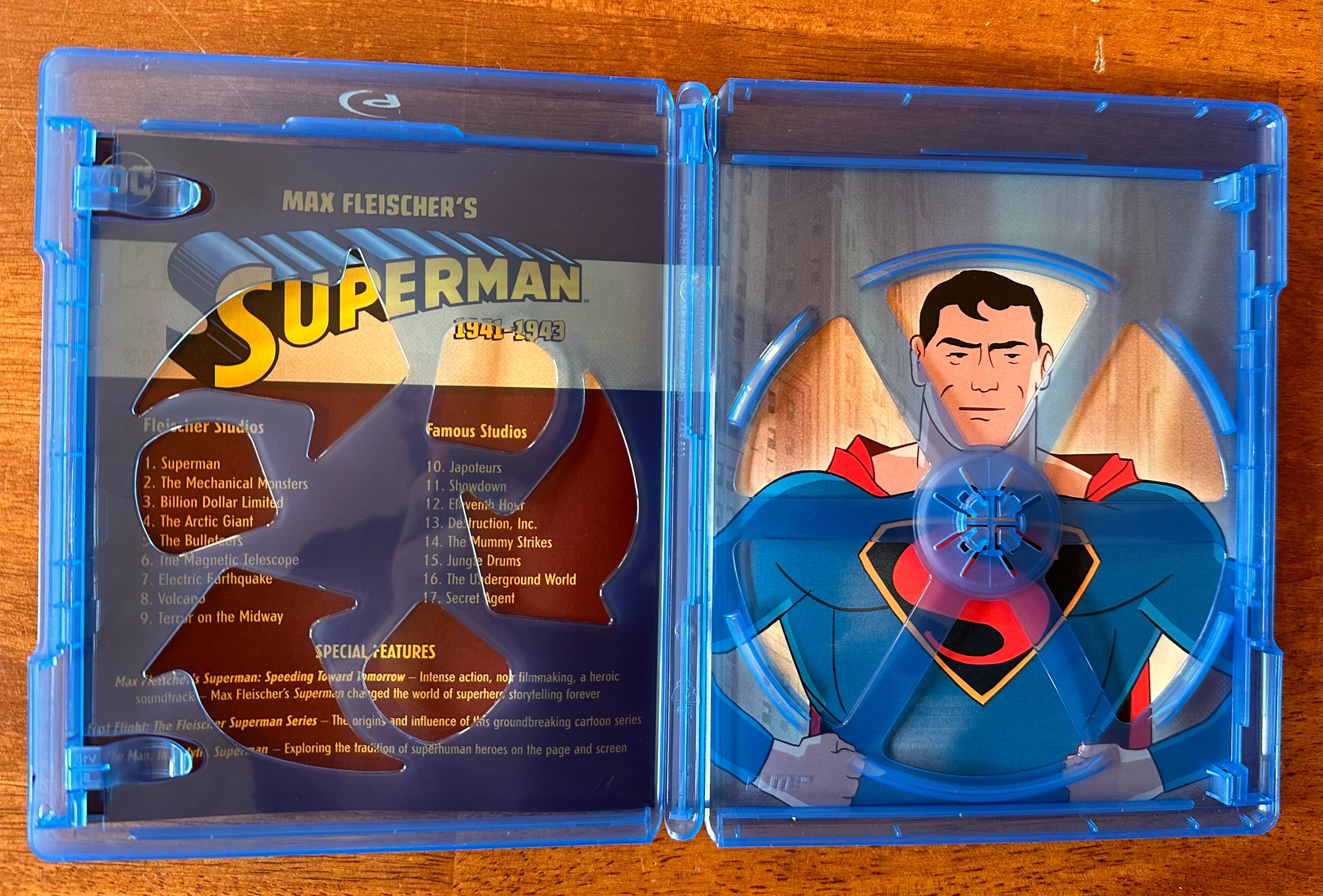
The disc itself is plain brown with the title and all the requisite logos. A step down from the DVD release that had nice images of Superman on each disc.
When you insert the disc you are presented with a widescreen image of the cover with the menu on the bottom. Bottom menus work well on blu-ray because of the pop-up menu feature this format has. With DVDs you are always jumping back to the main menu to see the chapters, options, or special features. It does mean the DVD release has a leg up on it with a few different images chosen for the menus. Although flipside the blu-ray doesn’t have annoying ads shoved in your face once you start the disc. I noticed a couple issues with the menu though. The first is pixelation which can be clearly seen on the S: 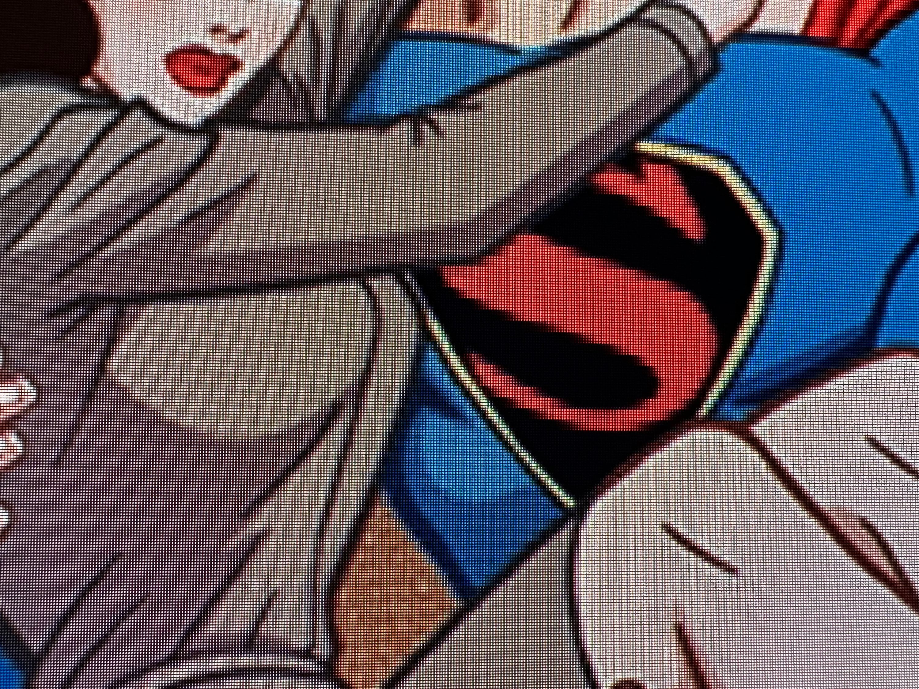
The other is there is an Audio menu item, but in it there is only one choice: English. Really strange to have this menu but no actual options in it. Maybe it’s there for international releases? 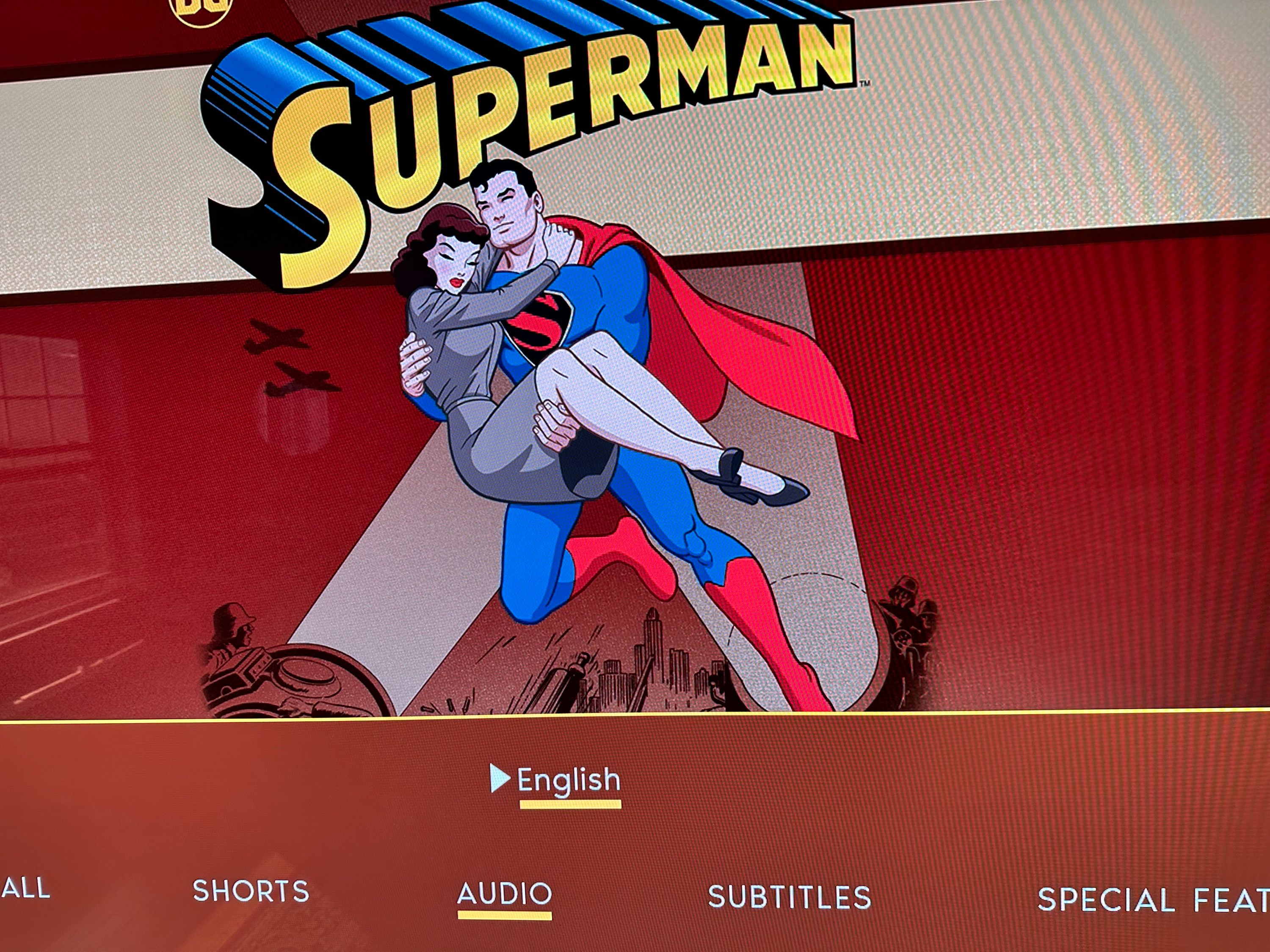
Let me briefly mention the new featurette Max Fleischer’s Superman: Speeding Toward Tomorrow before getting to the good stuff. This featurette was completely uninteresting to me. Talking heads saying how great these cartoons are. Yes of course we already know that. We bought the disc already! The only interesting thing about this is the unrestored shots it includes.
Now the video quality. The thing everyone is talking about. As mentioned above some folks on the internet have cried foul at this release because it looks too clean. Saying that in WBD’s effort to clean the picture they removed too much film grain and fine detail. The main evidence for this is shots from the new featurette. They show new HD clips from these shorts, but with no clean up. They are full of film grain, but also lots of other artifacts from being so old. Now there is no indication that these clips are from the new 4K 16-bit scan of the negatives. I actually think these are scans from a release print. The dirt and scratches on them look more like issues from a release print than from a negative. It’s possible that the version WDB used for the final product was much cleaner than the version used for these clips. I don’t work in the film industry, I have no insider knowledge of this so I could be really wrong.
I recently watched the MVD blu-ray release of The Point, an animated film from the 70s. The blu-ray notes that it was scanned in 2K from a 16mm release print because the whereabouts of some of the negative elements is unknown. It also notes that the condition of the elements made a complete restoration unfeasible. While thousands of individual pieces of image damage were removed entirely, some slight imperfections appear intermittently in the film. Watching the blu-ray looks like you are watching a 50 year old 16mm print for better or for worse. There are scenes with a vertical line through them. But when watching one of the standard definition documentaries there are clips of the film without any noise whatsoever. Just super clean images, but sadly in standard definition. This leads me to believe those old standard def scenes were struck from the negative or a much
newer print that is no longer available. In comparison the featurette HD clips we see of these Superman shorts look like the HD version of The Point. Full of grain, but also scratches, dirt, and other assorted problems. The full presentation of these shorts looks like the SD clips of The Point except in HD. Super clean, with no noise and very little grain.
I personally, did not find the lack of grain to be a dealbreaker. There are some textures that are softened, but it’s not clear if this is against the original creative intent. Grain is a part of movies shot on film, there is no denying it. If this were a live action movie shot on film with no grain I’d be unhappy. But this is animation. These shorts only have grain because of the limitations of the technology they were working with at the time. If they could have taken the original background paintings and cells and projected them onto a screen I think it would have looked close to this blu-ray release. There are of course problems with this restoration method. Namely you lose fine detail and can introduce edge enhancement artifacts. For me detail was clear throughout, but I did see the occasional artifact. Here is a close up of an example:  If you look closely at the left side of the building you can see a sort of halo around it. Not great, maybe not a deal breaker, but not great.
As this is a bonafide classic it would have been nice to get an archival quality release befitting it’s status. But WBD decided instead to release a version that a wider audience would get enjoyment from. And frankly if I ignore that snob part of my brain these look awesome. I love the colors, I love the clarity. These fans are calling for Warner Archive to handle the release because they have different priorities. I’m not sure that would give fans the results they expect. After watching these I watched the Warner Archives restoration of the 1944 Popeye short “She Sick Sailor”. It had more grain than this release, but was also very clean. No other artifacts or noise unlike the clips we get in the featurette.
As far as compression artifacts due to low bit rate, I didn’t see any. It’s possible they were there and I was so engaged with shorts that I just didn’t notice them. I’m watching on a 77” 4K screen so if there were issues like that I think I would have seen them.
I did notice an error though. At the beginning of Volcano we get a different intro. “Able to soar higher than any plane”. It’s right on the original DVD, but in this blu-ray we get the image of the plane but the audio still says leap tall buildings in a single bound. With the amount of time and effort put into this I’m bothered by these kinds of problems. I did read that some of the ending music was wrong, but I didn’t do a back to back comparison of every episode to confirm. Shame on you Warners.
Image comparison
I took some photos of my television to highlight some differences here. I don’t have a way to get screenshots off a blu-ray or DVD currently, but I thought this would be illustrative of the differences.
This is from the Bosko release:  The SD version from iTunes (which is no longer available):
  The original official DVD:
  This new blu-ray:
  The unrestored version from the featurette:
Digital version notes
iTunes has removed the standard definition versions from sale. Rather than upgrade what people already have from SD to HD they have made the “episode” numbers start with 101 instead of 1. A bit of a bummer for folks who bought these in iTunes already and want the HD versions. They’ve always been good about free upgrades from HD to 4K movies. At least it’s only $9.99 right now for the whole set. Cheaper than the blu-ray, but missing the featurettes.
iTunes also chose the ugly back of the box art for the purchase screen. Bizarre choice. 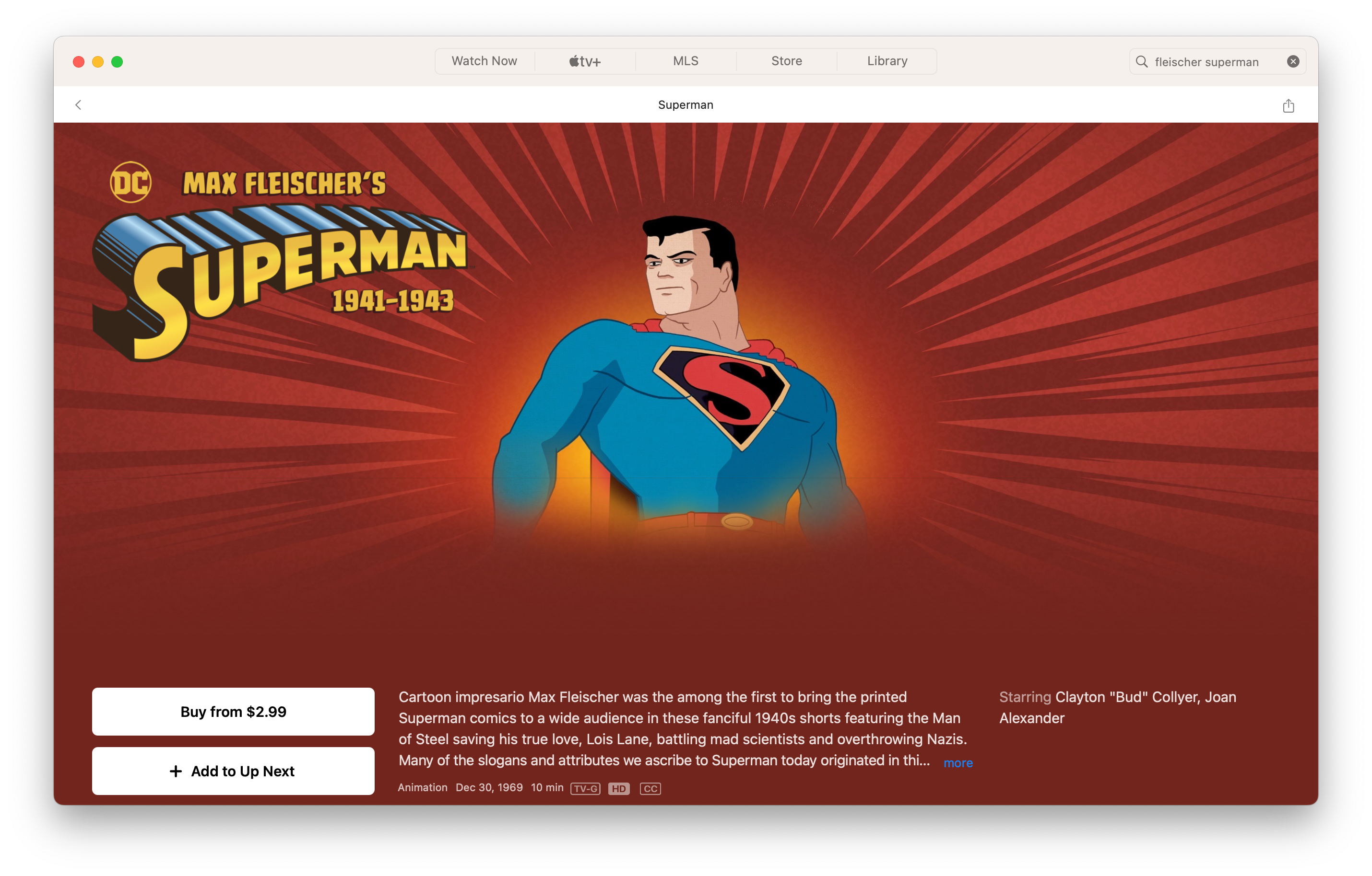 Quick comparison to the awesome image they chose for the Filmation cartoon purchase screen.
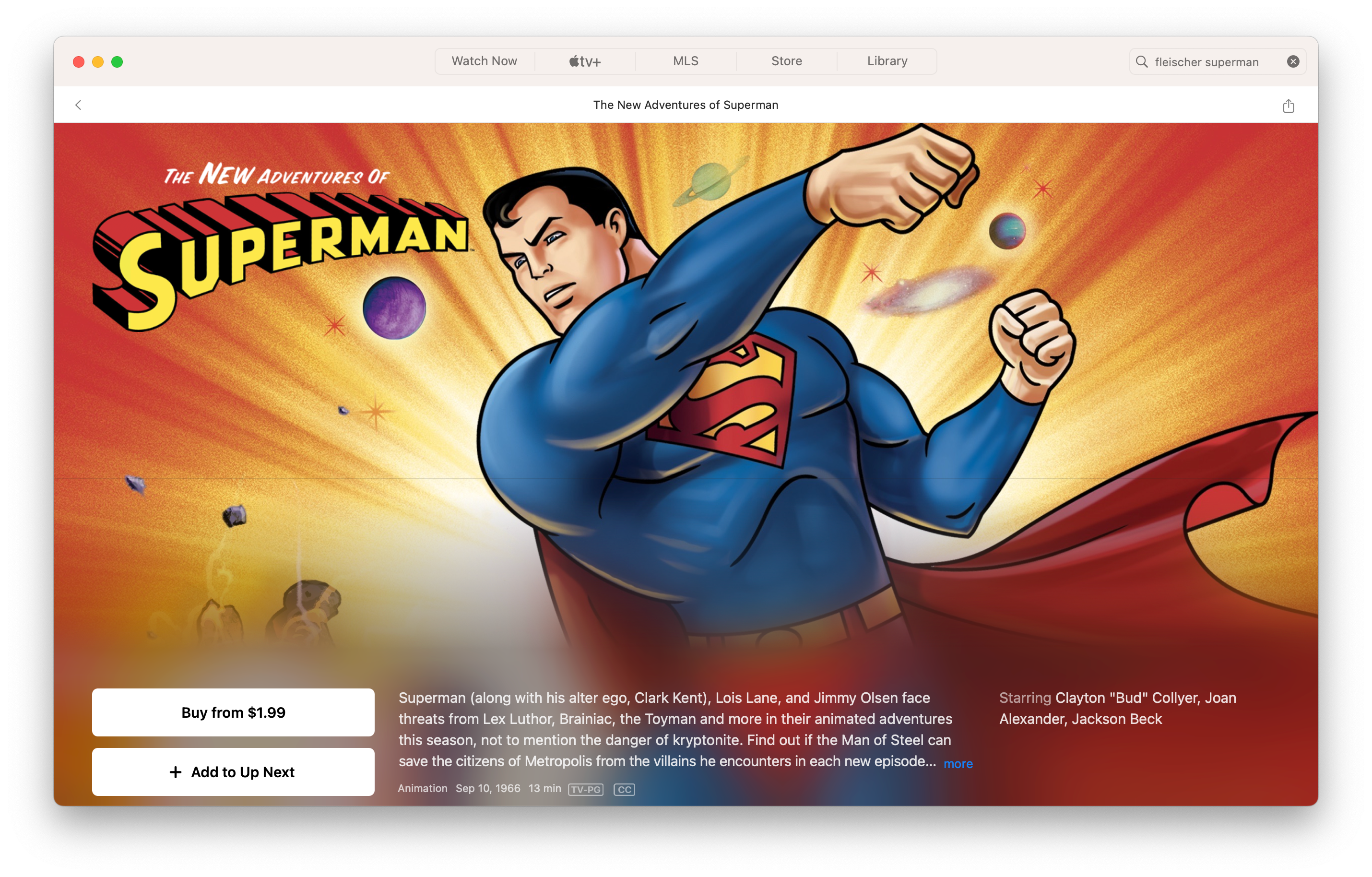
Should you buy this?
Do you love these shorts (except for the racist ones)? Then yeah you should get these. At least in iTunes. These shorts have probably never looked better and definitely haven’t looked this good in my life time.
(The) Daily Planet Globe
Good Miracle Monday, dear reader! With the 4K box set in my hands I thought about doing another follow up, but I’ve decided to keep things positive on our most sacred of holidays. Let’s talk about depictions of the Daily Planet globe in other media!
I just finished re-watching Smallville season eight along with the excellent Always Hold onto Smallville podcast. Being part of the Metropolis years we see lots of shots of the Daily Planet globe. One thing that stands out in the Smallville universe (Earth 167) version of this globe: the definite article “The”. Smallville’s globe says “The Daily Planet”. This got me wondering what other adaptations globes say. Here is a not-definitive list:
- Smallville - The Daily Planet
- Titans - Looks like Daily Planet, but it’s hard to tell 100%; picture below
- Arrowverse COIE Crossover (Earth 96) - The Daily Planet
- Superman Returns - Daily Planet
- Lois & Clark - I don’t think we ever see the top of the building, but the globe above the door has Daily Planet
- Superman the Movie - has a helicopter pad on the roof, but the intro has the globe with Daily Planet
- The Adventures of Superman - no globe!
- Superboy - no Daily Planet!
- Supergirl series- kiosk in the season two episode “Adventures of Supergirl” says Daily Planet
- Superman & Lois - Daily Planet (“The” on logo underneath)
- Man of Steel - no globe!
A couple of animated versions I’ve noted
- Scooby Do and Krypto Too movie - Daily Planet
- All Star Superman movie - Daily Planet
- Legion of Super Heroes movie - Daily Planet
- League of Super-Pets movie - The Daily Planet
- Ruby Spears series - Daily Planet
- The Animated Series - Daily Planet
- Fleischer shorts - Daily Planet
This wiki has some great screenshots of different globes across the ages.
I personally prefer the globe saying just “Daily Planet”. This is a shot of the Metropolis skyline in the Titans show. Despite only ever seeing Superman’s boots on the show I think this skyline looked good.
View the archives